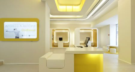
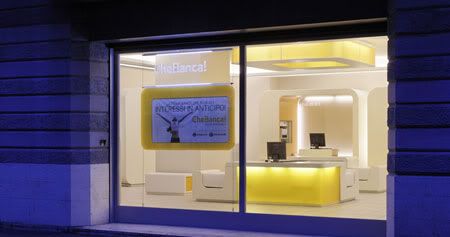
Like a bank of the future, the structure effectively has all the charm of a futuristic construction that looks almost as if it had landed from outer space, like a space shuttle or a spaceship that has just landed in the middle of an old Italian town.
Design Team: Crea International
Location: Italy
When to visit: Anytime now until their next makeover!
Che Banca! The exclamation meaning “What a Bank!” is the name of a new bank designed by the CREA International. Crea design concept for CheBanca! is “natural tech”.
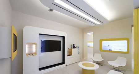
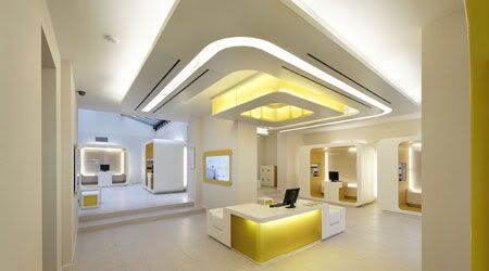
The leading design idea is that the things that surround us have to get back to essential: the warmth and light of the sun, of a technological but friendly one. A special sun that wraps us around through technology and its light. The layout of CheBanca! is organized so to remember the logical organization of the solar system with the client ideally at the centre of it. The natural tech of Che Banca! means ethic and transparency of a world that does not deceive. A technological world that is able to give space to people and their power to choose.
The leading design idea is that the things that surround us have to get back to essential: the warmth and light of the sun, of a technological but friendly one. A special sun that wraps us around through technology and its light. The layout of CheBanca! is organized so to remember the logical organization of the solar system with the client ideally at the centre of it. The natural tech of Che Banca! means ethic and transparency of a world that does not deceive. A technological world that is able to give space to people and their power to choose.
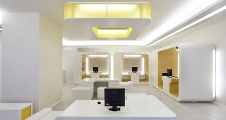
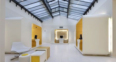
CREA International had a brilliant idea: making the bank, traditionally an aseptic environment, into something unusual, dreamy and attractive. They dusted off the old concept and gave it a new look that is definitely inviting and unusual. The interiors are organic, designed as a series of concave and convex forms; spaces are dynamic, fluid, energising. Everything is carefully designed down to the tiniest detail: workstations shaped like cabins in which users and tellers both sit on the same site, diffuse lighting, a children’s area to make going to the bank more fun for kids too.
With the intention of creating an informal, fun setting in which bank customers would feel at ease, but also in order to underline certain characteristics of the brand: simplicity, transparency and innovation. Yes, because this is a bank that invites customers to enter, cradles them, "caresses them" with a light setting that embraces people. If their goal was to create an attractive place that invited people in, even if just out of curiosity, they certainly achieved it.
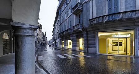
via CheBanca! | Crea International | Floor Nature
With the intention of creating an informal, fun setting in which bank customers would feel at ease, but also in order to underline certain characteristics of the brand: simplicity, transparency and innovation. Yes, because this is a bank that invites customers to enter, cradles them, "caresses them" with a light setting that embraces people. If their goal was to create an attractive place that invited people in, even if just out of curiosity, they certainly achieved it.


via CheBanca! | Crea International | Floor Nature
Pretty shop to stole money to normal people. Design that fucks humans.
ReplyDeleteLooks like a movie set for a sterile future world. Not very inviting or practical. I wouldn't want to work in that environment.
ReplyDeleteAseptic environment for sure.
ReplyDeletePeople have the power to choose alright.