Tuesday, June 1, 2010

M&G Ricerche by Samyn and Partners


The building is situated like an island in the middle of a rectangular pool and follows the outline of the foundations of a convent which once occupied this site.
M&G Ricerche Research Laboratory
Design Team: Samyn and Partners
Location: Venafro, Italy
Status: Completed 1991

As chemical industry research laboratory, the centre consists of two areas: a technical area with pilot plants for the development of production and processing methods, and a chemical-physical area with labs for the synthesis and analysis of chemical products. The implementation of these chemical and physical largescale experiments has a varying space requirement which is predictable only with difficulty. From this fact resulted the requirement to create an open, column-free space as large as possible, which at the same time would allow for separate tests to be carried out in smaller protected units.


The site eventually chosen, Venafro in the South of Italy, is a large valley surrounded by hills, fields and traditional buildings.


A light tentlike form appeared from the first sketches and evolved into an almost oval form, 85 m by 32 m, creating a single volume covered with a lightweight 15 m high structure, and supported by symmetrical metal lattice arches held by six longitudinal suspension cables.  This space, lit by the translucency of the membrane, as well as by the perimeter steel framed and arched window, is used for both types of research.

The structure is placed in the centre of an oval reflective pool, designed for security, thermal regulation, and to enhance the form and the landscape with its reflections and coolness.  The closed research areas as well as the offices are completely air-conditioned.

The membrane is made of PVC coated polyester, stretched between metal arches. At its base, a cable holds the feet to the arches positioned in the pool.  The junction between the membrane and the metallic perimeter half-arches is made of a supple transparent PVC material that is fixed into the perimeter of the half-arches and on to the membrane's main suspension cable.


Continue reading...

Wednesday, August 19, 2009

Centro Direzionale Forum by Mario Cucinella Architects

Mario Cucinella Architects

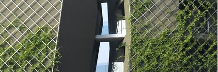
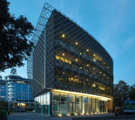
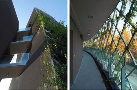
The steel grid forms a supporting structure for climbing plants (Star Jasmine), creating the appearance of vertical hanging gardens, reminiscent of a ivy covered buildings.
Centro Direzionale Forum
Design Team: Mario Cucinella Architects
Location: Rimini, Italy
Cost: € 3,500,000
When to visit: Completed 2006

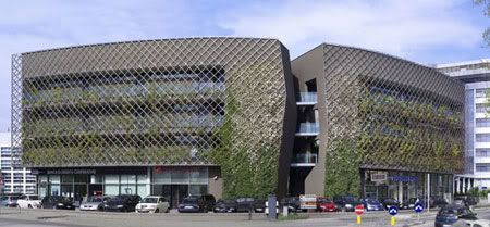
This mixed use building is located at the junction of a busy road at the entrance to Rimini town. It is five stories high and houses 1,700 m2 of offices and retail units.

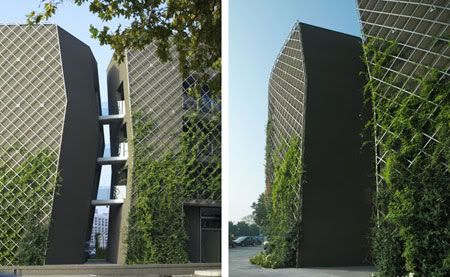
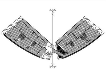
The building has an L shaped layout, facing onto a major road junction, with the entrance set at the point at which the two axes meet. The entrance is distinguished by a deep fracture in front of the road intersection that captures attention against the sheer surface of the facades.

Centro Direzionale Forum

The most striking feature of the design is the curved façade that faces the street, a green skin reminiscent of traditional ivy covered buildings. It is made from a steel grid where climbing plants grow that creates an uninterrupted screen over the entire length of the building, embracing the lateral elevations and connecting to the rear courtyard façade. This screen serves to give the building an homogeneous form that is in turn broken by a vertical split - a deep fracture that leads to a garden behind. The dark colour used on the building contributes to the contrast between the green skin and the entrance fissure.

The offices floors have balconies that overlook the street and are screened by the climbing plants. This system is permeable to air and light so the walkways can be used as veritable outdoor spaces.

Centro Direzionale Forum
Mario Cucinella Architects

Immediately behind the planted screen the galleries are protected by a circular section steel handrail with steel support posts.

At the rear of the building the two faces looking inwards over the plot form an angle of around 90° offering a secluded space for gardens or a covered piazza. The internal elevation of the building has a more secluded feel with its view over the internal courtyard garden.

Centro Direzionale Forum

via Mario Cucinella Architects

Continue reading...

Wednesday, July 8, 2009

CheBanca! by Crea International

Crea International

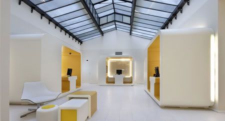
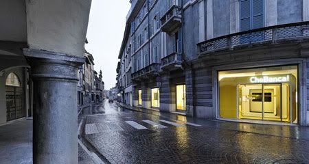
Like a bank of the future, the structure effectively has all the charm of a futuristic construction that looks almost as if it had landed from outer space, like a space shuttle or a spaceship that has just landed in the middle of an old Italian town.
CheBanca!
Design Team: Crea International
Location: Italy
When to visit: Anytime now until their next makeover!

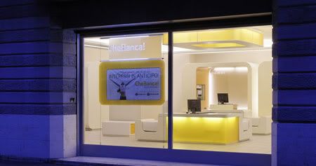
Che Banca! The exclamation meaning “What a Bank!” is the name of a new bank designed by the CREA International. Crea design concept for CheBanca! is “natural tech”.

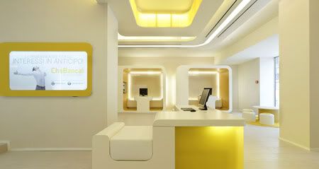
The leading design idea is that the things that surround us have to get back to essential: the warmth and light of the sun, of a technological but friendly one. A special sun that wraps us around through technology and its light. The layout of CheBanca! is organized so to remember the logical organization of the solar system with the client ideally at the centre of it. The natural tech of Che Banca! means ethic and transparency of a world that does not deceive. A technological world that is able to give space to people and their power to choose.

CheBanca!
Crea International

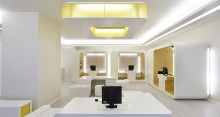
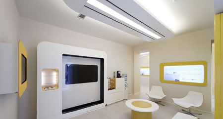
CREA International had a brilliant idea: making the bank, traditionally an aseptic environment, into something unusual, dreamy and attractive. They dusted off the old concept and gave it a new look that is definitely inviting and unusual. The interiors are organic, designed as a series of concave and convex forms; spaces are dynamic, fluid, energising. Everything is carefully designed down to the tiniest detail: workstations shaped like cabins in which users and tellers both sit on the same site, diffuse lighting, a children’s area to make going to the bank more fun for kids too.

With the intention of creating an informal, fun setting in which bank customers would feel at ease, but also in order to underline certain characteristics of the brand: simplicity, transparency and innovation. Yes, because this is a bank that invites customers to enter, cradles them, "caresses them" with a light setting that embraces people. If their goal was to create an attractive place that invited people in, even if just out of curiosity, they certainly achieved it.

Crea International
CheBanca!
Crea International
CheBanca!

via CheBanca! | Crea International | Floor Nature

Continue reading...

Friday, December 5, 2008

Danish Brand in Milan


“I wanted to create something that was just as simple and timeless as Fritz Hansen’s furniture,” commented Tagliacarne, “without compromising on the sculptural side. One could say that I focused on utilising the space instead of decorating it.”
Fritz Hansen Showroom Milan
Design team: Stefano Tagliacarne
Location: Corso Garibaldi 77, Milan, Italy
When to visit: Anytime or when visiting Milan fashion week

Fritz Hansen, historic Danish brand for contemporary design, opens its first showroom in Milan, designed by the architect Stefano Tagliacarne, as a strategic platform able to reach the international market.

A major challenge to Stefano Tagliacarne was to overcome the spatial irregularity of the showroom, a 340 square meters surface divided into three levels: the basement of 70 sqm; the ground floor of 40 sqm; and the first floor of 230 sqm well visible from the exterior. Tagliacarne links these three levels by the means of a big red column and a wood clad wall, both developing from the bottom of the basement to the top of the first floor.


The first floor, where visitors enter, connects to the second floor by a concrete spiral staircase, which is just 8 centimeters thick. The second floor has a flexible layout and is natural lightened, thanks to the big windows.

For the new store Fritz Hansen wanted to communicate the rich history of the Danish brand and its famous collections, to emphasize the brand image imprinted by the masterpieces of Arne Jacobsen and Poul Kjaerholm and to express the values of Danish culture in relation to the Italian context.


These premises have led Tagliacarne to design an informal exhibition space where Fritz Hansen design collections are the true protagonists. This means above all having minimized any kind of additional decoration, emphasizing textures, finishes and natural features of the structural elements of the space as well as the exposed products, which, in that way, become decorative elements themselves.


Stefano Tagliacarne has chosen the finishes of the structural elements also due totheir ecological sustainability, convenience and flexibility, meeting essential values of the Danish company Fritz Hansen. All materials used for the interior design of the showroom are easy to find, to install and to dismantle, allowing future evolutions of the interior project with the possibility to re-use a great number of elements.


With its dazzling showroom, Fritz Hansen aims to highlight the fact that attractive, high-quality furniture is to be seen as a work of art that belongs with architecture, matching the spirit of the times.

Tagliacarne has designed a space that exudes an air of quintessential Danish design and, as Fritz Hansen’s CEO Jacob Holm described it “as a place where we can feel at home”. For example, the use of raw wooden beams creates a warm atmosphere despite the uncompromisingly minimalist interior design.


via Fritz Hansen

Continue reading...