
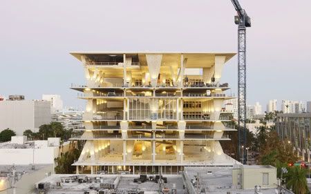
Herzog & de Meuron have produced not a new cultural behemoth but a strange sculptural structure, reviving the idea of the car park as a figure in the city.
1111 Lincoln Road
Design Team: Herzog & de Meuron
Location: Miami, USA
Status: Completed 2010
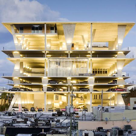
Multistorey carpark is always synonymous with paranoid, corrupt dystopia & denied its own architectural expression and buried - beneath the ground, unseen, uncelebrated, a poorly-lit, dirty secret. However, the latest building (carpark) from Herzog & de Meuron is a surprise to all of us.
Envisioned by developer Robert Wennett and designed by Herzog & de Meuron, the multistorey carpark is part of the 1111 Lincoln Road development. Robert Wennett, has used Miami Beach's parking shortage to smuggle in a layer of retail for which he otherwise would have struggled to get permission. Boutiques and bookshops at ground level establish a pattern of (upmarket) retail for (the now mid-market) Lincoln, while four condos on a new street at the side help with profits, leaving Wennett's own penthouse and a restaurant to occupy the top floor. There is even a shop halfway up the ramps, isolated and intriguing.
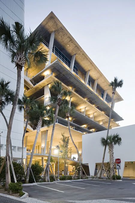
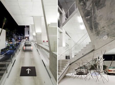
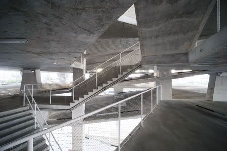
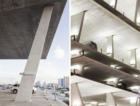
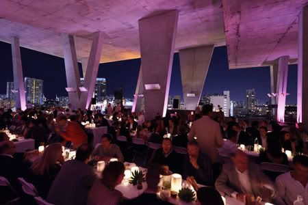
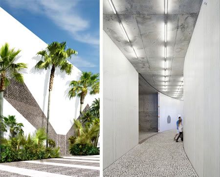
A stack of raw, sharply chamfered concrete layers is prised apart by wedge-shaped columns, which wind into each other and draw the eye into the slightly sinister shadows against the vivid blue of the Florida sky. It is almost shocking. As you ascend through the structure, its concrete planes fold themselves beneath you, each level exposing a yet more compelling vantage-point on the surrounding city. At one point a complex tangle of steel by artist Monika Sosnowska turns out also to be a safety feature, stopping kids getting struck beneath the ramp. By the time you reach the top, the city, the sea and the sky twinkle before you in a filmic panorama.
The idea is to create a series of layers that extend the public realm up into the building, to attract events, parties and life into the structure. Both architects and developer see the structure as an experiment in a new kind of downtown transport architecture, a building as exciting to enter as to emerge from, blinking into the Miami sun.
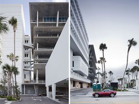
The public street in front of the car park has also been transformed. Artist Dan Graham has built a curvaceous glass pavilion outside. Beside the raw concrete, a gleaming white monolithic block provides one of the very few Swiss avant-garde drive-in banks.
This is not a conventional piece of regeneration, even if it is on a site that frankly needed it. A building dedicated to consumption in every way, most notably to fuel and fashion, it nevertheless becomes a stark and thoughtful reflection on the contemporary city. It strips architecture back to its sinewy muscles and the US city back to its autopianism. The diametric opposite of the sunny, pastel-tinted, much-loved art deco for which the city is known it is a vernacular derived from local conditions - sun, shopping, views and traffic.

via ft
Continue reading...