Wednesday, May 12, 2010

De Boogjes by Mecanoo Architecten


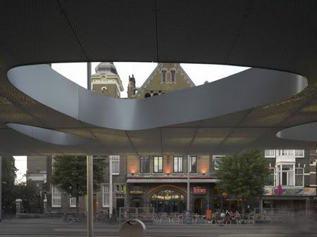
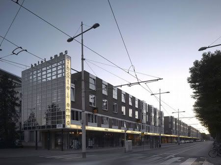
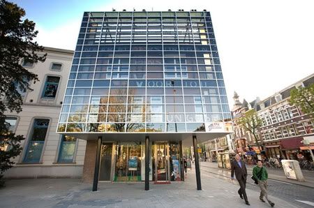
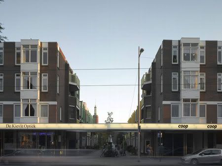
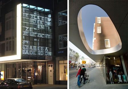
The shops also acquire an awning, which at the two ends of the street is raised up vertically in the form of bookends. This serves to create a grouping of the four blocks and enabling the complex to present itself again as a single entity. The two bookends display a changing selection of poems administered by Poetry International Rotterdam, using separate white letters behind glass.
De Boogjes
Design Team: Mecanoo Architecten
Location: Rotterdam, Netherlands
Status: Original building completion 1979; Redevelopment completion 2007

‘De Boogjes’ is a group of buildings designed by the architect Hammel and built in 1979. It is located in the centre of Rotterdam on the Nieuwe Binnenweg and consists of four building blocks comprising shops on the ground floor with three floors of apartments above and the Hotel Emma at the end of the street where it meets the Eendrachtsplein. The four blocks have characteristic arcades at ground level, whereby the shops are set back from the front elevation. These are ‘De Boogjes’ [The Arcades] from which the group of buildings derives its name. Not long after it was built, however, the concept of arcades not only failed to work but even elicited petty crime. The arcades are too low with a large number of columns that are much to wide so as to create uneasiness for the shopping public.
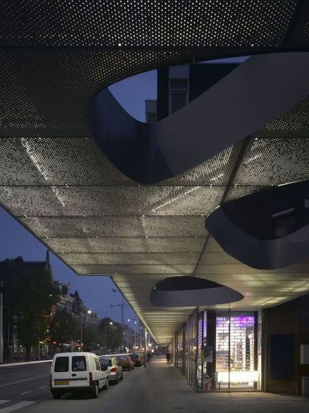


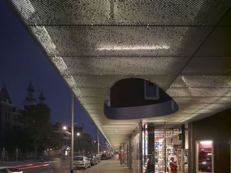
In 2001 the Association of De Boogjes Owners took the initiative to find a solution. Mecanoo decided to demolish the arcades and to bring the storefronts forward by 2.60 metres. The shops in turn gain more window space and the pavement is shifted towards the street. Mecanoo’s design is rendered in highly contrasting materials. The existing complex is built entirely from masonry, concrete ornamentation and wooden window and doorframes. The ceiling of the awning is made of unpainted perforated aluminium panels. The names of the shops are applied to the opal glass on the front of the awning.
Continue reading...

Thursday, February 18, 2010

John Lewis Department Store by FOA

John Lewis Department Store by FOA

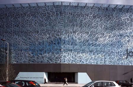
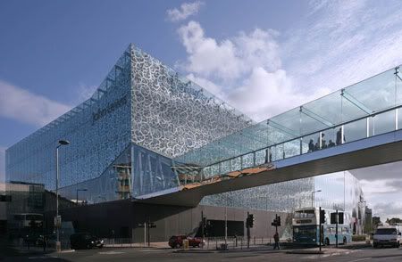
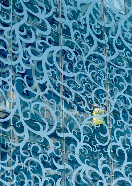
Looks like a big box wrapped in fancy tights, the striking facade was derived from a fabric design found in the John Lewis textile archive way back in 1803.
John Lewis Department Store
Design Team: Foreign Office Architects (FOA)
Location: Leicester, UK
Status: Completion 2008

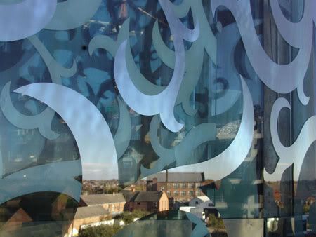
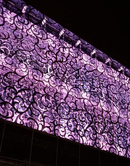
The design of the John Lewis Department Store and Cineplex by Foreign Office Architects is within the redevelopment of an existing inner-city retail centre in Leicester. Refuse to create a conventional opaque retail box, the department store design explores a layered transparency that will allow visual interaction between the store interiors and the city as in a net curtain. This is achieved through a double layered skin with a lace-like pattern applied to both layers. This membrane will act like a veil to the department store as well as a sun shading device to the interiors. The moire lace not only acts as a technical device, allowing for programmatic flexibility in the interiors whilst opening them to views and natural light, but it also will resonate, with the cultural and historical context of the city as well as with the tenant's brand: John Lewis.

John Lewis Department Store
John Lewis Department StoreJohn Lewis Department Store

The lace pattern draws on the rich history of Leicester City and John Lewis itself in respect to textile manufacturing and hosiery, and the large Asian population in Leicester. In order that the glass curtain wall achieves a textile affective quality, the lace pattern is built as a combination of four basic templates that vary in density but always meet at the edges in identical ways. This allows for provision of different degrees of opacity to the interiors as well as giving an appearance of non-repetitive and seamless fabric.

The decorative facade, which is a double layer of glass with a mirrored frit, acts like a net curtain. Inside, the pattern on the two layers lines up exactly, so customers can see out, but when viewed at an oblique angle from the pavement, the pattern becomes almost opaque.

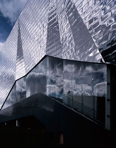
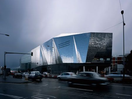
In order to establish synergy between the cinema and department store, the concept of fabric is extended to the Cineplex. The Cineplexes is a blank envelope enclosing 12 screens with no requirement of any daylight to the interiors, except in the areas of lobbies. The enclosing skin is designed as an opaque stainless steel rain screen which is treated in mirror finish and pleated at different scales to diffuse the large volume into a series of smaller reflective surfaces, animating the blank volume.

John Lewis Department Store

via FOA

Continue reading...

Tuesday, December 29, 2009

Encants market by b720 Arquitectos

Encants market

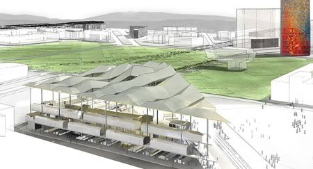
Encants market is an initiative to accomodate all commercial activities and improve the mobility, the public transport system and the management of equipments in the area.
Encants market/ Mercado de Els Encants de Barcelona
Design Team: b720 Arquitectos
Location: Barcelona, Spain
When to visit: Expected completion 2011

b720 Arquitectos has won the design of a new Encants market from the City Council of Barcelona. The new Fira of Bellcaire market, better known as Encants Vells of Barcelona, will be located in the zone of Bosquet and its transfer is one of the pieces that will facilitate the unfolding of the modify of the Metropolitan General Plan in the Glories area.

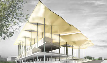
The new Encants market is installed as a device to mediate between the reform of the Glorias square and the axis of Meridiana, an area popularly known as the Glories of Bosquet. The b720 proposal raises a platform (or commercial square) at various levels as a continuous surface suitable for all commercial activities. By bending the platform, the different levels of the street are reconciled, understanding the market as a large square deck, capable of instilling activity in all parts of the program.

Encants market

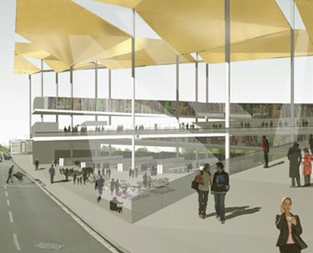
The new facility, defined as “functional, open and future”, tries, from a structural point of view, for protecting the business of inclement weather under their deck, but always retaining a sense of buying outdoors. The commercial solution proposed (shops and auction) will be located primarily at the street level and will not be placed under any building other than its own deck, which will form an open commercial space with a main façade to the Meridiana avenue and the Glories square.

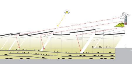
The remaining business that has the market (formed by the other shops that are not at the street level) and the new supply and services that may have (restaurant, play centres, offices, multipurpose rooms…) would be located over this zero level while preserving the sense of buying street. The project includes an underground car park with capacity for about 300 cars, loading area, storage area, locker, offices and other auxiliary services.

The cover, the principal component of urban recognition, protects commercial activities and reflects the city inside the market. Each modular structure will have different inclinations to reflect light, atmosphere and landscape.

b720 Arquitectos
b720 Arquitectos

via b720

Continue reading...

Friday, November 27, 2009

31 Queen Street by Gray Puksand

Gray Puksand

The refurbishment of the foyer space is akin to the approach of set design where the performance is the day to day activity of tenants within the commercial world.
31 Queen Street
Design Team: Gray Puksand
Location: 31 Queen Street, Melbourne
Status: Completion 2009
Cost: $5.0m

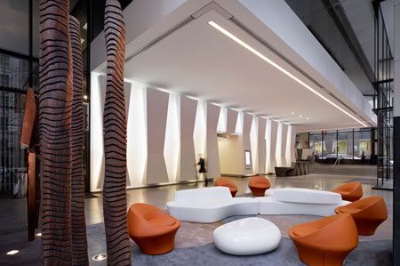
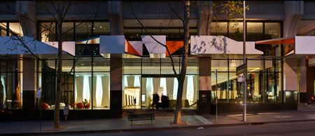
The refurbishment of 31 Queen Street, a building foyer and street façade is founded on the need to renew the commercial viability and asset value by ensuring existing and new tenants will remain occupied within the building.

With the city is now a 24/7 entity, where it’s important to ‘market’ such addresses outside of traditional building hours. Coming to life at night as a sculptural space to street view assists with the significance of the place.

By using the approach of set design, a number of elements have been implemented to strengthen the building appearance form street view. Externally it has received a dynamic facelift with the installation of a sculptural canopy. Designed in association with artist and sculptor Dan Templeman, the new canopy provides a new identity and presence at street level. A pure abstraction form to ‘go with the flow’ on one hand, yet ‘critique’ the geometry of the existing building on the other.

Gray Puksand
Gray Puksand
31 Queen Street

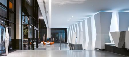
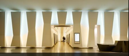
Internally, a folding wall of Corian and internally-lit perforated metal panels surround and reinvigorate the core. With lighting, the core wall punches out into the street, creating an impact both during the day and night, providing a strong aura and connection to the outside. The purity and abstraction of form adds a three dimensional layer to what is typically a flat plane.

The renewal of the foyer has been further strengthen, with the unification of the lift lobby and a new larger public waiting area using communal furniture pieces and new artworks. The addition of a seated café area to the upper level has created a new informal meeting space for all users of the building.

31 Queen Street
Gray Puksand
31 Queen Street
31 Queen Street

via idea-awards

Continue reading...

Saturday, November 21, 2009

Myer Redevelopment by NH Architecture

Myer Redevelopment

Dynamic installations and creative visual displays will create an inspiring shopping environment for customers - one that has never been seen before in Australia.
Myer Redevelopment
Design Team: NH Architecture
Location: Melbourne
Status: Completion end of 2009
Cost: $500 million

NH Architecture has been appointed for the redevelopment of the Myer Bourke and Lonsdale Street stores. The proposal consists of the redesign of the Myer flagship store with a new development north of Little Bourke Street consisting of a number of buildings around a network of public lanes.

This proposal offers a vision driven by bold ideas that include: increased area to the Bourke Street address, an upgrading that can set new standards in department stores, environmentally sustainable initiatives, and an architectural achievement that adds to Melbourne’s design accomplishments.

Myer Redevelopment
Myer Redevelopment

The proposed rooftop Myer Room provides a contemporary equivalent to the retained historic Mural Hall – the destination within a destination. It will be the hub of calendar of events: launches, shows, exhibitions, and dining. Its crystalline roofscape will be the end of a journey starting from the ground level – it will be the crown of the new Myer Melbourne.

The Lonsdale Street redevelopment will retain the historic façades to the north with five separate buildings behind. These buildings will be up to 10 levels high and be connected via a series of laneways. The mixed use building programme will include retail, hospitality and potential for serviced apartments or a hotel.

Myer Redevelopment
Myer Redevelopment

via nharchitecture

Continue reading...

Friday, October 16, 2009

KU64 Dental clinic by GRAFT Architects

GRAFT Architects

“There are few environments as negatively associated in expectation as a dental clinic. Hygienic and sterile atmosphere, the classical “white colour range” and last but not least the typical smell are very much connected with a feeling of a physical and psychic state of emergency and even abuse. Against this background we should be urging for a radical new understanding of hospitals in general and specifically dental clinics – away from negative prejudices towards an atmosphere of art, well being and relaxation.” - GRAFT
KU64 Dental clinic
Design Team: GRAFT Architects
Location: Berlin, Germany
Status: Completed 2006

The design concept for the dental clinic of Dr. Ziegler devises a radically new morphology for a medical setting. Folding, undulating floors create rises and hollows to hide in, inspired by a beach dune landscape. Ceiling and floor reflect each other in waves, defining protective spaces without the use of distinct enclosures. Hills and valleys are configured to enable privacy and intimacy as well as openness and vista.

GRAFT Architects
KU64 Dental clinic

Anamorphic images In white are silk screened onto the orange surface and can only be deciphered from distinct viewpoints. While moving through the clinic, the surface's appearance continuously changes. Furniture and topographical volumes double as storage space, and technical equipment is seamlessly integrated into the contours of the interior.

While the treatment spaces are defined by their discreet use of technology and contemplative nature opening up towards the skyline of Berlin only, the waiting area is transformed into an unexpectedly large, lounge-like space with an adjacent outside sun deck. The same typology of dune shaped surfaces create a common beach scenario, with integrated seats and soft benches, grouped around a free hanging fireplace.

GRAFT Architects
KU64 Dental clinic
KU64 Dental clinic

The concept of a dune-like sculpture at the floor and the ceiling is continued into a staircase, connecting the main floor with the terrace and the treatment spaces on the floor below. The horizontal shapes are transformed into walls, confining a middle corridor like a canyon. A rhythm of glass doors cut into this canyon providing visual connections to the street and courtyard and flood it with natural light.

GRAFT Architects
GRAFT Architects
GRAFT Architects

Photo credits: Hiepler Brunier Architektur fotografie
via KU64 | GRAFT Lab

Continue reading...

Friday, October 9, 2009

Mizu Salon by Niall McLaughlin Architects

Mizu Salon Boston

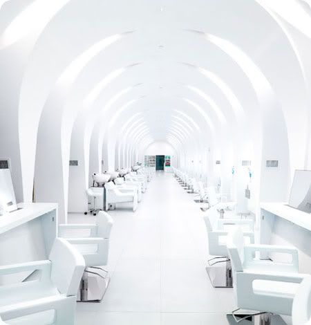
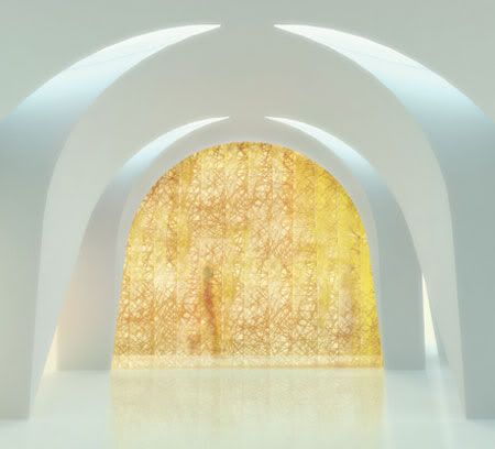
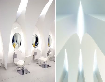
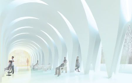
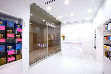
The simple vaulted cutting room is animated by repeating cuts in the soffit, which open into brightly lit spaces. When you lie back at your basin, you gaze on the ceiling's beautiful geometry.
Mizu Salon Boston
Design Team: Niall McLaughlin Architects
Location: Boston, USA
Status: Completion 2008
Cost: $1.9 million

Created by Elan Sassoon, the son of legendary hair stylist Vidal Sassoon, Mizu Salons blend the finest talent in hairstyling with modern architectural aesthetic and function. Located inside Mandarin Oriental,Boston, Mizu's architectural design and international talent attract world-wide attention and celebrity clientele. By creating beautiful hair, providing intuitive service and staying ahead of industry technology, Mizu salons will mark a new era in hairstyling and the salon experience.

Mizu Salon

The key design issue is the comfort and well being of each customer. This is an environment that is calm and uplifting. A customer should leave the salon feeling nurtured.

Soft spaces are created through strategic reflective lighting, light boxes and soffits. The cool colour temperature creates a sense of calm and cleansing whist warm gold colours introduce a feeling of relaxation and comfort.

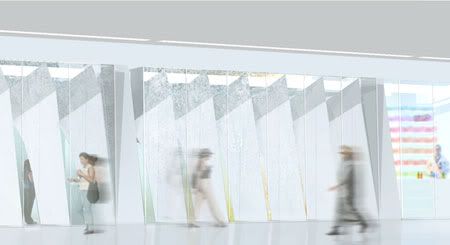
An arcaded passageway extends along the glass shop window. It leads from reception to hair cutting, dyeing and colour dispensary. This passageway makes a sculptural form when seen from the mall. It acts as a screen, making the cutting room a protected inner sanctum.

Mizu Salon Boston
Mizu Salon

“We are very proud of the designed arches. The entire structure was manufactured in Canada and sent in 500 pieces. The arches are made of GRG (glass reinforced gypsum), which is a high-quality plaster mixed with glass fiber. It took very skilled craftsman to install these and then we finished with an acoustical plaster to ensure the sound levels stay at a minimum, even with the hairdryers and conversations going on. Lastly, the arches are painted with a matte white paint that makes it easy to wipe clean.”

Each space incorporates experience-enhancing technology like Myvu glasses that offer television and movie entertainment in the stylist's chair, WiFi, and use of complimentary laptops available to every client. To further streamline the experience, at the end of an appointment, wireless check-out systems will complete any service and product transactions while sitting at the stylist station, shortening time spent waiting to pay at reception.

Niall McLaughlin Architects

via Reuters

Continue reading...

Friday, October 2, 2009

Conde Lumiares Drugstore by Mobil M

Conde Lumiares Drugstore

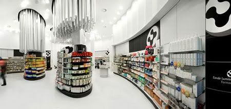
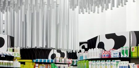
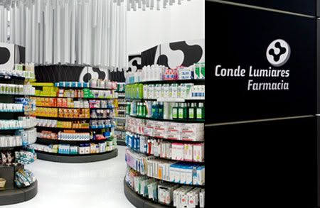
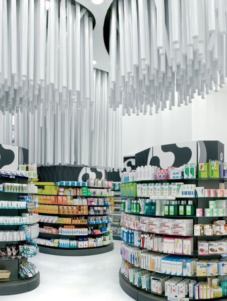
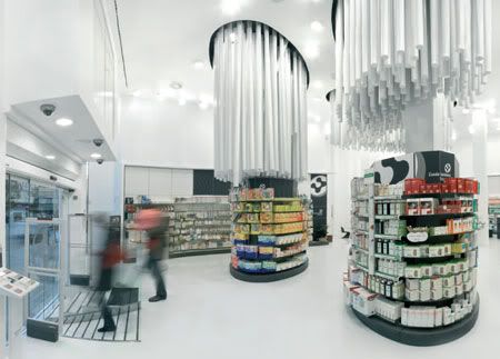
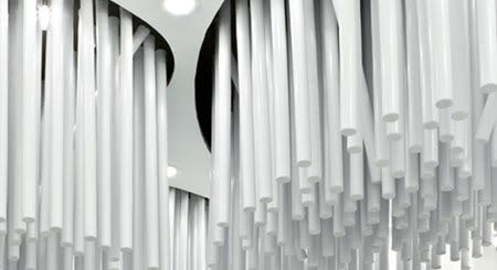
The 256 tubes hang from the centre of the shop, without doubt, the originality of this interior architecture.
Conde Lumiares Drugstore
Design Team: Mobil M
Location: Alicante, Spain
When to visit: Anytime

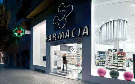
Spanish architecture firm Mobile M, has renovated the Conde Lumiares drugstore in Alicante, Spain, offering an innovative, non-traditional approach to pharmacy design while renovating the store.

Architect in charge, Daniel Ferrer has removed the suspended ceiling of the old shop, lending an airy and spacious feel to the interior. Ferrer has raised the roof from two meters to around five meters. To fill in the void created by having a large space open, Mobile M installed 256 suspended cylinders, ranging from two to four meters in length. A second level to the drugstore has also been created for use as a laboratory, warehouse and employee training area.

Conde Lumiares Drugstore
Mobil M

The exterior of the shop also received a makeover. The single piece shop window glass is five meters high, offering a view of the interior of the shop from outside.

Mobil M
Mobil M
Conde Lumiares Drugstore

via Mobil M

Continue reading...