Thursday, April 29, 2010

La Llotja theatre and conference centre by Mecanoo Architecten


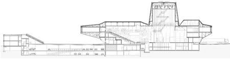
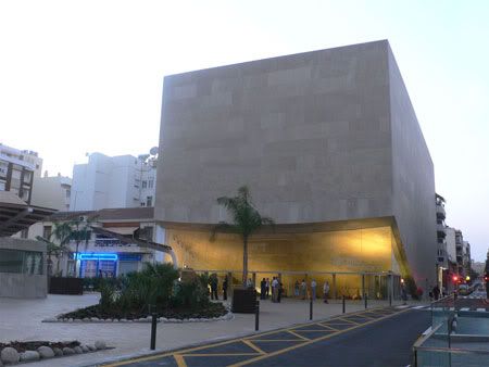
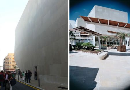
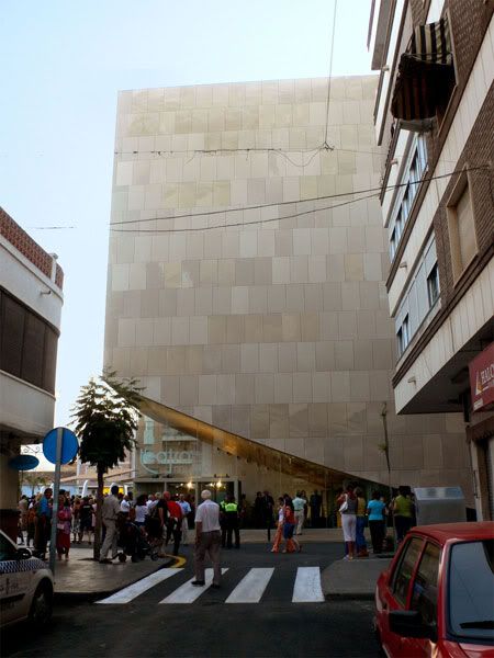
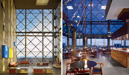
Regarded from the large scale of the region, the building forms a link between the river and the mountain. Viewed from the urban scale, La Llotja and the river form a balanced composition. At street level the cantilevers of La Llotja de Lleida theater and conference centre provide protection from sun and rain.
La Llotja Theatre and Conference Centre
Design Team: Mecanoo Architecten, LABB arquitectura
Location: Lleida, Spain
Status: Completion March 2010

Situated between the seu vella mountain and the segre river, the building design is influenced by its Spanish surroundings with earthen stone cladding and a light bathed interior with vibrantly coloured accents representing the fruits of the region. Sustainable design principles are integrated throughout La Llotja, with a large cantilever for shade and shelter from the rain, photovoltaics, thermal storage and a large roofscaped garden which also provides a city terrace for Lleida’s citizens.


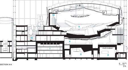
The large stone edifice seems to have sprouted from the Spanish earth. The building’s horizontal form provides a large garden on the roof, while under the cantilevers begins a square for events, with the stairs of the adjacent building serving as a tribune. Parking has been created underground with the loading area for trucks on the ground level, the same level where the theatre stage, dressing rooms and restaurant kitchen are found. Small trucks can load and unload on level -1. In a light court in the centre of the building, a monumental staircase rises from street level to the multifunctional hall on the first floor. A ramp leads on to the foyer on the second level where there is a panoramic window looking out across the city and the river. The entrances to the theatre, which also serve as a large conference hall, meeting rooms and a small conference room are located in the foyer. The latter is visually connected to the multifunctional hall by means of a raked tribune separated by a glass wall. The press office, VIP rooms and a meeting centre are situated on the city side of the building, accessed by an internal corridor. The entire functional logistics for the theatre and the conference centre are situated inconspicuously but extremely functionally. Restaurants with bars are located on the side of La Llotja facing the river and the square.The monolithic building is in fact composed of different pieces of buildings linked together by sound-absorbing foyers.


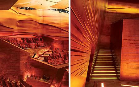
Materials ensure distinction and orientation in the interior. The exterior is of stone. Inside there are mainly white, plastered walls and either wooden or marble floors. The entrance hall and the multi-functional hall have a marble floor, while the foyer has a floor of mixed hardwood. The theatre has the atmosphere of an orchard with walls of dark wood in which trees of light have been cut out. Thousands of leaves on the ceiling light the hall. The colour palette of fruit is a theme that recurs in small details throughout the building. After all, the region of Lleida is famous for its fruit production. The roof is colourful: pergolas support a range of creepers and climbers like roses, jasmine and ivy. The garden with its mirador is not only pleasant but also useful since the roof cover keeps the building cool in the summer, provides a beautiful view for people living in the neighbourhood and serves an extra place for conference guests to sojourn.

La Llotja is 37,500 m2 with two congress halls (1,000 and 400 seats), the largest functions as a theatre as well, a congress hall with 200 seats, a multifunctional space and a lounge with a view on the old city and on the segre river, 9,500 m2 of parking and a public square of 15,325 m2, mercolleida office and retail of 2,591 m2. building costs amount to 35 million euro.


Continue reading...
Thursday, April 22, 2010

Municipal Theatre and Auditorium by FOA

Municipal Theatre and Auditorium by FOA

Given the scarce amount of space in the plot in respect to the required program, the design is to lifts the auditorium from the ground level, letting the plaza penetrate the plot, becoming a foyer that sits beneath the cantilevered mass of the building.
Municipal Theatre and Auditorium
Design Team: Foreign Office Architects
Location: Torrevieja, Spain
Status: Completion 2006

Torrevieja is one of the main tourist towns in south-east Spain, and it is now involved in an ambitious program of infrastructural improvements aimed at raising the profile of the town beyond its current mass tourist destination. This project is the result of a commission to implement a new urban infrastructure, a 650-seat theatre and auditorium, in a corner site inside one of the town centre blocks, and the redevelopment of a neighbouring existing plaza.

The scarce amount of space in the plot made the architects lift the auditorium from the ground level, letting the plaza penetrate the neighboring plot, becoming a foyer that sits underneath the cantilevered mass of the building. The public space becomes an incision into a solid mass, clad in local limestone, which fills the maximum volume allowed on the site, completing the blocks corner. The geometry of the auditorium has been used as the main feature of the cantilevered, stone mass; a reminder of the landscape of limestone quarries that surrounds the town.

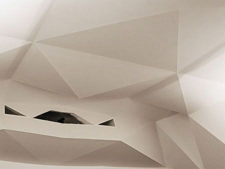
The building has been designed as a single container where the proscenium has been made removable, allowing a seamless continuity between the audience, the stage and the scenic tower. This will provide the maximum flexibility of use of the theatre. The interior finish of the room has been designed as a system of folded planes which reflect the sound to provide ideal acoustic conditions, both for theatre and musica (performances. The crystalline geometry of the interior finish and its white color are a reference to the towns trademark salt lakes.

Municipal Theatre and Auditorium by FOA

via FOA

Continue reading...
Tuesday, April 20, 2010

Cloud Tower by next-ENTERprise


The pavilion inserts itself into the landscape and, through its topographical configuration, reinterprets formal elements of the landscape garden — the play with perspective and visual relations, with contraction and expansion, with enclosure and opening.
Cloud Tower/ Wolkenturm Schlosspark Grafenegg
Design Team: next-ENTERprise
Location: Grafenegg, Österreich, Austria
Status: Completion June 2007

In 2007, the centuries-old architectural landscape of Grafenegg was enhanced by the addition of an open-air stage, which slots into the landscaped gardens like a giant pavilion. The building, designed by architects Marie-Therese Harnoncourt and Ernst J. Fuchs of the next-ENTERprise stands in a natural hollow and harmonises perfectly with its surroundings.


The Wolkenturm is a sculpture which ranges a good 15 metres into the sky, level with the tops of the highest trees, and offers an unexpected view from a range of different perspectives. Here, on the eastern side of the park, the viewer finds a reciprocal relationship between culture and nature. Slanting, unaligned windows fill the arena with light and give an impression of natural airiness. From the seating stands, which have space for 1,730 concertgoers, the view is of the historic castle in its romantic setting.

The open-air pavilion is used as a stage during festival season in summer, and as an attraction for excursionists and flaneurs — similar to the gazebos in historical landscape gardens, which were designed as a destination or a stop-over on extended walks.


The 'Schneise' (loosely translated: an incision in the landscape) creates a vista linking the riding school to the 'Black Gate', and serves as an entrance to and a passage through the auditorium area. The staging of views and spatial sequences, the framing and hiding of points of attraction, often achieved by the meandering layout of paths in the traditional landscape garden, is a theme taken up by varying the elevation of the incision to achieve this effects. Coming from the castle, the visitor is enticed to proceed by the silhouette of the 'cloud tower', visible behind the artificial mound. Immersing himself into the incision, he tunnels through the hill and — after passing this deep narrow — enters the wide arena of the auditorium and the stage, the 'cloud tower' of the stage roof suspended above it.

The basic rule of acoustics for open-air stages, 'what you see is what you hear' serves as a cue to explore affinities between perspective and acoustic space. The topography of the existing depression - the 'Große Senke' - is amplified by modeling the terrain. Artificial hillocks are created by further excavating the depression and subsequently redistributing the soil at its perimeter. Clearly distinguished from the natural terrain by their geometry, stage and auditorium nonetheless merge fluidly with the topography of the site. The stage roof is designed as an autonomous, sculptured object. Suspended above the landscape on a level with the tree canopies, it is placed among the groups of trees as if it were one more of them. The shiny metal surface on the outside reflects the sky and the trees, turning into a cloud-tower.

The Wolkenturm was awarded the Building Prize of Lower Austria in 2007.


via next-ENTERprise

Continue reading...
Monday, April 5, 2010

Appaloosa Branch Library by DWL Architects

Appaloosa Branch Library

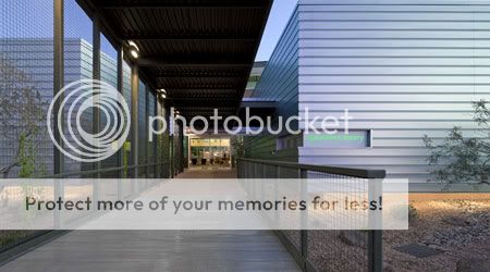
As you approach the library, the building’s metal skin changes colors- It’s primarily silver-gray straight on, and then as you get off to an angle you see a grayish green, as you get flatter to it, it goes dark green or a purplish color. As you’re driving up to it some of the walls look bright pink and some look bright green, creating the mirage effect.
Appaloosa Branch Library
Design Team: DWL Architects + Planners Inc.
Location: Scottsdale, Arizona
Status: Completion 2009

Designed in collaboration with Douglas Sydnor Architect and Associates, the Appaloosa Branch Library design theme celebrates the environment in a protected desert setting. They surveyed the site and decided they didn’t need to go back to historical precedent, or design something that would conform to what might work in other parts of the country. Instead they wanted something thoroughly modern and functional, with the crispness of steel design. They were creating something in the desert, so they decided they might as well create something for the desert.

Rising from a very functional plan, the 21,500 s.f. library concentrates its interior drama in a single large Reading Room that is 70 feet wide and 130 feet long. The space is naturally lit with indirect light that changes during the day but rarely enters the room directly. Sunsets will color the whole room with changing shades of pink and orange, while thunderstorms will be visible wherever they occur. The Reading Room is separated from staff spaces and meeting rooms by a massive geologically-layered concrete wall. Rooms along the south side are wrapped in iridescent metal and float a few feet above the arroyo. At the west end, the building digs into the earth, but at the east end it opens onto a patio with filtered views of the McDowell Mountains.

Appaloosa Branch Library

On the north side of the building, small windows actually form Morse code spelling out "Appaloosa." It was built to meet LEED Gold standards and has many "green" features, including photo voltaic cells, minimized water usage, roof designed to minimize heat island effect, minimal chemical usage during construction and operation and so much more. In addition, it was situated to avoid as much direct sunlight as possible. e.

As the only city building in northern Scottsdale, the Appaloosa branch functions as a public meeting place for residents. There is a café that serves as a “newsroom” where people often come and have coffee while they read the newspaper and watch the news.

Appaloosa Branch Library

via DWL Architects + Planners

Continue reading...
Saturday, March 20, 2010

Family Box by Crossboundaries Architects

Family Box by Crossboundaries Architects

“We have learned that to raise a happy, healthy and hopeful child, it takes a family, it takes teachers, it takes clergy, it takes business people, it takes community leaders, it takes those who protect our health and safety, it takes all of us.Yes, it takes a village to raise a child.”--Hillary Clinton
Family Box
Design Team: Crossboundaries Architects
Location: Beijing, China
Status: Completion December 2009 (1st phase)

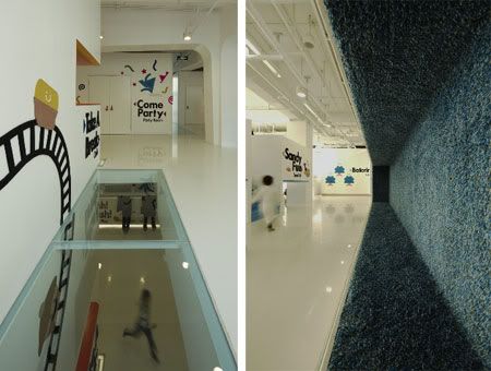
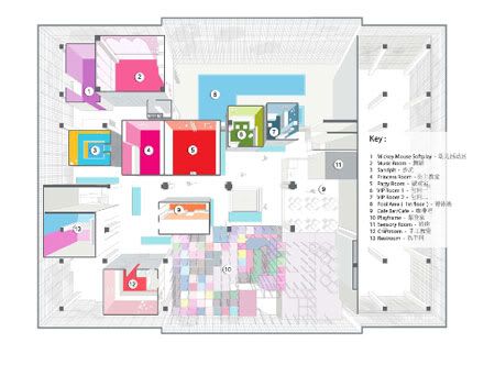
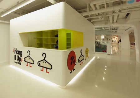
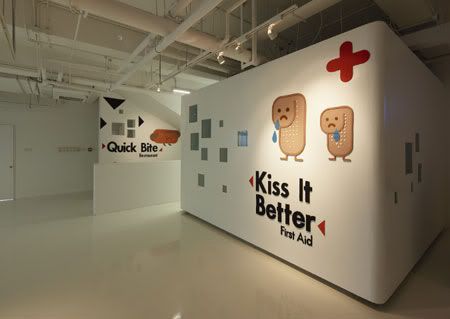
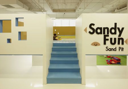
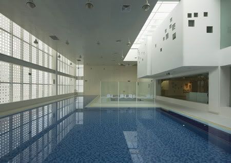
The slogan for the new children day care centre ‘Family Box' is taken from the US Secretary of State, Hillary Clinton. The program comes from Great Britain and its architectural design from Crossboundaries Architects. The building is located in the northwestern outskirts of Beijing. Family Box is something between a playground and a kindergarten, being used both by children ad adults. It hosts different kinds of activities, from swimming, playing games to various classes ranging from music and crafting to cooking. Further more there is a big playframe, a bookshop and a generous café area.

For Family Box, the architect designed two types of space, one for the parents and the other for the children with concerns of a kids-scale space and an adult-scale space.

Family Box by Crossboundaries Architects

When Crossboundaries Architects took over the project, the building was already under construction, designed for a different function- an existing structural system and column grid and also the building footprint – due to the involvement of another design firm in an earlier project stage. The rigid concrete structure of the building did not seem the most suitable for the purpose, so Crossboundaries Architects decided to counterbalance that in different ways.

Crossboundaries Architects was lucky that the two upper floors where not yet constructed – an opportunity for them to make the building more kids’ friendly: the architects decided to shift floor plates up and down and also cut out the floor in some areas to allow views between the floors.

Family Box by Crossboundaries Architects

The various activities are enclosed in freestanding boxes: this allows them to run parallel and it offers the most suitable environment for each. Their layout is meant to break the rigid layout of the concrete columns, which is also camouflaged with a series of arches that give a different rhythm to the environment.Visually, the common areas are treated with low contrast finishes in order to enhance and balance the space and equipments for the children.

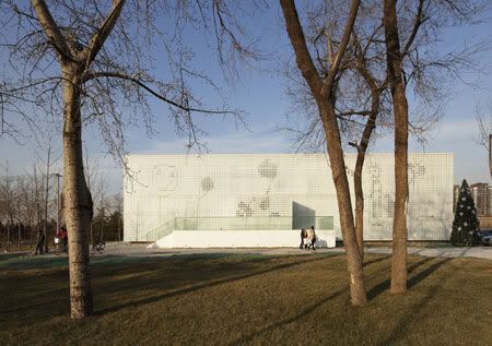
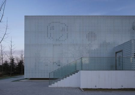
The glass facade has a printed pattern. The graphic motif is reversed: the background is translucent and the drawing is transparent. The surrounding landscape is designed using pre-fabricated concrete tiles. Their displacement follows the facade grid creating a continuity between vertical and horizontal surfaces and merging smoothly the access path to the park. They do not follow a flat surface, since placed on a hilly ground.

Family Box by Crossboundaries Architects

via Crossboundaries Architects

Continue reading...
Tuesday, March 9, 2010

Roman Quarry by AllesWirdGut Architektur

Roman Quarry by AllesWirdGut Architektur

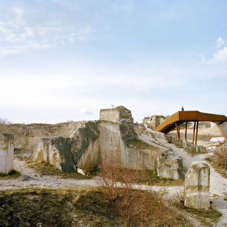
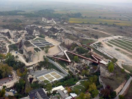
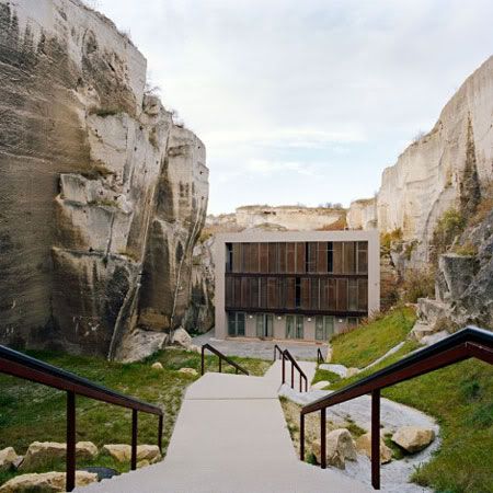
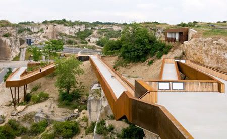
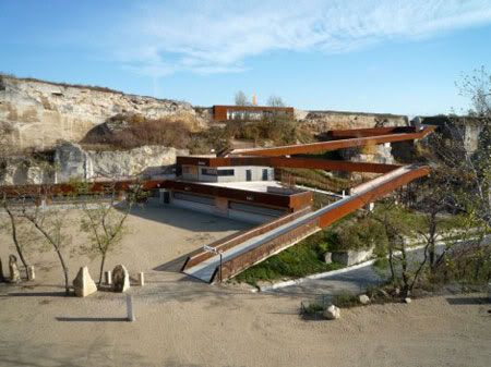
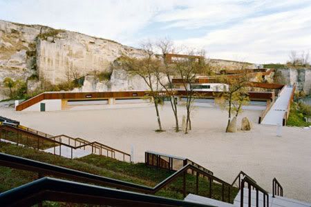
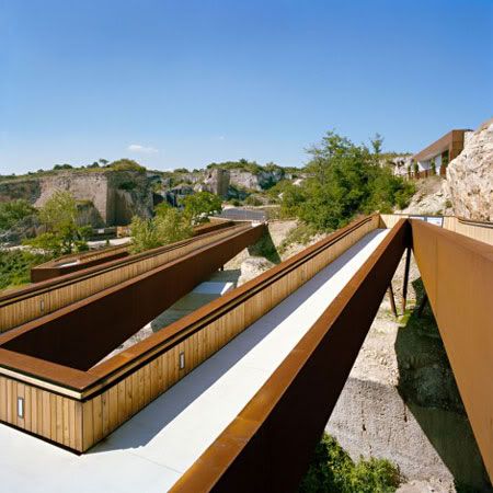
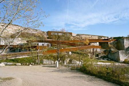
The building is designed in the deconstructivist style -with a limited palette of concrete, untreated timber and corten steel. The material choice accentuates the counterpoint of ramp and landscape by matching most of the materials to the colour of the surrounding sandstone, leaving the corten steel as the only strong visual element.
Roman Quarry
Design Team: AllesWirdGut Architektur ZT GmbH
Location: St. Margarethen, Austria
Status: Completion 2008

The quarry near St. Margarethen in eastern Austria is a special location with a 2,000-year-old history. In the 1950s, a sculpture symposium was established. Later, passion plays were performed there, and today the arena also provides a natural setting for an annual opera festival.

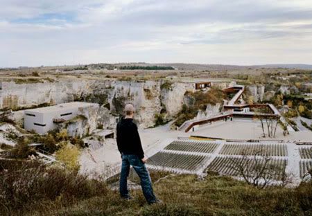
With the steadily growing numbers of visitors (up to 6,000 an evening), a redesign of the entire infrastructure became necessary. The underlying idea of the winning concept was to treat every area as part of the mise en scène and to integrate the rocky landscape into all phases of a visit to the theater.

Roman Quarry by AllesWirdGut Architektur

Impressed by the rugged beauty of what was essentially a derelict industrial site and by the precise works the artists had installed there, the architects saw their design as a continuation of the sculptural tradition. This called for a clear, yet simple formal language.

The access route leads from the car park to the entrance structure. After passing through a short linking tunnel, a breathtaking view of the arena opens up to visitors. From here, the centrepiece of the design – a 330-metre-long ramp that is also accessible to the disabled – makes a broad zigzag over rocks, ravines and the roof of the service structure, finally leading down to the festival location, which is 19 metres lower. Especially at the turning points along this route, visitors can pause to admire the sculptural quality of the project.

Roman Quarry by AllesWirdGut Architektur

The form of the ramp and the facade to the entrance structure are precisely defined through the use of preoxidized steel sheeting. This is not just a reminiscence of the industrial past of the location; it also meets quite pragmatic needs. The pre-corroded surface provides protection against the weather as well as against vandalism in the winter months. Wherever visitors are likely to come in contact with these surfaces, though – at the box office, catering counters, toilet entrances, etc. – white fibre-cement sheeting has been used, which creates a more refined note in contrast to the rough sandstone and the rusted steel.

Roman Quarry by AllesWirdGut Architektur

via detail.de | alleswirdgut

Continue reading...
Monday, March 1, 2010

Concert House Danish Radio by Jean Nouvel

Concert House Danish Radio by Jean Nouvel

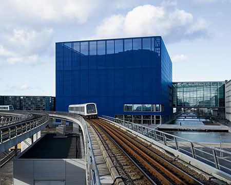
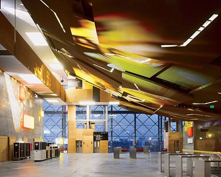
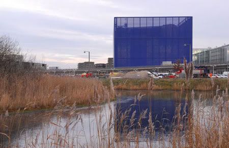
Jean Nouvel’s design approach, both the container and the auditoriums and spaces within assume a vastly different character depending on the time of day you visit, with its scaffolding-like blue box by day and fun-house lighting at night.
Concert House Danish Radio/ Copenhagen Concert Hall
Design Team: Ateliers Jean Nouvel
Location: Copenhagen, Denmark
Status: Completion 2009

Concert House Danish Radio, which belongs to Danish Radio and is the home of the Danish National Symphony Orchestra, sits on the outskirts of historic Copenhagen. With no built environment upon which Nouvel could establish a link to, the architect took the risk of following a completely new path. Nouvel converts the location’s lack of definition in urban planning terms into something positive by creating a presence, an identity, that is an exceptional urban building respecting the planned layout of the site.

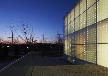
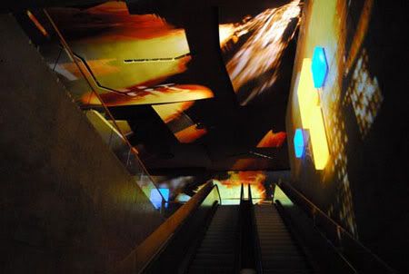
From the outside in bright light, it looks like nothing more than a large rectangular blue box in an industrial landscape. When the sun goes down, it is transformed into an ethereal, dematerialized object with images of musicians eerily flitting across the screens of glass fiber with a PVC coating. The multilevel interior foyer also changes personality by day and by night. In broad daylight, the main lobby looks like an airport from a 1940s war movie, where sun streams through large window walls and illuminates the dark concrete floor and military-style furnishings designed to resemble flight crates for musical instruments. At night, the tough-glam lobby takes on the iridescence of a multimedia nightclub, with projections splashing polychromatic patterns and videos across various surfaces.

Concert House Danish Radio by Jean Nouvel

The Main Concert Hall, Studio 1, seating 1,809 and raised above the lobby, it looks in section like some giant clam caught among pilings within a huge (190 by 315 feet) blue cage, 148 feet high. Nouvel called in Yasuhisa Toyota, who was also the consultant on Disney Hall, to design a space that could provide the right mix of direct and reflected sound with the appropriate reverberation time, and ensure a sense of clarity without dryness. Angled walls of CNC-milled birch-veneer board with textured grooves provide reflectivity and absorption, supplemented by “wave” walls of layered gypsum board in the upper part of the auditorium. In addition, lacquered birch-veneer panels on the ceiling and a sound reflector canopy over the stage modulate the acoustics in the hall where the ceiling soars to a height of 77 feet. With the birch walls stained a warm chestnut tone and the wave walls imbued with lush reddish and ocher tints by decorative painters Alain Bony and Henri Labiole, the room has the roseate candlelight glow of traditional concert halls.

Concert House Danish Radio by Jean Nouvel

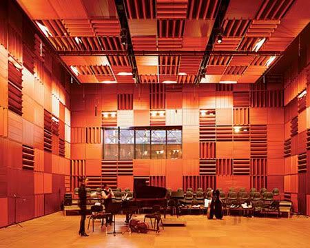
While Nouvel placed this largest hall in the upper reaches of the building, he sank three smaller music spaces about 8 feet below grade. The largest is a 540-seat rehearsal and concert hall (Studio 2); the next is a flexible black box (Studio 3), which accommodates 170 people standing or sitting for various musical fare; and a small, red concert hall that doubles as a production studio for 180 people (Studio 4). The three ancillary performance halls reveal distinct acoustical capabilities. Four strata of birch-paneled sliding doors in Studio 2 heighten the reflectivity of sound for orchestra rehearsals. In Studio 3, black gypsum-board wall panels open to absorb sound and provide a short reverberation time. Finally, in Studio 4, red aluminum-and-felt panels pivot for acoustical flexibility, for both recording and rehearsal use. Numerous music rooms, offices, and archives placed on the north end of the building supplement the performing arts spaces, and receive additional light by virtue of an elevated, outdoor courtyard.

Jean Nouvel won the competition to design the about 592,000 square foot concert hall in 2002, a fourth component of DR City, a 1.42-million-square-foot complex for Danish Radio’s offices, TV, radio, and orchestra productions.

Concert House Danish Radio by Jean Nouvel

via archrecord | Jean Nouvel

Continue reading...