Saturday, May 1, 2010

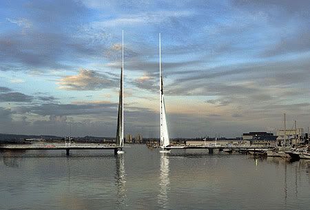
Southend Pier by White arkitekter


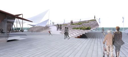
A key element of the proposed design is to make sure that the people of Southend use the Pier and take it into their heart. The Pier Head should be a vibrant place filled with activities with a walkable and bikeable street with attractive destinations located every 500 metres.
Southend Pier
Design Team: White Arkitekter, Price & Myers
Location: Essex, south east England, UK
Status: winning design

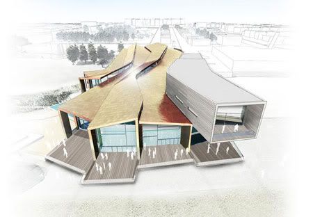
Teamed up with Price & Myers, White Arkitekter from Sweden won the prestigious competition to redevelop Southend Pier situated on the English Channel and the mouth of the Thames.

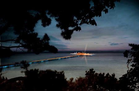
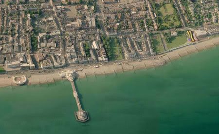
Southend Pier was in 2007 voted Pier of the Year and is the longest pier in the world. An iconic pier with its own distinctive character, history and people. One of the main attractions of the Pier is the view of the sea, and in particular, the feeling of being on the sea.

The Pier will be an extension of the High Street’s urban fabric onto the sea. White Arkitekter have proposed a series of destinations starting at Priory Park and ending at the Pier Head, transforming the pleasure pier into an urban pier. The Pier Head designed as a public space functioning like a modern Agora, part theatre, part art space, acting as a vibrant meeting place for both the people of Southendon-Sea and visitors.
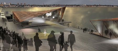

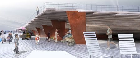
The main feature of the new Pier Head design will be an open air theatre with a terraced platform that will create lee, view point and seating for the audience. The outdoor theatre, with the Southend coastline as backdrop, has the capacity of 500 spectators. New buildings - a Culture Centre and a Restaurant - will be built offshore next to the existing Pier Head, creating a balanced enclosure and populated edges around the theatre space.

”The dramatic curving shapes of the buildings are derived from the wind and the waves themselves. This public, yet enclosed, space will be perfectly integrated into the scenery. It will be sculpted by wind and wave”, says landscape architect Niels de Bruin.

Materials will be low maintenance and long-lasting. In this specific setting we prefer materials with an untreated natural finish such as timber, corten steel and glass. These materials will add personality and warmth to the elegantly shaped buildings. The aggressive maritime environment is extremely hard on most traditional building materials and they have to be considered carefully in the design process.  All new buildings will be self-sufficient. Energy efficient design and renewable energy sources including wind turbines for electricity, natural ventilation and sea water heat pump, will make it a carbon neutral development.
Continue reading...

Thursday, February 18, 2010

John Lewis Department Store by FOA

John Lewis Department Store by FOA

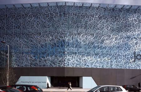
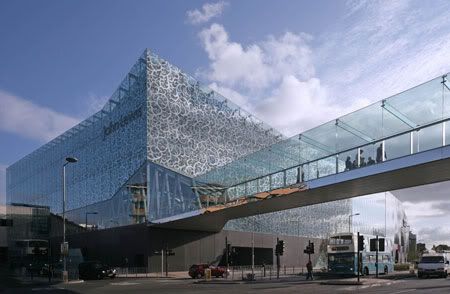
Looks like a big box wrapped in fancy tights, the striking facade was derived from a fabric design found in the John Lewis textile archive way back in 1803.
John Lewis Department Store
Design Team: Foreign Office Architects (FOA)
Location: Leicester, UK
Status: Completion 2008

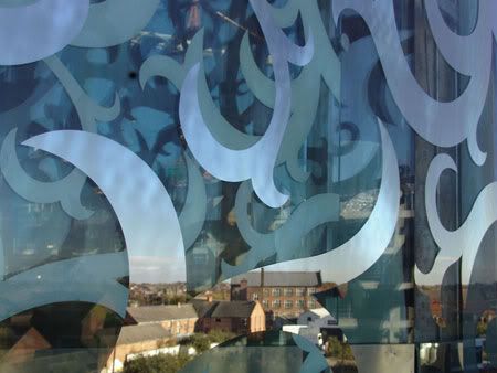
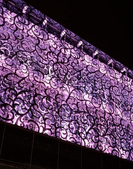
The design of the John Lewis Department Store and Cineplex by Foreign Office Architects is within the redevelopment of an existing inner-city retail centre in Leicester. Refuse to create a conventional opaque retail box, the department store design explores a layered transparency that will allow visual interaction between the store interiors and the city as in a net curtain. This is achieved through a double layered skin with a lace-like pattern applied to both layers. This membrane will act like a veil to the department store as well as a sun shading device to the interiors. The moire lace not only acts as a technical device, allowing for programmatic flexibility in the interiors whilst opening them to views and natural light, but it also will resonate, with the cultural and historical context of the city as well as with the tenant's brand: John Lewis.

John Lewis Department Store
John Lewis Department StoreJohn Lewis Department Store

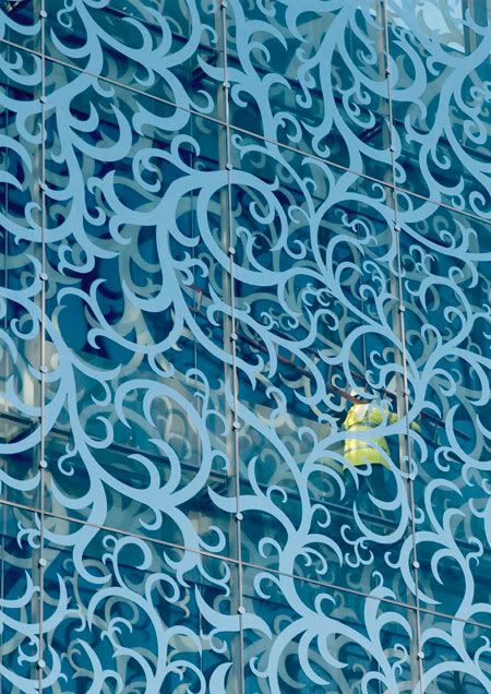
The lace pattern draws on the rich history of Leicester City and John Lewis itself in respect to textile manufacturing and hosiery, and the large Asian population in Leicester. In order that the glass curtain wall achieves a textile affective quality, the lace pattern is built as a combination of four basic templates that vary in density but always meet at the edges in identical ways. This allows for provision of different degrees of opacity to the interiors as well as giving an appearance of non-repetitive and seamless fabric.

The decorative facade, which is a double layer of glass with a mirrored frit, acts like a net curtain. Inside, the pattern on the two layers lines up exactly, so customers can see out, but when viewed at an oblique angle from the pavement, the pattern becomes almost opaque.

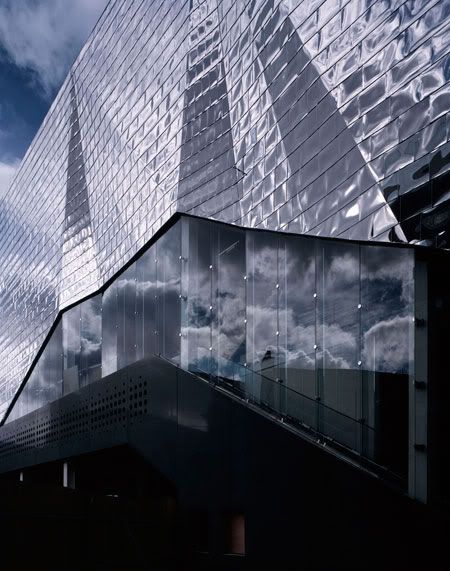
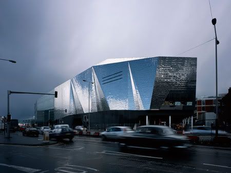
In order to establish synergy between the cinema and department store, the concept of fabric is extended to the Cineplex. The Cineplexes is a blank envelope enclosing 12 screens with no requirement of any daylight to the interiors, except in the areas of lobbies. The enclosing skin is designed as an opaque stainless steel rain screen which is treated in mirror finish and pleated at different scales to diffuse the large volume into a series of smaller reflective surfaces, animating the blank volume.

John Lewis Department Store

via FOA

Continue reading...

Tuesday, December 22, 2009

Birmingham Gateway by Foreign Office Architects

Birmingham Gateway

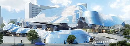
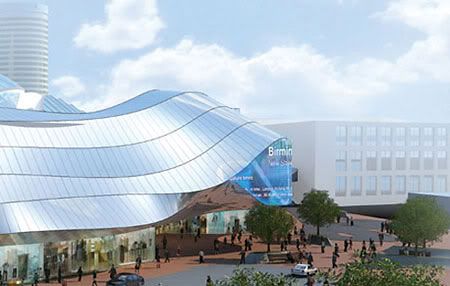
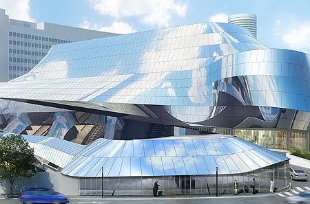
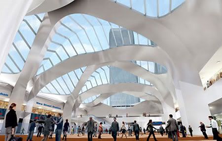
The design was inspired by the movement of people and trains at New Street and the beauty of the skyline.
Birmingham New Street Station /Birmingham Gateway
Design Team: Foreign Office Architects
Location: Birmingham, UK
Cost: £598m
Status: First phase 2012, Second phase 2015

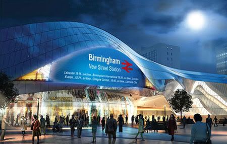
Foreign Office Architects beat more than 40 competitors to design the Birmingham New Street Station replacing the old station that has long been criticized for its outdated concrete appearance, lack of natural light and passenger congestion. The Birmingham New Street Station is an important transport hub and a key aspect of the city's public realm. As the first impression of Birmingham to a large influx of visitor, the newly design transport hub will will support over 52m passengers a year when operate.

In the new station, the distortion of perception produced by movement will be used in a similar way to the Doppler Effect's distortion of sound - by transferring the undulating, smooth forms of the track field into the geometry of the building, the design will distort the perception of the stations urban setting.The building is enclosed in a reflective screen which climbs the fee and wraps around the building. The concept for this envelope is simple: to clad the station in Birmingham Sky, crowds of people and trains. By turning this external rainscreen into a warping, reflective stainless steel surface the station will produce a controlled reflection of the surrounding urban field, tilting to avoid the reflections of surrounding buildings and shaping itself to reflect instead the famously cloudy Birmingham Sky, the moving crowds of passengers and the trains entering and exiting the station as the clouds pass over the buildings skin. This smooth, curved geometry, the buildings use of bifurcation as a formal system and its distortion of perception will combine to generate its identity.

Birmingham Gateway
Birmingham Gateway
Birmingham Gateway
Birmingham Gateway

via boxercreative

Continue reading...

Tuesday, October 27, 2009

Worthing Pool by Wilkinson Eyre Architects

Wilkinson Eyre Architects

Award winning London based architect firm - Wilkinson Eyre has beaten 109 other teams to win RIBA international competition to design 'a new swimming complex for Worthing which would be a first class leisure facility for the town and be a landmark building demonstrating civic pride and status' to replace Worthing's ageing 1960's Aquarena.
Worthing Pool
Design Team: Wilkinson Eyre Architects
Location: Worthing, UK
Status: Initial concept only.
Cost: £17M

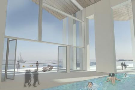
The new pool complex will feature an eight-lane 25-metre pool, a dive/learner pool, indoor pools with flumes and rapids, and outdoor “leisure waters” as well as a café, crèche and health and fitness centre.

Chris Wilkinson, director and founder of Wilkinson Eyre, said: “Worthing is a beautiful English seaside town with a spectacular waterfront and I am delighted to have the opportunity of designing a building on such an important site.

Wilkinson Eyre Architects

“It is a great opportunity to continue the tradition of British contemporary seaside architecture”.

The new pool will be built beside the ageing Aquarena which will be demolished once the new facility is complete.

The other shortlisted firms were Allford Hall Monaghan Morris; Thomas Heatherwick with local firm Saville Jones; Pringle Richards Sharratt, and Ian Simpson Architects.

Worthing Pool
Worthing Pool

via Wilkinson Eyre | BD online

Continue reading...

Wednesday, October 7, 2009

Poole Harbour Second Crossing by Wilkinson Eyre Architects


A landmark bridge with an opening span that would form the catalyst for the regeneration of the surrounding area.
Poole Harbour Second Crossing
Design Team: Wilkinson Eyre Architects
Location: Poole, UK
Status: Ongoing
Cost: £40 million

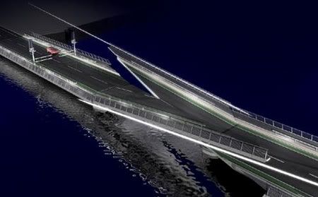
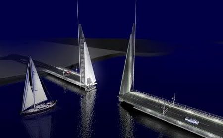
With extreme traffic pressure on Poole’s existing road bridge, this new crossing is an essential component in the town’s strategy for future growth. Connecting the Old Town to Lower Hamsworthy across a busy channel, the low level bridge will have to open almost hourly for maritime traffic. The design therefore is driven by the need for robustness and reliability.

Poole Harbour Second Crossing

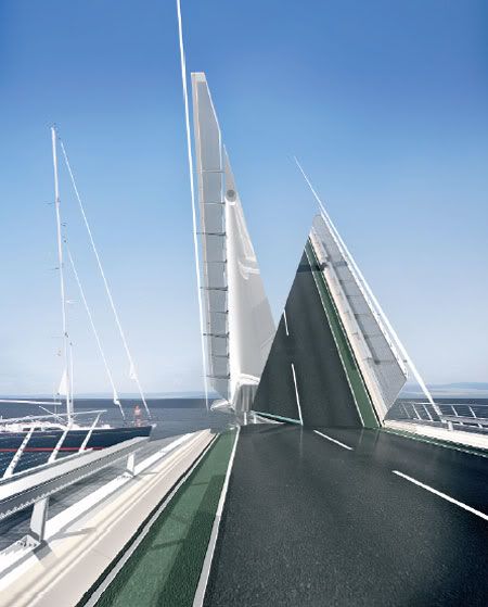
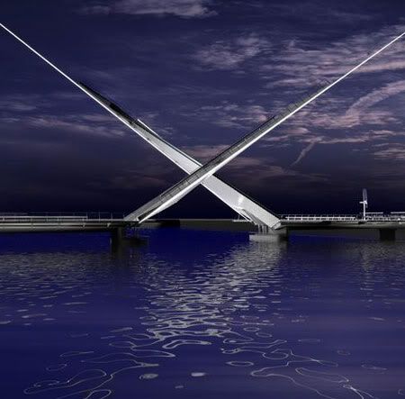
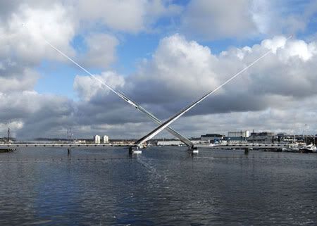
The bridge is configured as a simple bascule – a flat deck with two hydraulically operated lifting sections. Normally the joint between each sections is transverse, but here it is skewed across the deck creating two triangular leaves. The twin bascule span form two 37m long triangular decks when in the raised position. These cross as they rise and come to rest in an overlapping composition, mirroring the shape of racing yachts passing through the bridge in this international sailing centre. As they lift the bridge becomes a sculptural piece, introducing new vertical elements into the otherwise flat vista of sea, land and sky.

Poole Harbour Second Crossing

via Wilkinson Eyre Architects | New Civil Engineer

Continue reading...
Sunday, July 12, 2009

Chamber Music Hall by Zaha Hadid Architects

Chamber Music Hall

A voluminous ribbon swirls within the room, carving out a spatial and visual response to the intricate relationships of Bach’s harmonies. As the ribbon careens above the performer, cascades into the ground and wraps around the audience, the original room as a box is sculpted into fluid spaces swelling, merging, and slipping through one another.
Chamber Music Hall
Design Team: Zaha Hadid Architects
Location: Manchester Art Gallery, T1 Gallery, Manchester,UK
When to visit: Summer 2009. Daytime entry to the installation is free. It will be open for viewing July 4 – Aug 31, Tue – Sun (and Bank Holiday Mon) 10am - 5pm.

Zaha Hadid Architects have created a unique chamber music hall specially designed to house solo performances of the exquisite music of Johann Sebastian Bach this summer time. The chamber music hall has been installed within Manchester Art Gallery for the duration of the Manchester International Festival 2009.

The design process involved architectural considerations of scale, structure and acoustics to realize a dynamic formal dialogue inseparable from its intended purpose as an intimate chamber music hall. A layering of spaces and functions is achieved through the ribbon wrapping around itself, alternately compressing to the size of a handrail then stretching to enclose the full height of the room. Circulatory and visual connections are continually discovered as one passes through the multiple layers of space delineated by the ribbon.

Zaha Hadid Architects

The ribbon itself consists of a translucent fabric membrane articulated by an internal steel structure suspended from the ceiling. The surface of the fabric shell undulates in a constant but changing rhythm as it is stretched over the internal structure. It varies between the highly tensioned skin on the exterior of the ribbon and the soft billowing effect of the same fabric on the interior of the ribbon. Clear acrylic acoustic panels are suspended above the stage to reflect and disperse the sound, while remaining visually imperceptible within the fabric membrane. Programmed lighting and a series of dispersed musical recordings activate the spaces between the ribbon outside of performance times. The installation is designed to be transportable and re-installed in other similar venues.

Zaha Hadid Architects

Pivotal to its function is the performance of the ribbon. It has been designed to simultaneously enhance the acoustic experience of the concert while spatially defining a stage, an intimate enclosure, and passageways. It exists at a scale in which it is perceived as both an object floating in a room as well as a temporal architecture that invites one to enter, inhabit and explore.

Chamber Music Hall
Chamber Music Hall
Chamber Music Hall

via bustler

Continue reading...
Sunday, April 19, 2009

hedgehog building by Moxon Architects


The appearance of the building changes quite dramatically depending on the position of the viewer. The three-dimensional cladding creates an animation for the passersby. As the appearance of the building shifts from solid to transparent, the interior is revealed.
Hedgehog building
Design Team: Moxon Architects
Location: Preston, Lancashire, North West of England
When to visit: Granted Detailed Planning Permission

The Hedgehog building or ‘163 PRS / Olivers Place’ by Moxon is a 40,000 square foot office building located in the north west of England. The building is perhaps most striking for its unusual façade. While the main exterior is clad in glass, a superstructure sits on top of it featuring an array of aluminium fins on all four facades of the building.


The aluminium fins, or Reeds, are all oriented in the same direction. On the SW facade they act as a large scale brise soleil and rain screen, but appear more visually permeable on the SE facade. Early morning and winter sunlight is able to enter the building while high summer sun is excluded and so does not adversely alter the environmental conditions within the building. The Reeds also appear as a thicket of material that gives the building a striking appearance that changes dramatically depending on the position of the viewer.


The roundabout and the 3 dimensional nature of the cladding system combine to create animation as one moves towards the building obliquely along the approach roads. By turns the building appears solid and then transparent depending on the viewers position: it reveals the interior as one moves around it.The fins are definitely an aesthetic choice, but they also serve as sun and rain protection.


via moxonarchitects | Eikongraphia

Continue reading...
Saturday, December 27, 2008

East Beach Cafe


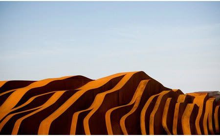
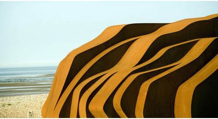
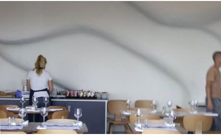
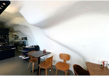
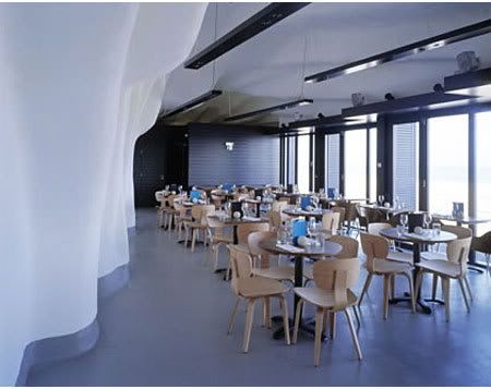
The East Beach Cafe is no ordinary seaside kiosk, rising like a piece of weatherworn driftwood washed up on Littlehampton’s East Beach; it is at once familiar and alien to its coastal surroundings. The Cafe is a bold statement that has already made Littlehampton a destination for day tripping design and architecture junkies, while at the same time providing local residents with a local cafe to call their own.
East Beach Cafe
Design Team: Heatherwick Studio
Location: Littlehampton, UK
When to visit: Anytime. East Beach Cafe is open 7 days a week, all year round.

Heatherwick Studio was commissioned to design a café building to replace a seafront kiosk in Littlehampton, a traditional seaside town on England's south coast. Exposed to weather and vandalism, the narrow site sits between the sea and a parade of houses.


The studio saw its challenge as being to produce a long, thin building without flat, two-dimensional façades.

The building is sliced diagonally into ribbons which wrap up and over the building, forming a layered protective shell, open to the sea in front. The opening is filled with glass doors and windows, protected at night by roller shutters concealed within the building's geometry, the 30-centimetre width of the ribbons being the dimension of a shutter mechanism.

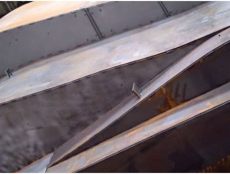
The shell of the building provides both its skin and structure. It comprises a steel outer layer, which is cut at a shallow angle into a series of vertical slices. Its rippling form conjures up a wide variety of visual metaphors.


The choice of materials has played a key part in developing the building concept. The exposed seaside location will subject the building to heavy weathering, with the high salt content of the air speeding the natural degradation of all materials. With this in mind, Thomas Heatherwick opted for naturally finished materials that respond well to the local environment. The mild steel shell that forms the outer skin will rust and gain character as it ages, while an oil based coating applied
after the surface has ‘weathered’ will help to prolong the life of the building.

Rather than use a traditional structural method in which one part rests on another, the primary structure of the building is a ‘monocoque’ steel shell in which all parts act together, similar to the hull of a ship.


In contrast to the conventional white-washed seaside aesthetic, the building is raw and weathered, its structural steel shell finished with an oil-based coating that permits a rust-like patination to develop without affecting structural performance.

A kiosk and cafeteria by day and a restaurant in the evening, the new café seats sixty.


Via East Beach Cafe | Heatherwick Studio

Continue reading...