Wednesday, June 2, 2010

1111 Lincoln Road by Herzog & de Meuron


Herzog & de Meuron have produced not a new cultural behemoth but a strange sculptural structure, reviving the idea of the car park as a figure in the city.

1111 Lincoln Road
Design Team: Herzog & de Meuron
Location: Miami, USA
Status: Completed 2010

Multistorey carpark is always synonymous with paranoid, corrupt dystopia & denied its own architectural expression and buried - beneath the ground, unseen, uncelebrated, a poorly-lit, dirty secret. However, the latest building (carpark) from Herzog & de Meuron is a surprise to all of us.

Envisioned by developer Robert Wennett and designed by Herzog & de Meuron, the multistorey carpark is part of the 1111 Lincoln Road development. Robert Wennett, has used Miami Beach's parking shortage to smuggle in a layer of retail for which he otherwise would have struggled to get permission. Boutiques and bookshops at ground level establish a pattern of (upmarket) retail for (the now mid-market) Lincoln, while four condos on a new street at the side help with profits, leaving Wennett's own penthouse and a restaurant to occupy the top floor. There is even a shop halfway up the ramps, isolated and intriguing.


A stack of raw, sharply chamfered concrete layers is prised apart by wedge-shaped columns, which wind into each other and draw the eye into the slightly sinister shadows against the vivid blue of the Florida sky. It is almost shocking. As you ascend through the structure, its concrete planes fold themselves beneath you, each level exposing a yet more compelling vantage-point on the surrounding city. At one point a complex tangle of steel by artist Monika Sosnowska turns out also to be a safety feature, stopping kids getting struck beneath the ramp. By the time you reach the top, the city, the sea and the sky twinkle before you in a filmic panorama.

The idea is to create a series of layers that extend the public realm up into the building, to attract events, parties and life into the structure. Both architects and developer see the structure as an experiment in a new kind of downtown transport architecture, a building as exciting to enter as to emerge from, blinking into the Miami sun.


The public street in front of the car park has also been transformed. Artist Dan Graham has built a curvaceous glass pavilion outside. Beside the raw concrete, a gleaming white monolithic block provides one of the very few Swiss avant-garde drive-in banks.

This is not a conventional piece of regeneration, even if it is on a site that frankly needed it. A building dedicated to consumption in every way, most notably to fuel and fashion, it nevertheless becomes a stark and thoughtful reflection on the contemporary city. It strips architecture back to its sinewy muscles and the US city back to its autopianism. The diametric opposite of the sunny, pastel-tinted, much-loved art deco for which the city is known it is a vernacular derived from local conditions - sun, shopping, views and traffic.


via ft

Continue reading...

Saturday, May 1, 2010

Southend Pier by White arkitekter


A key element of the proposed design is to make sure that the people of Southend use the Pier and take it into their heart. The Pier Head should be a vibrant place filled with activities with a walkable and bikeable street with attractive destinations located every 500 metres.
Southend Pier
Design Team: White Arkitekter, Price & Myers
Location: Essex, south east England, UK
Status: winning design

Teamed up with Price & Myers, White Arkitekter from Sweden won the prestigious competition to redevelop Southend Pier situated on the English Channel and the mouth of the Thames.

Southend Pier was in 2007 voted Pier of the Year and is the longest pier in the world. An iconic pier with its own distinctive character, history and people. One of the main attractions of the Pier is the view of the sea, and in particular, the feeling of being on the sea.

The Pier will be an extension of the High Street’s urban fabric onto the sea. White Arkitekter have proposed a series of destinations starting at Priory Park and ending at the Pier Head, transforming the pleasure pier into an urban pier. The Pier Head designed as a public space functioning like a modern Agora, part theatre, part art space, acting as a vibrant meeting place for both the people of Southendon-Sea and visitors.


The main feature of the new Pier Head design will be an open air theatre with a terraced platform that will create lee, view point and seating for the audience. The outdoor theatre, with the Southend coastline as backdrop, has the capacity of 500 spectators. New buildings - a Culture Centre and a Restaurant - will be built offshore next to the existing Pier Head, creating a balanced enclosure and populated edges around the theatre space.

”The dramatic curving shapes of the buildings are derived from the wind and the waves themselves. This public, yet enclosed, space will be perfectly integrated into the scenery. It will be sculpted by wind and wave”, says landscape architect Niels de Bruin.

Materials will be low maintenance and long-lasting. In this specific setting we prefer materials with an untreated natural finish such as timber, corten steel and glass. These materials will add personality and warmth to the elegantly shaped buildings. The aggressive maritime environment is extremely hard on most traditional building materials and they have to be considered carefully in the design process.  All new buildings will be self-sufficient. Energy efficient design and renewable energy sources including wind turbines for electricity, natural ventilation and sea water heat pump, will make it a carbon neutral development.


Continue reading...

Friday, April 2, 2010

Houten Fire Station by Samyn and Partners

Houten Fire Station

In order to deter the kids from vandalizing the building, the station features a giant wall of pictures painted by local children from all 22 of the surrounding schools.
Houten Fire Station
Design Team: Samyn and Partners
Location: Houten, Netherlands
Status: Completed 2000

The municipal authority in Houten commissioned the Samyn and Partners practice to build a small fire station on a site surrounded by lots of green space. The building agenda set a requirement that there should be space to accommodate six fire engines.

The theme in drawing up the design is the radical division of the roof structure from the internal organization. It represents the idea of the shelter, the independence of the shell from the building itself. The building's interior is in keeping with the client's requirements.

Houten Fire Station
Houten Fire Station

The choice of the a parabolic shell roof at the fire station in houten was ‘the result of the search for elegance of form’, and also brings about an optimization of the structure. The fast method of construction was a further significant factor favouring this choice at the fundamental design stage.

There is a two-way split of the interior. The south side has been conceived as a completely transparent space in which just glass has been used. Here, the firefighting equipement is kept in what resembles a large shop window.

This barely heated hall is intended to serve as a climatic buffer zone, both in winter and in summer. All the other functions have been gathered together in the northern half of the building, a construction built of loadbearing brickwork. From the open corridors, there is a view onto the fire engines.

Houten Fire Station
Houten Fire Station

The ground floor houses showers, changing rooms and the sanitary provisions as well as storage rooms for mechanical equipment. A conference room and a cafeteria for the firefighters are situated on the first floor.

The office spaces are located on the second floor with storage rooms for technical equipment on top.

In this socially problematic area of the city, it was asked to the 2200 five to seven years old schoolboys and schoolgirls of the 22 schools of the city to represent the epic of the firemen on DIN A3 - size panels.

The 2200 panels, changing colour as a flame from dark blue at the bottom over green an yellow to orange at the top, were laid out on the main brick wall of the Fire Station, renamed "house of the firemen". It resulted into a magnificent hieroglyph-like composition protected by the glazed façade. The project gathered all the families of Houten, so that an emotional link was woven between the population and the building. In this way, the "house" is protected from the vandalism it was likely to suffer before that, in each family, a little brother or a little sister's piece of artwork was integrated in the work.

The glazed façade incorporates large overhead gates designed to allow the firefighting force to make a quick operational exit. The building's length runs in an eastwest direction which allows the southern façade to incorporate photovoltaic cells. The fire station's overall form appears as a modern variant on the traditional theme of the shed.

Houten Fire Station
Houten Fire Station
Houten Fire Station

via Samyn and Partners

Continue reading...

Friday, October 30, 2009

Queen Alia International Airport by Foster + Partners

Queen Alia International Airport

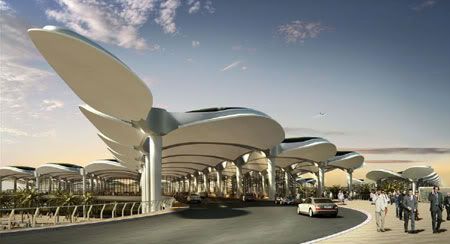
The concept for the Queen Alia International Airport articulates a sense of Arabic hospitality, combines function, technology and a distinct sense of place to provide a greatly expanded and enhanced gateway to the region.
Queen Alia International Airport
Design Team: Foster + Partners, Maisam - Dar Al-Omran JV
Location: Amman, Jordan
Status: Completion 2011
Cost: $600M

Queen Alia International Airport, named after Queen Alia, the third wife of King Hussein of Jordan who died in a helicopter crash in 1977 is Jordan's largest airport that is situated in Zizya area, 20 miles south of Amman. The airport has two passenger terminals and a cargo terminal that was built in 1983.

The new expansion of the airport is designed by Foster + Partners, to make Jordan a regional hub and once it is completed, it should be able to handle around nine million passengers a year, nearly three times as many as it does now.

Queen Alia International Airport

Retaining the existing runway, the scheme comprises a new terminal building that will bring a sense of clarity to the airport, streamlining circulation and establishing coherent wayfinding. Formally, the building draws on the vernacular tradition of outdoor areas and open-air gardens. These courtyards contain water pools that reflect natural light into the building and provide a comfortable microclimate, as well as a subtle means of establishing orientation inside. Large covered interior spaces form a direct relationship to the external environment and accommodate generous greeting and hospitality areas that are central to the terminal’s cultural programme.

An environmentally sustainable system, the airport's canopy roof has been inspired by the organic form of natural palm trees, while its black external surface is reminiscent of Bedouin tents. Split beams at the column junctions and generous reveals allow daylight to flood deep into the building, creating a dynamic play of light while also offering shelter from direct sunlight. The roof canopy acts as a thermal store to heat and cool the building and also conserves water by collecting rainwater and night time condensation. In addition, banks of photovoltaic panels have the potential to supplement the electricity supply, so reducing the building’s energy consumption.

via Foster + Partners

Continue reading...

Wednesday, October 7, 2009

Poole Harbour Second Crossing by Wilkinson Eyre Architects


A landmark bridge with an opening span that would form the catalyst for the regeneration of the surrounding area.
Poole Harbour Second Crossing
Design Team: Wilkinson Eyre Architects
Location: Poole, UK
Status: Ongoing
Cost: £40 million

With extreme traffic pressure on Poole’s existing road bridge, this new crossing is an essential component in the town’s strategy for future growth. Connecting the Old Town to Lower Hamsworthy across a busy channel, the low level bridge will have to open almost hourly for maritime traffic. The design therefore is driven by the need for robustness and reliability.

Poole Harbour Second Crossing

The bridge is configured as a simple bascule – a flat deck with two hydraulically operated lifting sections. Normally the joint between each sections is transverse, but here it is skewed across the deck creating two triangular leaves. The twin bascule span form two 37m long triangular decks when in the raised position. These cross as they rise and come to rest in an overlapping composition, mirroring the shape of racing yachts passing through the bridge in this international sailing centre. As they lift the bridge becomes a sculptural piece, introducing new vertical elements into the otherwise flat vista of sea, land and sky.

Poole Harbour Second Crossing

via Wilkinson Eyre Architects | New Civil Engineer

Continue reading...

Saturday, February 7, 2009

18 Septemberplein


At night the light elements together with the light coming through the glass elements from the parking, will create a tapestry of light.
18 Septemberplein
Design team: Massimiliano Fuksas Architetto
Location: Eindhoven, The Netherlands
When to visit: Still under construction.

The “18 Septemberplein” is one of the major squares in the city of Eindhoven. The square is the connection between the central station area and the main shopping district of the city. The demand for 2000 parking places for bicycles together with the important logistical function of the square led to a design of an underground bicycle parking, leaving room for the movement of people on the square. Two buildings, similar in form to each other but contrasting to there context, mark the space of the square. Two cone-like shapes form the entrance to the bicycle parking under a central strip of ceramic tiles, fountains lights and glass elements embedded in the square floor.


via Massimiliano Fuksas Architetto

Continue reading...