Architecture nourishes itself constantly from images hidden in our memory, ideas which become sharp and clear and unexpectedly mark the beginning of a project. Perhaps this is why the echo of the hispano-islamic culture which is still latent in Cordoba has subconsciously signified more than a footnote in the new museum proposal.
Cordoba Contemporary Art Center/ C4
Design Team: Nieto Sobejano Arquitectos, realities:united
Location: Cordoba, Spain
When to visit: 2010
Nieto Sobejano Arquitectos have always been admirers of the hidden geometric laws through which those artists, artisans and master builders of a remote Cordovan past were capable of creating a multiple and isotropic space within the Mosque, a building facetted with vaults and muqarna windows, permutations of ornamental motifs with lattice windows, paving and ataurique decorations, or the rules and narrative rhythms implicit in the poems and tales of Islamic tradition.
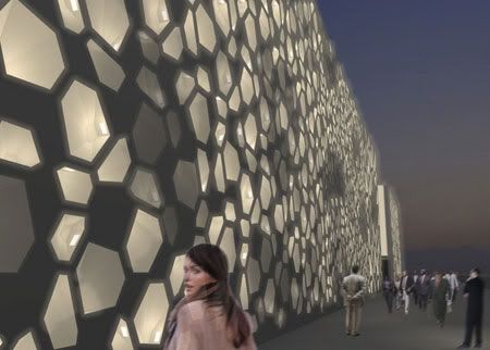
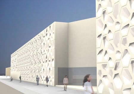
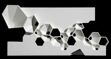
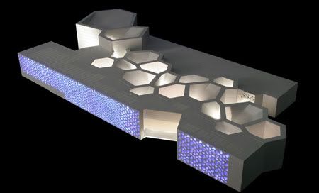
Like those literary structures which include a story within another story, within yet another- a story without an end - Nieto Sobejano Arquitectos conceived the project as starting with a system, a law generated by a repeating geometric pattern, originating in a hexagonal shape, which in turn contains three different types of rooms, with 150 m2, 90 m2, and 60 m2. Like a combinatorial game, the permutations of these three areas generate sequences of different rooms which possibly can come to create a single exhibition area.
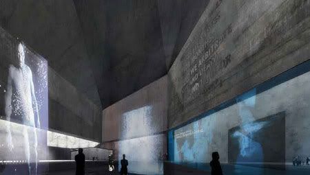
The artists' workshops on the ground floor and the laboratories on the upper floor are located adjacent to the exhibition halls, to the point where there is no strict difference between them: artistic works can be exhibited in the workshops while the exhibition halls can also be used as areas for artistic production. The assembly room - the black box - is designed as a stage area suitable for theatrical productions, conferences, film screenings, or even for audiovisual exhibitions.
The Centre of Contemporary Art is not a centralised organism: its centre moves from one area to another, it is everywhere. It is designed as a sequence of rooms linked to a public walkway, where the different functions of the building come together. Conceived as a crossroads and meeting place, it is a communal area for exhibitions and exchange of ideas, to view an installation, see exhibitions, visit the café, use the mediateque, wait for the start of a show in the black box, or perhaps gaze at the Guadalquivir river.
The materials will contribute to suggest the character of an art factory which pervades the project. In the interior, walls and bare slabs of concrete and continuous tiled floors, establish a spatial area capable of being transformed individually using different forms of intervention. A network of electrical, digital, audio and lighting infrastructure creates the possibility of multiple views and connections everywhere.
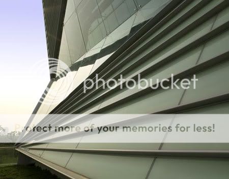
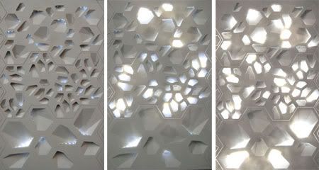
Outside, the building aspires to express itself through one material: prefabricated panels of concrete with fibreglass - GRC - and at the same time clad opaque and perforated façades, or make up the flat and sloping roofs of the halls. The industrialised concept of the system as well as the conditions of impermeability, insulation and lightness of the material, contribute to guarantee the precision and rationality of its execution but also plays a part in the combinatory concept which governs the whole project.
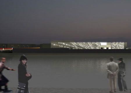
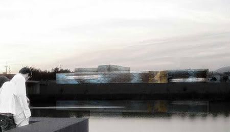
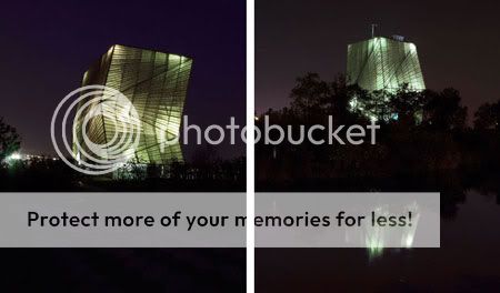
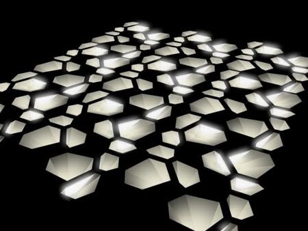
In a second step realities:united was commissioned to further develop the conception and the design for this media skin. The façade facing the river, the main face of the building to the outside, is designed as a screen perforated by numerous circular holes where monochromatic LED lights are located with the colours red, green and blue. Using a computer program, video signals will generate images, texts or colours which will be reflected in the surface of the river and will permit installations specifically designed for the location. During the day, natural light will filter through the perforations and inundate the interior covered walkway. In the Centre for Contemporary Art, artists, visitors, experts, researchers and the inquisitive, will meet as in a contemporary zouk, without an obvious spatial hierarchy. It will be a centre for creative artistic processes which will link closely the architectural space with the architectural space with the public: an open laboratory where architecture attempts to provoke new modes of expression.
via Nieto Sobejano Arquitectos | realities:united


The artists' workshops on the ground floor and the laboratories on the upper floor are located adjacent to the exhibition halls, to the point where there is no strict difference between them: artistic works can be exhibited in the workshops while the exhibition halls can also be used as areas for artistic production. The assembly room - the black box - is designed as a stage area suitable for theatrical productions, conferences, film screenings, or even for audiovisual exhibitions.
The Centre of Contemporary Art is not a centralised organism: its centre moves from one area to another, it is everywhere. It is designed as a sequence of rooms linked to a public walkway, where the different functions of the building come together. Conceived as a crossroads and meeting place, it is a communal area for exhibitions and exchange of ideas, to view an installation, see exhibitions, visit the café, use the mediateque, wait for the start of a show in the black box, or perhaps gaze at the Guadalquivir river.
The materials will contribute to suggest the character of an art factory which pervades the project. In the interior, walls and bare slabs of concrete and continuous tiled floors, establish a spatial area capable of being transformed individually using different forms of intervention. A network of electrical, digital, audio and lighting infrastructure creates the possibility of multiple views and connections everywhere.
Outside, the building aspires to express itself through one material: prefabricated panels of concrete with fibreglass - GRC - and at the same time clad opaque and perforated façades, or make up the flat and sloping roofs of the halls. The industrialised concept of the system as well as the conditions of impermeability, insulation and lightness of the material, contribute to guarantee the precision and rationality of its execution but also plays a part in the combinatory concept which governs the whole project.


In a second step realities:united was commissioned to further develop the conception and the design for this media skin. The façade facing the river, the main face of the building to the outside, is designed as a screen perforated by numerous circular holes where monochromatic LED lights are located with the colours red, green and blue. Using a computer program, video signals will generate images, texts or colours which will be reflected in the surface of the river and will permit installations specifically designed for the location. During the day, natural light will filter through the perforations and inundate the interior covered walkway. In the Centre for Contemporary Art, artists, visitors, experts, researchers and the inquisitive, will meet as in a contemporary zouk, without an obvious spatial hierarchy. It will be a centre for creative artistic processes which will link closely the architectural space with the architectural space with the public: an open laboratory where architecture attempts to provoke new modes of expression.


via Nieto Sobejano Arquitectos | realities:united
Continue reading...

