Friday, August 28, 2009

Sfera Building by Claesson Koivisto Rune

Sfera Building

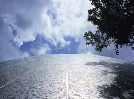
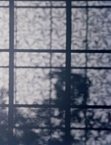
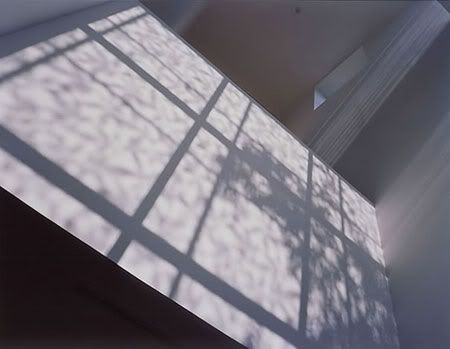
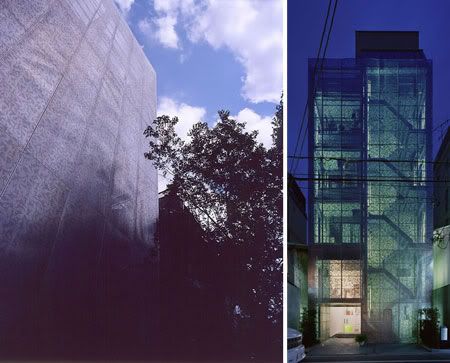
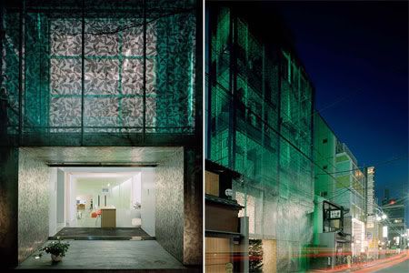
The leaf-patterned facade, filters sunlight and creates a distinct leaf-patterned shadow into the interior of the building.
Sfera Building
Design Team: Claesson Koivisto Rune
Location: Kyoto, Japan
When to visit: Anytime. Closed Wednesday

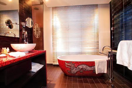
The Sfera Building is a culture centre in Gion containing an art gallery, a design shop, an art book and music store, restaurants, offices and a cafe. Gion is the traditional district of Kyoto. The centuries old low wooden houses share a typical feature: the sunscreen, made of bamboo, wood or rice paper.

Sfera Building
Sfera Building
Sfera Building

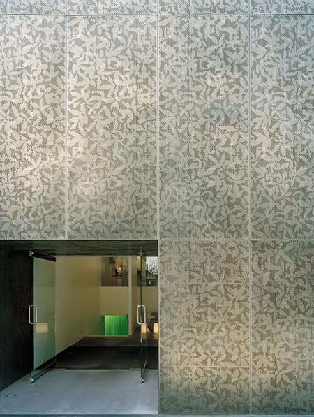
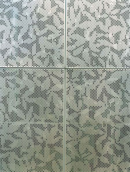
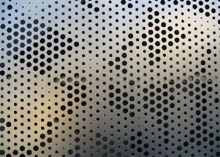
The designers wanted to find a way to make a screen that did the same thing, but in a new way for the pre-existing structure. So they picked some cherry leaves and in their Stockholm studio, laid the cherry leaves out on a light-table in a somewhat random pattern. They photographed the pattern digitally and the image was use as the template for piercing the titanium panels of the building facade. The resulting facades was a "leaf screen" that had a monolithic appearance, yet was actually transparent: a titanium veil creating an intricate play of leaf-patterned light and shadow on the interior.

Sfera Building
Sfera Building
Sfera Building

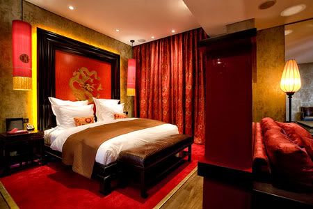
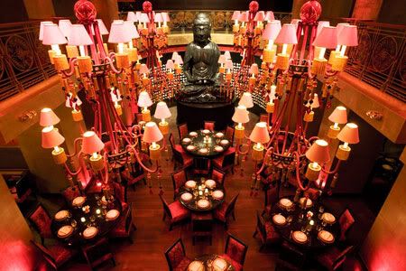
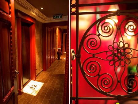
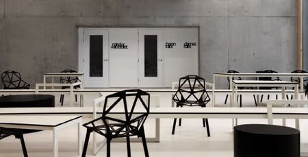
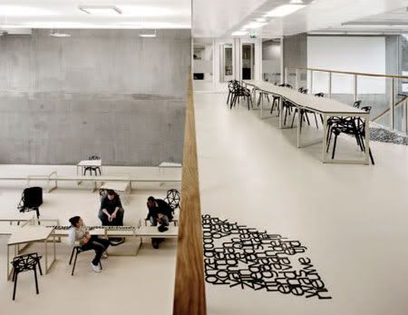
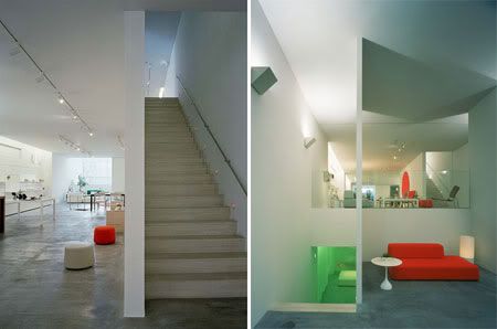
Sfera Bar is a space of simplicity, held together by its sensitivity and sense of balance. The interior is inspired by the aura of a night lake or afterimages of the moon, a dusk-like effect is achieved by elaborate lighting effects. This leaves each and every visitor with a unique impression of a kaleidoscopic, space-like world.

Sfera Building
Sfera Building
Sfera Building
Sfera Building
Sfera Building

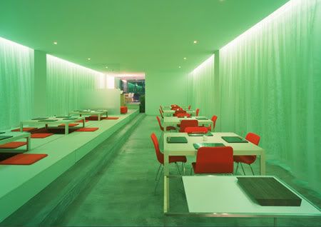
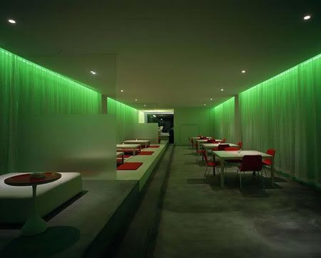
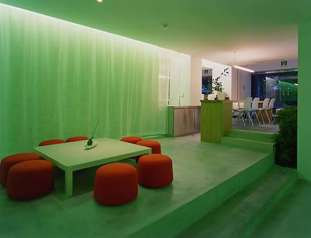
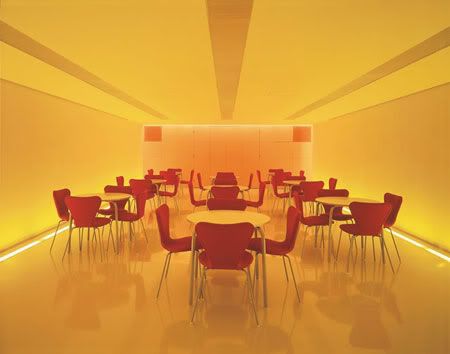
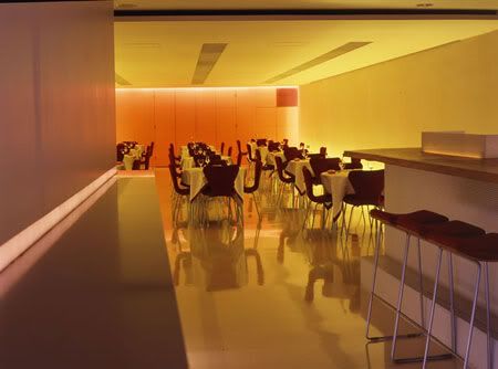
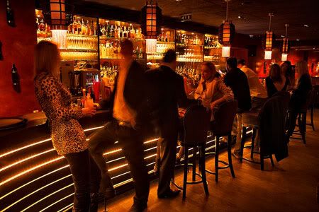
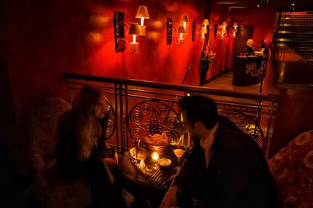
The interior utilizes accessories and tableware from the SferaShop; the furniture was designed expressly for use in the bar. Separate to the counter, private spaces are also available. This may be the preference for those who prefer to take it slow and sip some wine, puff on a cigar or enjoy cocktails with friends. Subject to the sensibilities of the individual, the bar offers a multitude of possibilities.

Sfera Building
Sfera Building

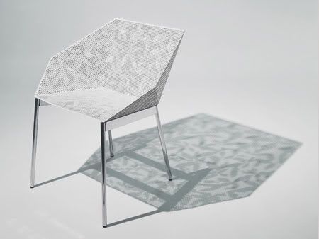
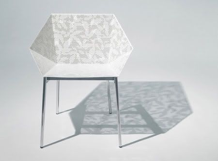
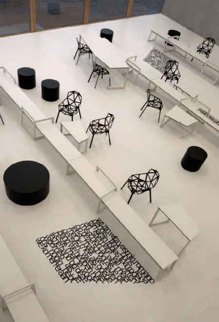
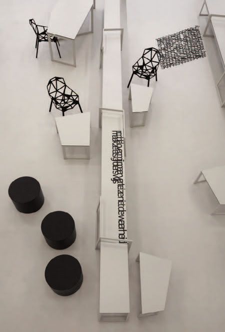
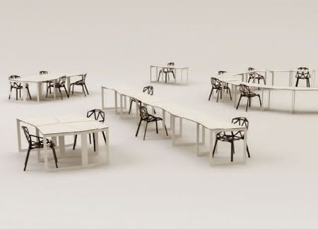
The Sfera Building's owner, Mr. Shigeo Mashiro wished to have a chair which he could use in his outdoor cafe. Pleased by the effect of the facade and its shadow, the designers hit upon the idea of creating a chair which would also symbolize the Sfera Building by using the same idea.

And hence born the Sfera chair for Sfera Building.

Sfera Building
Sfera Building
Sfera Building

via Claesson Koivisto Rune | Sfera

Continue reading...

Thursday, August 27, 2009

Habiter Ecologique by Mario Cucinella Architects

Habiter Ecologique

This residential building was specially designed for the exhibition 'Habiter Ecologique' or ‘For Sustainable Living’ held at the Cité de l’Architecture et du Patrimoine in Paris.
Habiter Ecologique
Design Team: Mario Cucinella Architects
Location: Boulogne Bilancourt, Paris
When to visit: For the exhibition, 13th May to 1st November 2009

This residential building was specially designed for the exhibition 'Habiter Ecologique' or ‘For Sustainable Living’ held at the Cité de l’Architecture et du Patrimoine in Paris from 13th May to 1st November 2009.

The building is 1,780m2 over six floors and is located in Boulogne Bilancourt just outside Paris. It is conceived as a series of overlapping timber layers. One façade has protruding ‘boxes’ that create a dynamic elevation with private protected terraces. The opposite side is calm and ordered. The spaces flow into one another and link the two sides of the building. Shared services are on the ground floor, such as the kindergarten, restaurant and bar and on the roof is a garden shared by all the inhabitants.

Habiter Ecologique
Living Ecologically

The environmental strategies employed, such as photovoltaics, materials and insulation, have allowed a building that is energy positive, producing 6kWk/m2 per year more than it consumes.

The idea of the exhibition is to show an holistic approach to architecture (both global and multi-disciplinary) creating a habitat that socially equitable , ecologically sustainable and economically viable.

Living Ecologically

via Mario Cucinella Architects

Continue reading...

Friday, August 21, 2009

MN19 Office by b720 Arquitectos

MN19 Office

The new facade is a colourful transparent glass slats float horizontally, changing from yellow to orange.
MN19 Office
Design Team: b720 Arquitectos
Location: Barcelona
When to visit: Anytime

The project consists of transforming an administrative building between party walls, which had significant structural problems, into an office building.

The work presents two basic concepts: on one side, the training of obtaining, from a very determining pre-existence, the flexibility and services level that this typology demands. On the other side, a new facade had to allow its identification as a contemporary corporative building. b720 decided to use colour as an integration tool in a consolidated environment of upper class apartment buildings On the facade of Mestre Nicolau, coloured transparent glass slats draw a surface floating without specific limits face to the siding.

The whole sets out gradually in two aspects: horizontally, the colour, changing from yellow to orange, borrowing the shades of the awnings of the close bourgeois balconies and terraces, and, vertically, the density of the slats, which, depending on the sun rays and on the narrowness of the street, make the protection more necessary in the upper floors than in the lower floors.

MN19 Office
MN19 Office

In the inner facade, b720 take advantage of the existing siding wall. They designed a simple white facing with oblong holes, regularly arranged. Every hole is encircled with a thick sheet plate as a perimeter entrance portal projecting from the facade surface and painted in several colours with a progression similar to the one of the main facade, By removing a projecting body of the interior facade, it was possible to place the new access core in the central space, which was an air shaft by the party wall on the right. This allowed the distribution of the floors In two main office areas, facing, respectively, the exterior -Mestre Nicolau St. and the inside -air shaft and also a central area thought as an open office.

The ground floor is at the street level and comprises the accesses to the offices, the ramp for the parking access and a commercial premise taking the rest of available space. The structure was reinforced with carbon fibre and endured certain changes in the position of the columns existing in the basement and ground floors to be able to fit the current distribution to the new conditions of use. b720 used colour combined with very highlighted graphics as a very effective resource to supply unity and style. The hall and stairs are covered with black terrazzo applied continually on flooring and vertical facings, which sometimes tilt and form light grooves or transform in the concierge desk.

MN19 Office

via b720 Arquitectos

Continue reading...

Wednesday, August 19, 2009

Centro Direzionale Forum by Mario Cucinella Architects

Mario Cucinella Architects

The steel grid forms a supporting structure for climbing plants (Star Jasmine), creating the appearance of vertical hanging gardens, reminiscent of a ivy covered buildings.
Centro Direzionale Forum
Design Team: Mario Cucinella Architects
Location: Rimini, Italy
Cost: € 3,500,000
When to visit: Completed 2006

This mixed use building is located at the junction of a busy road at the entrance to Rimini town. It is five stories high and houses 1,700 m2 of offices and retail units.

The building has an L shaped layout, facing onto a major road junction, with the entrance set at the point at which the two axes meet. The entrance is distinguished by a deep fracture in front of the road intersection that captures attention against the sheer surface of the facades.

Centro Direzionale Forum

The most striking feature of the design is the curved façade that faces the street, a green skin reminiscent of traditional ivy covered buildings. It is made from a steel grid where climbing plants grow that creates an uninterrupted screen over the entire length of the building, embracing the lateral elevations and connecting to the rear courtyard façade. This screen serves to give the building an homogeneous form that is in turn broken by a vertical split - a deep fracture that leads to a garden behind. The dark colour used on the building contributes to the contrast between the green skin and the entrance fissure.

The offices floors have balconies that overlook the street and are screened by the climbing plants. This system is permeable to air and light so the walkways can be used as veritable outdoor spaces.

Centro Direzionale Forum
Mario Cucinella Architects

Immediately behind the planted screen the galleries are protected by a circular section steel handrail with steel support posts.

At the rear of the building the two faces looking inwards over the plot form an angle of around 90° offering a secluded space for gardens or a covered piazza. The internal elevation of the building has a more secluded feel with its view over the internal courtyard garden.

Centro Direzionale Forum

via Mario Cucinella Architects

Continue reading...

Waterwijk Ypenburg by MVRDV

Photo by Joao_Morgado

The blocks are spartan in their simplicity. Variation is achieved by alternating the materials and colours of both roofs and fronts with wood shingles, aluminium sheeting, roofing tiles and polyurethane panels in vivid green and blue, silver and black, brown and orange.
Waterwijk Ypenburg
Design Team: MVRDV
Location: Ypenburg, The Hague, The Netherlands
When to visit: Completed 2003

For a relatively cheaper housing area, The Hagen Island housing development will typically results in rows of 12 to 20 prefab units. Four long boring bars would fit on the island. By cutting and splitting these bars, a more open, garden-esque environment will appear. It increases social diversification and mixage. Both single units as well as blocks with two, three, four, or eight units are positioned at various locations on the existing plots: in the front, the middle or at the end, thus creating an enormous series of cross-views that increase communication, open areas and social opportunities, and reduce the claustrophobia existent in such a compact area.

Waterwijk Ypenburg
Waterwijk Ypenburg

In order to meet the budget for doing this, two methods have been used.

By creating a ring road with all the parking lots around the four rows of plots, the infrastructure has been minimized and a pedestrianized; a child-friendly environment has been created. This leads to bigger plots, thus creating an escape from the overwhelming density of the existing development Hedges surrounding the plots give the island its character and name.

Photo by Joao_Morgado
Waterwijk Ypenburg
Waterwijk Ypenburg

Photo credits: Joao_Morgado
via MVRDV | Mimoa

Continue reading...

Friday, August 14, 2009

Buddha-Bar Hotel by Raymond Visan

Buddha-Bar Hotel

Dripping with style and sex appeal, Buddha-Bar Hotel in the heart of historic Prague is designed for shameless sybarites – from its scarlet wall hangings to its sumptuous hammam.
Buddha-Bar Hotel Prague
Design team: Raymond Visan, DWA Architects
Location: Jakubská Street, Prague
When to visit: Opening January 2009

The exclusive Buddha-Bar brand, the unique vision of the creative spirit of Raymond Visan comes to Prague with the first-ever Buddha-Bar Hotel in the world. The five-star hotel includes the legendary Buddha-Bar Restaurant & Bar and a brand new trendy restaurant, the Siddharta Café, all of which were opened in January 2009.

Buddha-Bar Hotel
Buddha-Bar Hotel

The hotel is located in a six-floor historical building from the early 20th century which underwent a major renovation in 2008. Featuring luxury rooms and exquisite suites, a mystic two-level underground Buddha-Bar restaurant, bar and lounge with its well-known giant sitting Buddha, the Buddha-Bar Hotel Prague will embolden the essence of contemporary Oriental interiors with a French colonial influence.

The hotel offers accommodation in 36 rooms and three exquisite suites, the rooms averaging 39 sqm. Some of the rooms have private terraces or Japanese gardens while other make the best use of the intricacy and sophistication of the building’s layout and attic space. The interior is dominated by red and gold colours with black and dark brown furniture highlights, such as alligator print chairs or bamboo panels. A massive black jacaranda bed with a dragon design at the bed-head clearly defines the room design, setting the tone along with a bewitching light of Chinese lamps.

Raymond Visan

The Buddha-Bar Hotel Prague goes beyond expectations for unparalleled experience and individual relaxation, relying mainly on its top-brand design, one-of-a-kind, mesmerising ambiance, original fusion of exquisite culinary flavours and highly customised approach. The oriental influence is apparent from specially chosen colours, materials, fabrics, flavours, aromas and fragrances stimulating all human senses.

Buddha-Bar Hotel
Raymond Visan
Raymond Visan

via Buddha Bar Hotel Prague

Continue reading...

Thursday, August 13, 2009

Panta Rhei college by i29

Panta Rhei college

There is a field of tension between the free, blank character of the open spaces and the personal, almost emotional nature of the poems.Both have been carried to great lengths; in the sense that the spaces are very aloof and quiet, but the text carpets speak to the children in a direct and personal way.
Panta Rhei College
Design Team: i29, Snelder Architects
Location: Amstelveen, Netherlands
When to visit: Anytime

In the design for the new accommodations of public school Panta Rhei in Amstelveen (NL) there is a lot of attention on the balance between freedom and a sense of security. Snelder Architects realized a building with many open multifunctional spaces where students can make themselves familiar with the teaching material. The interior design by i29 links up with that perfectly and gives the spaces an identity that connects with the students’ environment and addresses them directly and personally. i29 let itself be inspired by the name of the school. Panta Rhei, meaning ‘everything flows’, ‘everything is in motion’. This led to a design that leaves space for the imagination of the users, offering elements that can be used flexibly, which also propagates the school’s identity.

Panta Rhei college

Throughout the entire school poems have been applied to the linoleum floors and the furniture. The thought behind this is that there are moments outside of the classroom when you can learn and gain insights: often a casual setting is very inspiring. Maybe these poems provide a different perspective in an unguarded moment. i29 commissioned the poet Erikjan Harmens for this. He worked out themes like insecurity and friendship together with the students. The open texts leave room for their own interpretation. i29 modelled the poems in ‘carpets of text’ in which the letters stick together and seem to fl ow from each other. From a distance the texts form intriguing graphic patterns. This imagery has been implemented by i29 in the new school logo, the facade and the signposting throughout the school. The furniture, which was made to measure, is informal and dynamic. Because work takes place both in groups and individually, i29 itself designed tables in asymmetrical, angular shapes. These shapes allow the furniture to be linked together in all kinds of ways and different configurations can be made, such as square, circular or starshaped setup. This means the pieces can be used in the general spaces as well as in the classrooms and staff rooms.

Panta Rhei college
Panta Rhei college

i29: ‘We think in structures and rhythms and not in taste or style. You can look at it as music which deals with harmony and contrast. One tone is not unconnected to the next and silence is essential.’ i29 has realised a spatial composition which has been carried out without compromise. Over the neutral basis of tables and benches there is a fine fabric of black elements; consisting of the poems, the hassocks and the Magis One-chairs. The furniture is strong and robust, but does not look bulky, rather refined. Remarkable in this context is the choice of the Grcic chair. It matches well here because of its technical aura and it urges you to think about the design and production process. It is a vocational school after all. Just because this is not a university, does not mean you do not have to challenge the students.

Panta Rhei college
Panta Rhei college


via i29

Continue reading...