Friday, February 26, 2010

Schloss Museum by HoG architektur

Schloss Museum Austria

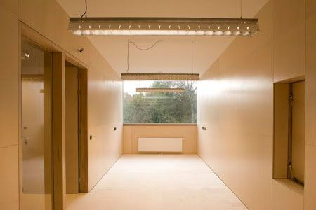
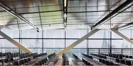
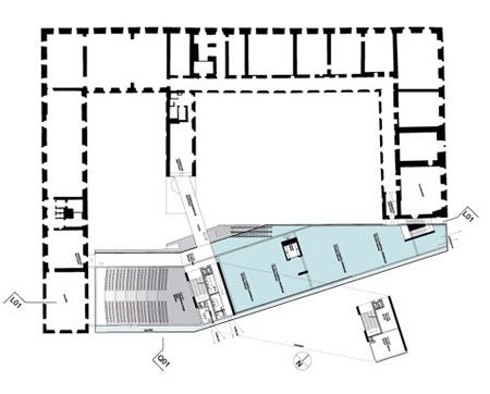
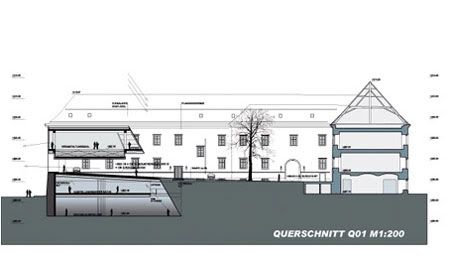
The concept for the south wing is remarkably simple. The new building has three areas: the lower building shaped largely by the historic fabric, the "neutral" distribution zone of the entrance level, and the upper floor that tells us about contemporary technology.
Schloss Museum Linz
Design Team: HoG Architektur
Location: Linz, Schlossberg, Austria
Status: Completion 2009

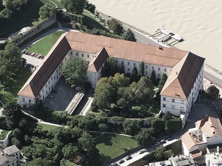
A former imperial residence, military hospital, prison, barracks and, most recently, a museum, the Linz Castle has been home to the Upper Austrian national museum since 1965. The castle lost its city-facing south wing to a fire in 1800. With the need for more and bigger exhibition spaces offered an ideal opportunity to replace the lost wing with a 21st-century extension.

HoG Architektur from Graz won the design competition in 2006 with the winning concept rested on a dual strategy: to reinstate the missing wing without entirely closing off the castle courtyard, and to preserve the public accessibility of this unique location.

Schloss Museum Austria

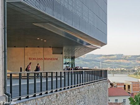
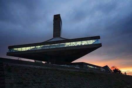
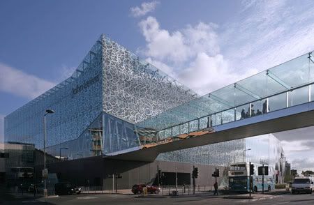
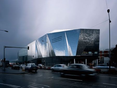
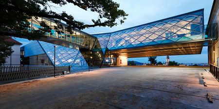
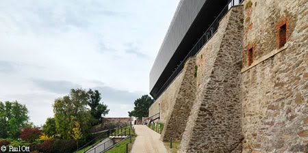
The design achieved this by means of a layered volume. The old wall has been topped by a windowless 'beam' that hovers over a pedestrian route along the foyer, museum shop and restaurant. The wide span and 30-metre cantilever above the main entrance is made possible by an elevated steel truss construction.

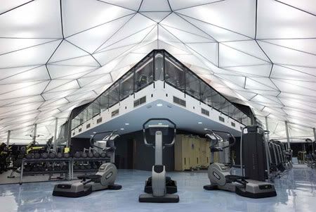
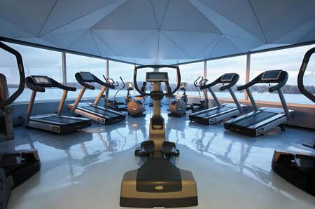
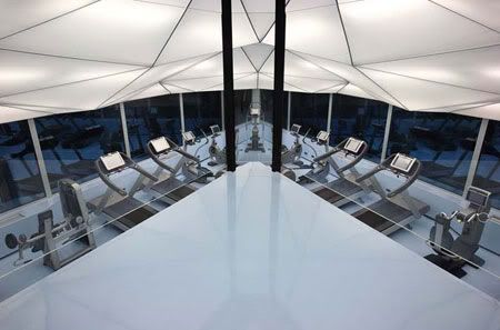
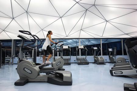
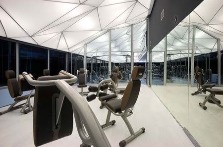
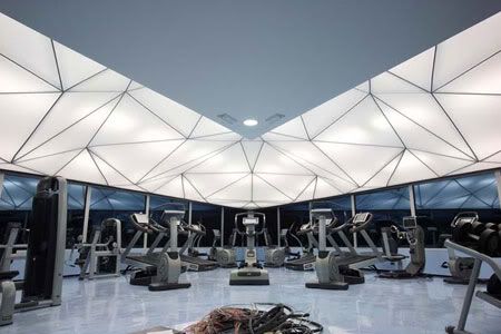
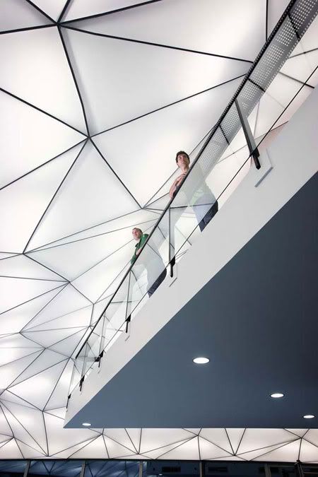
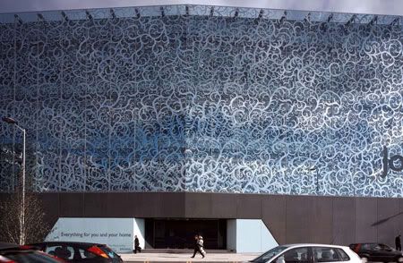
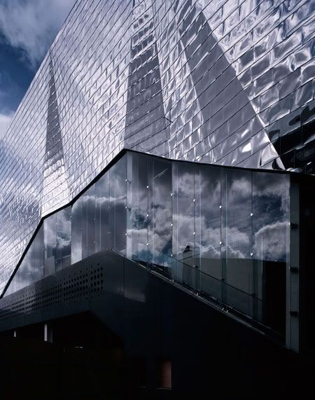
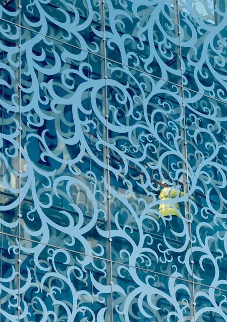
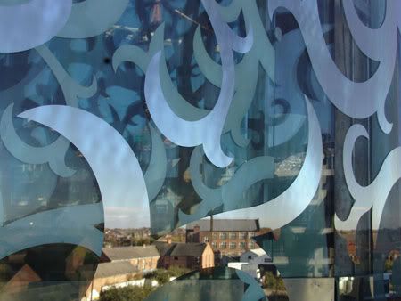
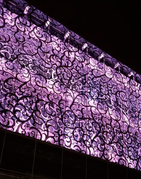
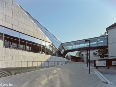
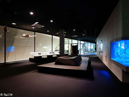
The inside of the castle complex has a more open, less defensive character. The classic symmetry of the castle is disrupted by, among other things, allowing the new wingto bend and curve. The stepped topography of the courtyard has been replaced by a raked plateau that adds a new, functionally binding yet subtle element. Rather more eye-catching is the Y-shaped glazed staircase and connecting bridge that float above the courtyard.And incontrasi to the three underground levels, where some of the exhibition space is housed, daylight is welcomed with open arms here. The diagonal diamond pattern of the huge glass panels provides another contrast with the overall horizontality of the new wing. And raising the pedestrian bridge above the ground serves to emphasize the transparency of the intervention.

Schloss Museum Austria

via Schloss Museum | HoG

Continue reading...

Wednesday, February 24, 2010

Wellness Sky by 4of7 Architecture

Wellness Sky by 4of7

With the client requested of a ‘cloud-like’ impression form the new interior, 390 backlit panels with the finite variation in shape and size are suspended from the ceiling.
Wellness Sky
Design Team: 4of7 Architecture
Location: Belgrade, Serbia
Status: Completion 2006

The Wellness Sky project is the change of use and refurbishment of the existing building on Belgrade riverfront. The building named ’Danube Flower’ was built some thirty-five years ago. It used to house an exclusive restaurant which was a segment of a larger recreational centre accessible to the public. The project was sponsored by the communist government of the time and endorsed by then ubiquitous president J.B.Tito, who was the first guest at the restaurant on November 22nd 1973. It was a famed hangout spot until its decay in the nineties and its final closure which coincided with the start of the civil war in the country. For the period of fifteen years the building was not in operation and has deteriorated considerably.

Wellness Sky by 4of7

With the client requested of a ‘cloud-like’ impression form the new interior. The architects have focused on the ceiling to get new looks and reorganize existing space since the existing structure from seventies was extraordinary. In many ways the building is particular but above all for its synthesis between architectural and structural reasoning. The main volume of the building, triangular in plan, is elevated some fifteen meters above the river and the ground level with the pedestrian esplanade. It is supported solely by the central core which contains two elevator shafts and double spiral staircase.

Cantilevers are reaching out some twelve meters giving a levitating feel to the building. In addition one more structural move is crucial for seamless interaction between exterior and interior of the building. Concrete floor-slab and ceiling shell are not connected at the perimeter of the building, allowing for the continuity of the glass façade to the full extent. Uninterrupted glass strip, with the total length of 150 meters, is wrapping around the building to give constant presence of the Danube River in the interior, with sweeping views reaching far out, both upstream and downstream.

Wellness Sky by 4of7

Defining moment of the new spatial expression is the ceiling. Its design is the sequence of geometric transformations and subdivision applied to the original grid. As a result, approximately 390 backlit panels with the finite variation in shape and size are suspended from the triangular steel construction.

The idea was to create light and spacious space so that visitors should be getting an impression of entering a cloud on arrival. In response 4of7 have opted for reflective resin floor finishes throughout and semi translucent ceiling; both aiming to expose sleek forms of Technogym training equipment in the open plan arrangement.

Wellness Sky by 4of7

via 4of7

Continue reading...

Tuesday, February 23, 2010

Sheepstable by 70F

Sheepstable by 70F

70F architecture’s Sheep stable in Almere, the Netherlands provides more than a home for the much needed sheep.
Sheepstable
Design Team: 70F Architecture
Location: Almere, the Netherlands
Cost: € 300.000
Status: 2008

The city of Almere has a sheeppopulation of about 80 sheep. To centralize and house this population, a sheepstable was needed. The stable is designed with a homogeneous crosssection. The construction and cladding is made of wood. Only the curved girders are made of steel. The stable is designed to receive visitors like citizens or schoolclasses. At the end, on the second floor, a room for the shepard and a small office is realised.

The stable is designed with an a-symmetrical homogeneous cross-section. The part of the building where the sheep reside is relatively low; the high part is situated above the (public) pathway and the hay storage section, making it possible to store a large amount of hay. The shape also creates a natural flow for the air inside the building, which is refreshed by two slits at the foot of each long side of the building.

Sheepstable by 70F
Sheepstable by 70F

The detailing of the corner of the building, where the long facade ends and the gable starts, is extremely important for the overall experience of the architecture of this building. It emphasizes the cross sectional shape of the building, and finishes the long facade of the building, which starts as a facade and slowly becomes roof.

The construction (pine) and cladding (Western Red Cedar) are made of wood. Only the curved girders are made of steel. This was done to emphasis the tube-like shape of the interior, which would have been less strong using twice as high wooden girders. All vertical walls in the stable and office are clad with beech plywood.

The stable is designed to make it possible for the public to visit the building and experience the keeping of sheep up close. At one end of the building, on the second floor, a room for the shepherd and a small office is realized. There are sleeping facilities for the shepherd, who has to stay over night in case any sheep are lambing. Work in and around the stable will be done by, amongst others, people who live with a mental social or psychiatric disability, supervised by the shepherd.

Apart from the public function, the Muslim community of Almere will be able to buy the lambs they need for yearly ritual purposes.

Sheepstable by 70F
Sheepstable by 70F
Sheepstable by 70F
Sheepstable by 70F

via 70f

Continue reading...

Thursday, February 18, 2010

John Lewis Department Store by FOA

John Lewis Department Store by FOA

Looks like a big box wrapped in fancy tights, the striking facade was derived from a fabric design found in the John Lewis textile archive way back in 1803.
John Lewis Department Store
Design Team: Foreign Office Architects (FOA)
Location: Leicester, UK
Status: Completion 2008

The design of the John Lewis Department Store and Cineplex by Foreign Office Architects is within the redevelopment of an existing inner-city retail centre in Leicester. Refuse to create a conventional opaque retail box, the department store design explores a layered transparency that will allow visual interaction between the store interiors and the city as in a net curtain. This is achieved through a double layered skin with a lace-like pattern applied to both layers. This membrane will act like a veil to the department store as well as a sun shading device to the interiors. The moire lace not only acts as a technical device, allowing for programmatic flexibility in the interiors whilst opening them to views and natural light, but it also will resonate, with the cultural and historical context of the city as well as with the tenant's brand: John Lewis.

John Lewis Department Store
John Lewis Department StoreJohn Lewis Department Store

The lace pattern draws on the rich history of Leicester City and John Lewis itself in respect to textile manufacturing and hosiery, and the large Asian population in Leicester. In order that the glass curtain wall achieves a textile affective quality, the lace pattern is built as a combination of four basic templates that vary in density but always meet at the edges in identical ways. This allows for provision of different degrees of opacity to the interiors as well as giving an appearance of non-repetitive and seamless fabric.

The decorative facade, which is a double layer of glass with a mirrored frit, acts like a net curtain. Inside, the pattern on the two layers lines up exactly, so customers can see out, but when viewed at an oblique angle from the pavement, the pattern becomes almost opaque.

In order to establish synergy between the cinema and department store, the concept of fabric is extended to the Cineplex. The Cineplexes is a blank envelope enclosing 12 screens with no requirement of any daylight to the interiors, except in the areas of lobbies. The enclosing skin is designed as an opaque stainless steel rain screen which is treated in mirror finish and pleated at different scales to diffuse the large volume into a series of smaller reflective surfaces, animating the blank volume.

John Lewis Department Store

via FOA

Continue reading...