Friday, October 30, 2009

Queen Alia International Airport by Foster + Partners

Queen Alia International Airport

The concept for the Queen Alia International Airport articulates a sense of Arabic hospitality, combines function, technology and a distinct sense of place to provide a greatly expanded and enhanced gateway to the region.
Queen Alia International Airport
Design Team: Foster + Partners, Maisam - Dar Al-Omran JV
Location: Amman, Jordan
Status: Completion 2011
Cost: $600M

Queen Alia International Airport, named after Queen Alia, the third wife of King Hussein of Jordan who died in a helicopter crash in 1977 is Jordan's largest airport that is situated in Zizya area, 20 miles south of Amman. The airport has two passenger terminals and a cargo terminal that was built in 1983.

The new expansion of the airport is designed by Foster + Partners, to make Jordan a regional hub and once it is completed, it should be able to handle around nine million passengers a year, nearly three times as many as it does now.

Queen Alia International Airport

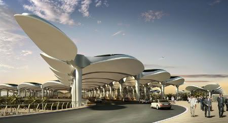
Retaining the existing runway, the scheme comprises a new terminal building that will bring a sense of clarity to the airport, streamlining circulation and establishing coherent wayfinding. Formally, the building draws on the vernacular tradition of outdoor areas and open-air gardens. These courtyards contain water pools that reflect natural light into the building and provide a comfortable microclimate, as well as a subtle means of establishing orientation inside. Large covered interior spaces form a direct relationship to the external environment and accommodate generous greeting and hospitality areas that are central to the terminal’s cultural programme.

An environmentally sustainable system, the airport's canopy roof has been inspired by the organic form of natural palm trees, while its black external surface is reminiscent of Bedouin tents. Split beams at the column junctions and generous reveals allow daylight to flood deep into the building, creating a dynamic play of light while also offering shelter from direct sunlight. The roof canopy acts as a thermal store to heat and cool the building and also conserves water by collecting rainwater and night time condensation. In addition, banks of photovoltaic panels have the potential to supplement the electricity supply, so reducing the building’s energy consumption.

via Foster + Partners

Continue reading...

Thursday, October 29, 2009

Bird Island Nest House by Grant Associates

Bird Island

Grant Associates’ Nest House was one of 6 winning designs for an international competition to create a sustainable dwelling set within an island tropical landscape. The idea is simple: to create energy efficient residential dwellings on Bird Island at Sentul West and promote contemporary architecture with a bent on sustainable technologies.
Bird Island Nest House
Design Team: Grant Associates
Location: Sentul West, Kuala Lumpur, Malaysia
Status: Expected completion 2010

The Nest House takes its inspiration from the bird inhabitants of Bird Island, with living spaces wrapped within a functional and beautiful woven dome, suggestive of weaver bird and bower bird nests. Its outer skin is a rough weave of found materials, onto which are fixed photovoltaic and solar thermal panels. Its edges are clad in tropical planting, with epiphytes, ferns, orchids and climbers.

The internal facilities are a very simple sequence of beautiful boxes and ledges. This contrast between the natural rough envelope and the artificial smooth interior gives the house its distinct character.

The Nest House sits close to the ground and engages with the lake and surrounding landscape. Floating islands and edge planting of tropical marginal and aquatic species form an attractive outlook from the house and attract birds to inhabit the grounds and water around the structure.

Bird Island is a sustainability project of Malaysia's YTL Corporation in 'seeking zero'. A test bed for sustainable living and responsible development.

Bird Island
Bird Island

via Bird Island


Continue reading...

Tuesday, October 27, 2009

Worthing Pool by Wilkinson Eyre Architects

Wilkinson Eyre Architects

Award winning London based architect firm - Wilkinson Eyre has beaten 109 other teams to win RIBA international competition to design 'a new swimming complex for Worthing which would be a first class leisure facility for the town and be a landmark building demonstrating civic pride and status' to replace Worthing's ageing 1960's Aquarena.
Worthing Pool
Design Team: Wilkinson Eyre Architects
Location: Worthing, UK
Status: Initial concept only.
Cost: £17M

The new pool complex will feature an eight-lane 25-metre pool, a dive/learner pool, indoor pools with flumes and rapids, and outdoor “leisure waters” as well as a café, crèche and health and fitness centre.

Chris Wilkinson, director and founder of Wilkinson Eyre, said: “Worthing is a beautiful English seaside town with a spectacular waterfront and I am delighted to have the opportunity of designing a building on such an important site.

Wilkinson Eyre Architects

“It is a great opportunity to continue the tradition of British contemporary seaside architecture”.

The new pool will be built beside the ageing Aquarena which will be demolished once the new facility is complete.

The other shortlisted firms were Allford Hall Monaghan Morris; Thomas Heatherwick with local firm Saville Jones; Pringle Richards Sharratt, and Ian Simpson Architects.

Worthing Pool
Worthing Pool

via Wilkinson Eyre | BD online

Continue reading...

Monday, October 26, 2009

The Library by Tirawan Songsawat

The Library

Not many hotels can boast a blood red pool. It doesn’t sound attractive, but on an overcast day the red is warmly inviting, and the designer’s philosophy is refreshingly logical; nothing about this place is conventional, why stop with the pool?
The Library Koh Samui
Design Team: Tirawan Songsawat
Location: Koh Samui, Thailand
Status: Visit anytime

White minimalist lofts arranged along a the beach, with a bloody red swimming pool and a startlingly white media room; The Library breaks all the rules and turns upside down any notion you might have of a beach hotel on an idyllic Thai island.

The Library Building consists of three box-style units adjoining together where the middle box is an open-air serving as a mini-café. The other two boxes are the huge library for not only books but also other entertainment media.

The Library
The Library
The Library
The Library

Divided into 26 suite/studio cabins, the complex avoids the monolithic hotel-complex look, scattering discreet buildings in lush vegetation. Each cabin consists of a suite space on the ground floor and a studio upstairs, complete with ocean view. Accommodation concept is to divide space equally between outdoor and indoor in both horizontal and vertical way. This idea was stemmed from simple concept that when holiday, people prefer to spend more time out in the open rather than staying in an air-conditioned box. Consequently, each building unit will be built in a box style by emphasizing in increasing efficiency of space utilization vertically and horizontally.

The Library
The Library

Designed as an outpost of casual elegance, The Library interiors are finished in a distinctive minimalist style with strong color palates. Rooms are finished in a bold color scheme that emphasizes red and gray elements against pure white walls and floor space, echoed by the red swimming pool and white library complex. The purity pays off: the old-growth forest and lively beach are there to be enjoyed without distraction.

The Library
The Library
The Library Koh Samui

via The Library

Continue reading...

Friday, October 23, 2009

Illoiha Omotesando Fitness Gym by Nendo

Fitness Gym by Nendo

The gym is more like an art space rather than a typical gym. The climbing wall was decorated with Baroque style photo frame.
Illoiha Omotesando Fitness Gym
Design Team: Nendo
Location: Tokyo
When to visit: Completed 2006
Awards: JCD Design Award / Gold Award

The second branch of the ILLOIHA fitness club is located on two below-ground floors of a building. Since the gym is spread out over the two floors, we decided to use a studio with an unusual two-story ceiling to unify the space.

To express the original brand concept of "becoming beautiful through movement", we chose the theme "rock-climbing on Omotesando" and developed a design that uses the mismatch between a rugged outdoor sport and Tokyo's fashion district to its advantage. Instead of the usual rough and outdoorsy climbing wall, we came up with the idea of using interior design elements like picture frames, mirrors, deer heads, bird cages and flower vases to create a challenging wall with hard-to-find holds and unusual finger grips. We hope that our uniquely Omotesando-style climbing wall inspires newcomers to try out the sport, and starts a new wave in fitness with style.

Fitness Gym by Nendo

via nendo

Continue reading...

Wednesday, October 21, 2009

Jugetsudo by kengo kuma

Jugetsudo by  kengo kuma

Jugetsudo, which means a place to watch the moon, is the brand of Japanese green teas. Their first salon outside Japan is a simple and functional place, where customers will be able to get a glimpse of Japanese culture through the spirit of tea.
Jugetsudo, Paris
Design Team: kengo kuma & associates
Location: 95, rue de Seine, Paris
When to visit: Open 11:00 - 19:00 (Closed Sunday, Monday and national holidays)

Jugetsudo, is the brand of green teas launched by Maruyama Nori, a 155-year-old family-run Tokyo company specializing in edible dried seaweed. The founder's great-great-granddaughter Maki Maruyama, director of the Paris salon, asked Kuma for a design both contemporary and traditional, in harmony with nature and the Zen spirit of the Japanese tea ceremony. Jugetsudo has chosen to entrust the design of their boutique to Kengo Kuma because his ideas and the spirit of his work are perfectly in line with the conception of the Jugetsudo brand; “a concord of tradition and renewal.”

The bamboo thicket was his main concept for the 800-square-foot project. "In the thicket floats a different kind of air from that in our daily lives," he explains. Literally, of course, it's the thicket itself that's floating: 650 stalks of natural Japanese bamboo measuring 1 to 4 feet long suspended from the ceiling. Although they're installed in a regular grid pattern, the different lengths create an impression of undulations.

Jugetsudo by  kengo kuma

Kyoto temples, where the flooring is often salvaged from roofs, inspired Kuma's choice of slate-gray sandstone for the floor tile on Jugetsudo's ground level. Running around the perimeter is a trough filled with paler gray river rocks—a miniature rock garden. Contributing yet another shade of gray is phosphate-finished steel, one of Kuma's favorite materials. Steel shelves, suspended in the windows or built into the sidewall, offer canisters of tea along with exquisite teapots, cups, and other ceramic wares.

Warmer neutrals play a part as well. Full-height walls of rice paper appear in two different textured patterns in identical shades of creamy white. In the center of the room, tea and Japanese sweets are served to customers seated along one side of a counter, a single knot-free slab of the blond hinoki cypress revered in Japan and often used in temples and shrines. Durable, lustrous, and fragrant, the wood "fits harmoniously with the idea of a tea salon," Kuma says. Set into the counter is a large hot plate for boiling water in an ornate cast-iron kettle.

Jugetsudo is the first project completed in France by Kengo Kuma & Associates. The overall design was to encourage "not only the selling of tea but also cordial communication with customers," Kengo Kuma says.

Jugetsudo by  kengo kuma

Photos credits: Jimmy Cohrssen.
via InteriorDesign

Continue reading...

Tuesday, October 20, 2009

White Chapel by Aoki Jun

White Chapel

Architecture often separates structure and decoration,but in this chapel there is no border between these two elements.
White Chapel, Hyatt Regency Osaka
Design Team: Aoki Jun
Location: Hyatt Regency Osaka
When to visit: Completed 2006

White Chapel is a small chapel built within the site of Hyatt Regency Osaka. It is used for wedding ceremonies and accommodates 80 people. The structure consists of square steel rings 60cm in diameter, with sides of 25mm, which are interlocked three-dimensionally.

The ring components were inspired by the shape of a tetrahedron. Its flat planes were replaced with rings, connected at their edges. Although the structure uses rings to create diamond-like shapes, the two most common symbols of marriage, Aoki says this is a happy coincidence: “I just pursued a beautiful geometrical shape.”

White Chapel
White Chapel

The three-dimensional layout of the ring corresponds to the array of the circle, inscribed in the 4 regular hexagons within the unit. Steel rings are welded together, forming a foam-like three-dimensional grid which is mainly occupied by voids. This not only supports the roof but is also used to assist the glass exterior as MPG System. Inside the grid, a double-layered woven screen of white organdy is hung.

By day sunlight enters the chapel through the six-metre-high network of rings. At night, it is illuminated by fluorescent strip lighting along the top and bottom of the wall, along with recessed halogen down lights, creating a glowing reflection in the lake.

These sensuous qualities probably account for the great success of the chapel: in its first year, more than 200 weddings have taken place there.

White Chapel
White Chapel
White Chapel

via Aoki Jun

Continue reading...

Friday, October 16, 2009

KU64 Dental clinic by GRAFT Architects

GRAFT Architects

“There are few environments as negatively associated in expectation as a dental clinic. Hygienic and sterile atmosphere, the classical “white colour range” and last but not least the typical smell are very much connected with a feeling of a physical and psychic state of emergency and even abuse. Against this background we should be urging for a radical new understanding of hospitals in general and specifically dental clinics – away from negative prejudices towards an atmosphere of art, well being and relaxation.” - GRAFT
KU64 Dental clinic
Design Team: GRAFT Architects
Location: Berlin, Germany
Status: Completed 2006

The design concept for the dental clinic of Dr. Ziegler devises a radically new morphology for a medical setting. Folding, undulating floors create rises and hollows to hide in, inspired by a beach dune landscape. Ceiling and floor reflect each other in waves, defining protective spaces without the use of distinct enclosures. Hills and valleys are configured to enable privacy and intimacy as well as openness and vista.

GRAFT Architects
KU64 Dental clinic

Anamorphic images In white are silk screened onto the orange surface and can only be deciphered from distinct viewpoints. While moving through the clinic, the surface's appearance continuously changes. Furniture and topographical volumes double as storage space, and technical equipment is seamlessly integrated into the contours of the interior.

While the treatment spaces are defined by their discreet use of technology and contemplative nature opening up towards the skyline of Berlin only, the waiting area is transformed into an unexpectedly large, lounge-like space with an adjacent outside sun deck. The same typology of dune shaped surfaces create a common beach scenario, with integrated seats and soft benches, grouped around a free hanging fireplace.

GRAFT Architects
KU64 Dental clinic
KU64 Dental clinic

The concept of a dune-like sculpture at the floor and the ceiling is continued into a staircase, connecting the main floor with the terrace and the treatment spaces on the floor below. The horizontal shapes are transformed into walls, confining a middle corridor like a canyon. A rhythm of glass doors cut into this canyon providing visual connections to the street and courtyard and flood it with natural light.

GRAFT Architects
GRAFT Architects
GRAFT Architects

Photo credits: Hiepler Brunier Architektur fotografie
via KU64 | GRAFT Lab

Continue reading...

Wednesday, October 14, 2009

Gimme Shelter by Rojkind Arquitectos

ordos 100

Gimme Shelter has a submerged ground design and draws inspiration from cave dwelling of nomads in Mongolia. Based on sand dune morphology, the submerged design structure provides adequate warmth and air during winter and summer months.
Gimme Shelter, Ordos 100
Design Team: Rojkind Arquitectos, Herzog and de Meuron, Fake Design
Location: Inner Mongolia
Status: Completion 2010

Mexican architecture firm, Rojkind Arquitectos was chosen to build the Gimme Shelter for the Ordos 100 project. Gimme Shelter is a private multifunctional residence, to be built on a total area of 1,000m².

Gimme Shelter drew inspiration from the Mongolian nomads. The building design is based on ancient cave habitats known as Yaodong, a structure that withstand the tundra climate and harsh summers of Inner Mongolia.

Gimme Shelter
Gimme Shelter

To shelter the residents from extreme climatic conditions, Gimme Shelter has a protective shell that incorporate passive solar and geothermal design elements along with elastic design elements. The residence will have four floors, connected by a series of bridges. The entrance is located in the north side of the hard protective shell and leads to the second floor. The west side houses all services while the main living areas are located in the extreme east along with other support features.

Distribution of private and public space was decided on the premise of dynamic-programmatic circulation. The residence covers a number of storeys, having separate areas such as living room, work room, rest room and interior gardens. Each space is uniquely shaped and has been designed in such a way that ceilings become terraces for other semi-private activities. Walls and ceilings shift in different directions making the areas multifunctional.

The interior gardens house various plants and are a design feature that naturally cools the inside of the building during summer. There are a numerous enclosures as one moves towards the interior garden area. These enclosures allow cross ventilation cooling during summer months.

ordos 100
Gimme Shelter
ordos 100

via kosekose

Continue reading...

Friday, October 9, 2009

Mizu Salon by Niall McLaughlin Architects

Mizu Salon Boston

The simple vaulted cutting room is animated by repeating cuts in the soffit, which open into brightly lit spaces. When you lie back at your basin, you gaze on the ceiling's beautiful geometry.
Mizu Salon Boston
Design Team: Niall McLaughlin Architects
Location: Boston, USA
Status: Completion 2008
Cost: $1.9 million

Created by Elan Sassoon, the son of legendary hair stylist Vidal Sassoon, Mizu Salons blend the finest talent in hairstyling with modern architectural aesthetic and function. Located inside Mandarin Oriental,Boston, Mizu's architectural design and international talent attract world-wide attention and celebrity clientele. By creating beautiful hair, providing intuitive service and staying ahead of industry technology, Mizu salons will mark a new era in hairstyling and the salon experience.

Mizu Salon

The key design issue is the comfort and well being of each customer. This is an environment that is calm and uplifting. A customer should leave the salon feeling nurtured.

Soft spaces are created through strategic reflective lighting, light boxes and soffits. The cool colour temperature creates a sense of calm and cleansing whist warm gold colours introduce a feeling of relaxation and comfort.

An arcaded passageway extends along the glass shop window. It leads from reception to hair cutting, dyeing and colour dispensary. This passageway makes a sculptural form when seen from the mall. It acts as a screen, making the cutting room a protected inner sanctum.

Mizu Salon Boston
Mizu Salon

“We are very proud of the designed arches. The entire structure was manufactured in Canada and sent in 500 pieces. The arches are made of GRG (glass reinforced gypsum), which is a high-quality plaster mixed with glass fiber. It took very skilled craftsman to install these and then we finished with an acoustical plaster to ensure the sound levels stay at a minimum, even with the hairdryers and conversations going on. Lastly, the arches are painted with a matte white paint that makes it easy to wipe clean.”

Each space incorporates experience-enhancing technology like Myvu glasses that offer television and movie entertainment in the stylist's chair, WiFi, and use of complimentary laptops available to every client. To further streamline the experience, at the end of an appointment, wireless check-out systems will complete any service and product transactions while sitting at the stylist station, shortening time spent waiting to pay at reception.

Niall McLaughlin Architects

via Reuters

Continue reading...