Wednesday, February 18, 2009

GreenPIX- Zero Energy Media Wall


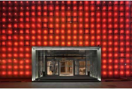
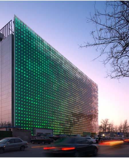
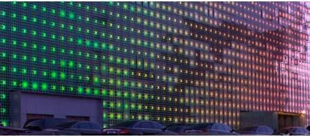
Featuring the largest color LED display worldwide and the first photovoltaic system integrated into a glass curtain wall in China, the building performs as a self-sufficient organic system, harvesting solar energy by day and using it to illuminate the screen after dark, mirroring a day’s climatic cycle.
GreenPIX- Zero Energy Media Wall
Design Team: Simone Giostra & Partners, Arup
Location: Chang’an Jingya Restaurant-No. 26 Fuxing Road, Haidian District,Beijing
When to visit: Preferable after dark.

GreenPix is a groundbreaking project applying sustainable and digital media technology to the curtain wall of Xicui entertainment complex in Beijing, near the site of the 2008 Olympics.


The project was designed and implemented by Simone Giostra & Partners, a New York-based office with a solid reputation for its innovative curtain walls in Europe and the US, with lighting design and façade engineering by Arup in London and Beijing. Content manager Luisa Gui will coordinate the opening program with Shanghai-based guest curator Defne Ayas and software development by New York-based media artist Jeremy Rotsztain.
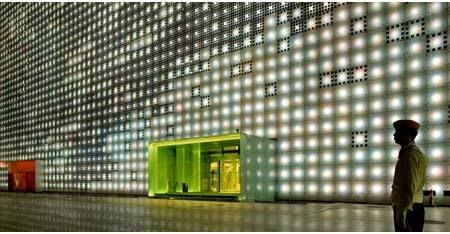


Greenpix behaves like an organic system, absorbing solar energy during the day and then generating light from the same power that evening. Responding to the aggressive and unregulated economic development currently undertaken by the Chinese industry, often at the expense of the environment, GreenPix promotes the uncompromised integration of sustainable technology in new Chinese architecture.
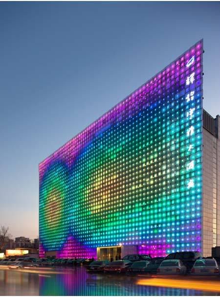


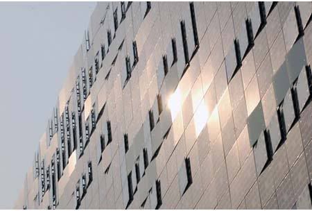
With the support of leading German manufacturers Schueco and SunWays, the architect Simone Giostra with Arup developed a new technology for laminating photovoltaic cells in a glass curtain wall and oversaw the production of the first glass solar panels by a Chinese manufacturer. The polycrystalline photovoltaic cells are laminated within the glass of the curtain wall and placed with changing density on the entire building’s skin. The density pattern increases building’s performance, allowing natural light when required by interior program, while reducing heat gain and transforming excessive solar radiation into energy for the media wall.



via GreenPIX | ARUP | Simone Giostra & Partners

Continue reading...

Monday, February 16, 2009

Only Chocolate


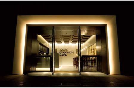
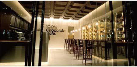
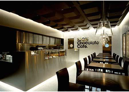
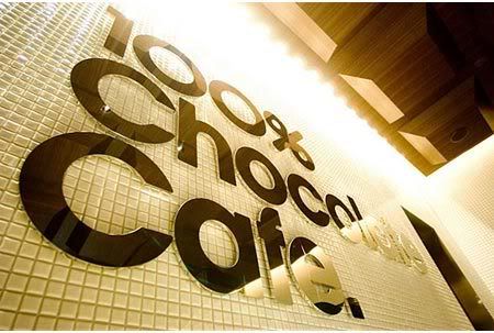
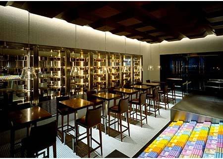
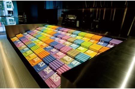
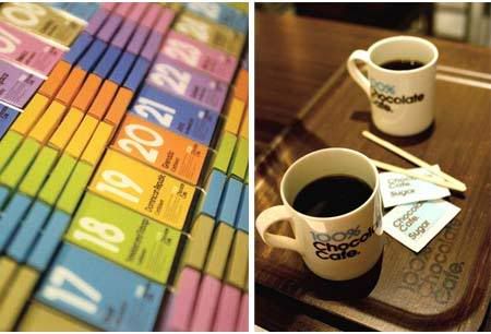
The 100% chocolate cafe is based on the theme - 'Chef's Table in the Kitchen'. They have a total 56 different flavors of chocolate that are coded by colors and numbers.
100% Chocolate Cafe
Design team: Masamichi Katayama of Wonderwall
Location: 2-4-16 Kyobashi, Chuo-ku, Tokyo
When to visit: Weekdays 9:00 - 20:00 / 11:00 to 19:00 Saturday and holidays (except New Year)

100% chocolate cafe is run by old Japanese chocolate brand, Meiji. The environment was designed by Masamichi Katayama of Wonderwall, while all the graphics were by Groovisions.


The entire establishment is rendered as a chocolate kitchen, with a table placed within to accommodate invited guests. Covering one of the walls are 56 different types of chocolate blocks, tastefully placed in glass showcases. Air conditioning was installed in the wall, and 56 kinds of chocolate from 17 countries, including 22 types of cacao beans, neatly lined up like a library in it.

It is a stylish chocolate bar you don't want to miss.


via Wonderwall | 100% Chocolate Cafe | Groovisions

Continue reading...

Saturday, February 14, 2009

Mandarin Oriental @ Dellis Cay


“My inspiration was the light. I have designed all the buildings trying to capture this light, I have tried to have the light going through all the spaces like a blade. The design is sophisticated but based on simplicity.”
Mandarin Oriental @ Dellis Cay
Design team: Piero Lissoni
Location: Dellis Cay, Turks & Caicos Islands
When to visit: 2010

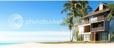
Sitting on the westernmost end of the island The Residences at Mandarin Oriental Dellis Cay demonstrate a respectful attitude towards nature and the island’s intimacy. This exclusive collection comprises Hotel Residences and the small enclave of Beach House Residences at Mandarin Oriental Dellis Cay designed by the prestigious architect Piero Lissoni.

Under the management of Mandarin Oriental, the Residences offer a range of services and facilities to delight owners beyond their expectations.

HOTEL RESIDENCES


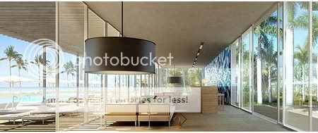
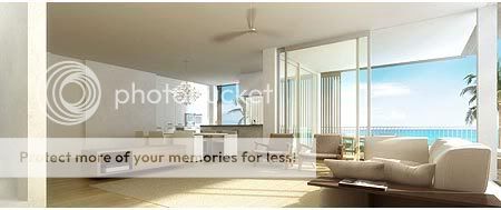
Enhanced by all the gracious splendor and superb services of the Mandarin Oriental, the twenty-four private residences at Mandarin Oriental Dellis Cay will offer a wondrous living style. Each of the Hotel Residences is very much a home of its own, whether you choose a one-bedroom duplex, an expansive two-bedroom residence, or the three- and four-bedroom penthouses with panoramic sea views. All will bear the unique stamp of Piero Lissoni, both in sophisticated contemporary design and distinct furniture packages accentuated by Lissoni's impeccable grasp of form and color. The Hotel Residences will also feature private terraces, Boffi kitchens, top-tier appliances and lavish finishes and amenities throughout.


In addition, the Hotel Residences will place all the delights of the Mandarin Oriental within your reach. Only a few short steps away are the pleasures of the signature restaurant, a variety of pools, the MO Bar, boutique shops and the lush tropical landscaping that virtually envelops you at Dellis Cay.


BEACH HOUSE RESIDENCES


Piero Lissoni will be creating nine 3-story buildings that exquisitely complement the island's natural landscape and line the powder-sand beaches of Dellis Cay. There will be only six Beach House Residences per building, with two and three-bedroom residences ranging from 2,000 to more than 3,000 square feet - many featuring expansive private terraces. Artfully positioned around a central pool, the Beach House Residences will offer a variety of picturesque pools and ponds for relaxation and exercise - all interconnected by a series of lushly landscaped walkways that also provide direct beach access.


The Beach House Residences boast unobstructed ocean views and are fully serviced by the staff of Mandarin Oriental Dellis Cay - catering to your every requirement. Each residence features distinctive furniture packages, state-of-the-art Boffi kitchens, spacious master suites and lavishly equipped bathrooms. Situated to maximize privacy and seclusion, every Beach House Residence is designed to highlight the natural beauty of Dellis Cay.

via Dellis Cay | Lissoni Associati

Continue reading...

Wednesday, February 11, 2009

The City Of Man


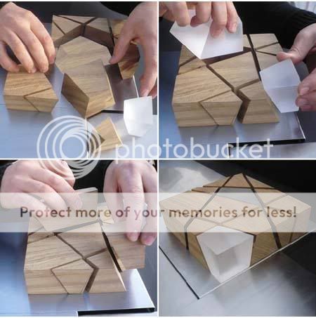
The design was inspired by a traditional Shanghai game, Imbrighi said. In the game, children drop a batch of 20 to 30 sticks on a table and try to move one stick at a time without moving the others until all the sticks are cleared.
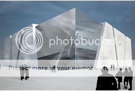
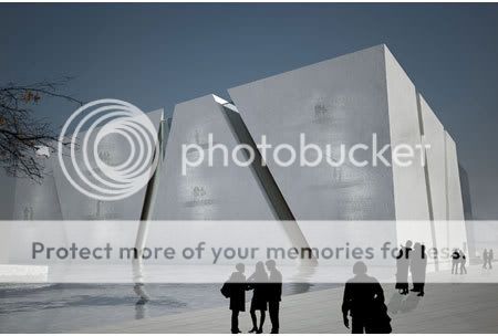
Italian Pavilion | Shanghai Expo 2010
Design team: Giampaolo Imbrighi, Iodice Architetti (Teresa Crescenzi, Antonello De Bonis, Cosimo Dominelli, Francesco Iodice, Giuseppe Iodici and Marcello Silvestre)
Location: between Nanpu Bridge and Lupu Bridge along both sides of the Huangpu River, Shanghai.
When to visit: May 1 to Oct 31, 2010

The Italian Pavilion of Architect Imbrighi – selected among 65 proposals, on one hand, to represent Italian cultural values in contemporary terms and, on the other hand, to advance original solutions both on the technological level, to comply with the imperative of eco-compatibility, and on the structural level, to meet the need – if necessary – to dismount it and to rebuild it on a reduced scale in another area of the city.


The pavilion, called The City of Man, is composed of 20 functional modules that covers a 3,600 sq. m. square layout building, 18 m high, divided in several irregular bodies of different sizes, connected by steel bridge structures that allow to see the connection balconies.

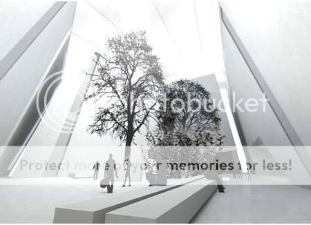
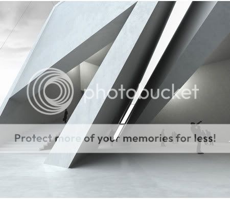
The building is decorated on three sides by a film of water that reflects the structure highlighting the natural shinny effects. The brilliance of the structure is reproduced inside both via slits which evoke the narrow alleys between the city buildings, and also thanks to the use of transparent cement, a new, recently created multifaceted material. Because of its particular and diverse component on the different sides of the building, this material generates a twofold architectural effect, from the outside a nocturnal effect of the liveliness inside, and from the inside, the outside daylight atmosphere. The surface of the pavilion will appear transparent with the sides made up of self-cleaning glass.


The photovoltaic elements integrated in the glass of external covers shall guarantee a screening effect against radiations, while the lighting project of the building is not only aimed to scan the spaces, but also to favour energy saving.


The different sections of the building make up a geometrical variety symbolizing the tradition and regional customs which define the Italian identity: a type of mosaic of which each of the parts show a single picture. The form also highlights the topographic complexity of Italian cities, with its numerous short narrow roads and alleys which suddenly open onto a large square, a characteristic which can also be found in the traditional Chinese urban centres. A psycho physical effect of comfort is given by an internal garden, the presence of water and natural light which spreads throughout the area across the patios and by the walls.


via Shanghai Expo | Iodice Architetti

Continue reading...

Tuesday, February 10, 2009

The Markthal by MVDRV Architects

The Markthal

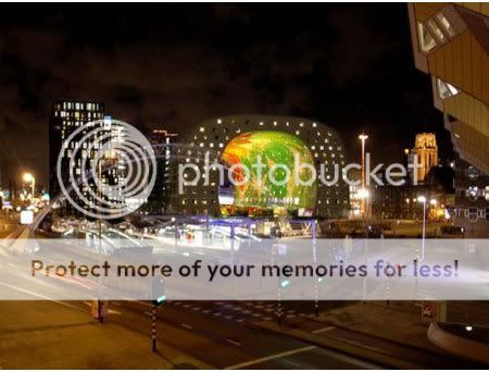
The Market Hall or Markthal is the first covered , permanent food market in the Netherlands under the new laws.
The Markthal/ Market Hall
Design team: MVDRV Architects
Location: Grote Markt, next to the Hoogstraat in the Laurens quarter, Rotterdam, The Netherlands.
When to visit: Expected to be ready by 2010

New laws in the Netherlands require covered areas for traditional open air meat and fish markets due to new hygienic constraints.

The Market Hall is part of the new inner city heart for the Laurens Quarter, the pre-war centre of Rotterdam. A sustainable and intelligent combination of food, leisure, living and parking. Fully integrated to enhance and use the synergetic possibilities of the different functions. A large scale building fitting into the neighbourhood, with main entrances linking up with the natural flow of the public circulation to the train station and the main shopping streets; with separate entrances for the parking garage and the apartments. A building with inner logistic and an attractive and economical parking garage.

The Markthal
The Markthal

The market will include 100, mostly permanent, stalls covering a total gross lettable area of 1,800 m2. It is expected that 65 vendors will utilize the space. The Market Hall also comprises a total gross lettable retail area of 3,000 m2 and total gross lettable catering area of 1,600 m2 on the ground level and first floor, as well as a supermarket of 1,800 m2 and an underground car park for 1,100 cars. The Market Hall is housed in an arch-shaped building, and will include 246 residences. A covered square with a pleasant public security and controllability emerges of it. During day it serves as central market hall, after closing hours the hall will be an engaged living area with light and liveliness enriched by the restaurants situated on the first floor.

The apartments follow the strict Netherlands laws regarding natural daylight: all rooms that require natural light are situated on the outside. Kitchens, dining rooms and storage are positioned at the market side, establishing a connection to the market.

The Markthal

The interior of the arch will be covered in LED technology providing the city with an ever changing interior. The front and backside are covered with a flexible suspended glass facade, allowing for maximum transparency and a minimum of structure.

A new icon for Rotterdam, a public building emerging from housing.

The Markthal
The Markthal

via MVRDV Architects | Markthal

Continue reading...

Monday, February 9, 2009

Aésop Flinders Lane


We aim to add rather than detract from the existing built environment, taking into consideration the characteristics of the neighbourhood and the type of outlets with which we share the street. Within each store, we work with objects and materials that offer interesting possibilities because of their colour, texture or history.
Aesop Flinders Lane
Design team: Rodney Eggleston and Anne-Laure Cavigneaux of March Studios
Location: Shop 1C, 268 Flinders Lane, Melbourne, Australia.
When to visit: Anytime.

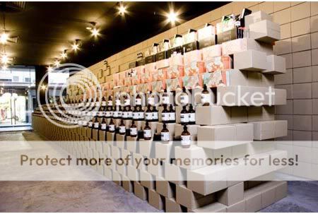
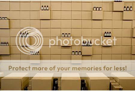
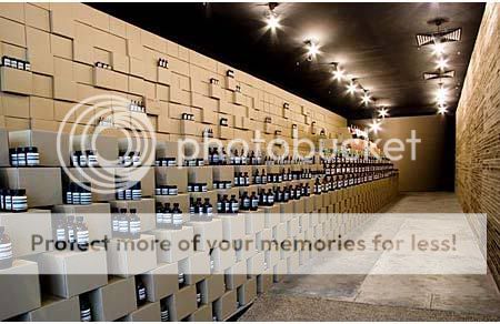
In 2007, Aesop’s Flinders Lane store was given a temporary makeover by Melbourne’s March Studio. Constructed in just five days, the store fit out is made entirely from industrial-grade cardboard, from the shelving units and countertop to the eastern facade. Once the centre of Melbourne’s rag trade, Flinders Lane is now home to stores including Journal Canteen and Superfino. The team responsible for Aesop’s redux are architects Rodney Eggleston and Anne-Laure Cavigneaux, who won the 2007 National Interior Design Awards for their work on Dusk bar in St Kilda.


The ambient new store has drawn attention from all sorts of passers by. Store manager, Kate, says she wasn’t expecting how amazed customers would be by the store’s design. “It’s clear it’s a very tactile environment. Most people come in and tend to want to touch it all.”


Since being established by Dennis Pahitis twenty years ago, Aésop skin care has become an uncontested success story in the notoriously fickle beauty industry – focused on providing its worldwide clientele with the highest quality botanical skin care, rather than subscribing to mainstream-cosmetic anti-aging hype.


Aésop now have 78 international stockists, plus 20 signature stores including stores in Paris, London and Sydney. Most Aésop stores are unique in the retail landscape and have little in common with one another aside from a warm and welcoming ambience.


via yatzer | Aésop | March Studio
Photo credits: Amanda de Simone

Continue reading...