Thursday, April 29, 2010

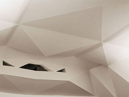
La Llotja theatre and conference centre by Mecanoo Architecten


Regarded from the large scale of the region, the building forms a link between the river and the mountain. Viewed from the urban scale, La Llotja and the river form a balanced composition. At street level the cantilevers of La Llotja de Lleida theater and conference centre provide protection from sun and rain.
La Llotja Theatre and Conference Centre
Design Team: Mecanoo Architecten, LABB arquitectura
Location: Lleida, Spain
Status: Completion March 2010

Situated between the seu vella mountain and the segre river, the building design is influenced by its Spanish surroundings with earthen stone cladding and a light bathed interior with vibrantly coloured accents representing the fruits of the region. Sustainable design principles are integrated throughout La Llotja, with a large cantilever for shade and shelter from the rain, photovoltaics, thermal storage and a large roofscaped garden which also provides a city terrace for Lleida’s citizens.


The large stone edifice seems to have sprouted from the Spanish earth. The building’s horizontal form provides a large garden on the roof, while under the cantilevers begins a square for events, with the stairs of the adjacent building serving as a tribune. Parking has been created underground with the loading area for trucks on the ground level, the same level where the theatre stage, dressing rooms and restaurant kitchen are found. Small trucks can load and unload on level -1. In a light court in the centre of the building, a monumental staircase rises from street level to the multifunctional hall on the first floor. A ramp leads on to the foyer on the second level where there is a panoramic window looking out across the city and the river. The entrances to the theatre, which also serve as a large conference hall, meeting rooms and a small conference room are located in the foyer. The latter is visually connected to the multifunctional hall by means of a raked tribune separated by a glass wall. The press office, VIP rooms and a meeting centre are situated on the city side of the building, accessed by an internal corridor. The entire functional logistics for the theatre and the conference centre are situated inconspicuously but extremely functionally. Restaurants with bars are located on the side of La Llotja facing the river and the square.The monolithic building is in fact composed of different pieces of buildings linked together by sound-absorbing foyers.


Materials ensure distinction and orientation in the interior. The exterior is of stone. Inside there are mainly white, plastered walls and either wooden or marble floors. The entrance hall and the multi-functional hall have a marble floor, while the foyer has a floor of mixed hardwood. The theatre has the atmosphere of an orchard with walls of dark wood in which trees of light have been cut out. Thousands of leaves on the ceiling light the hall. The colour palette of fruit is a theme that recurs in small details throughout the building. After all, the region of Lleida is famous for its fruit production. The roof is colourful: pergolas support a range of creepers and climbers like roses, jasmine and ivy. The garden with its mirador is not only pleasant but also useful since the roof cover keeps the building cool in the summer, provides a beautiful view for people living in the neighbourhood and serves an extra place for conference guests to sojourn.

La Llotja is 37,500 m2 with two congress halls (1,000 and 400 seats), the largest functions as a theatre as well, a congress hall with 200 seats, a multifunctional space and a lounge with a view on the old city and on the segre river, 9,500 m2 of parking and a public square of 15,325 m2, mercolleida office and retail of 2,591 m2. building costs amount to 35 million euro.


Continue reading...

Wednesday, April 28, 2010

Bornhuetter Hall by LTL Architects


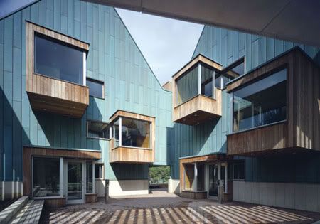
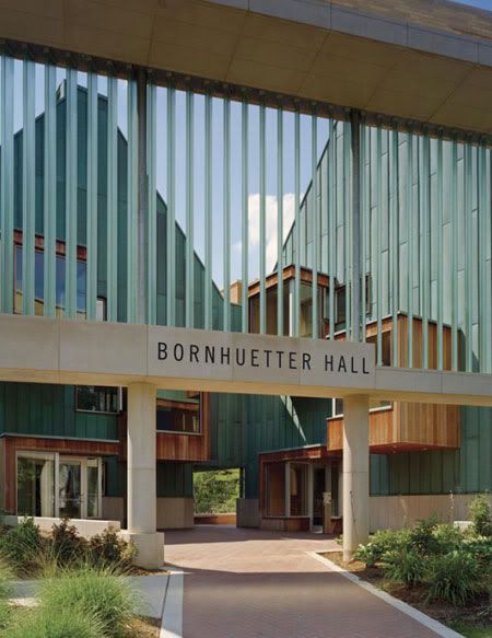
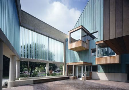
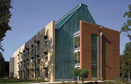
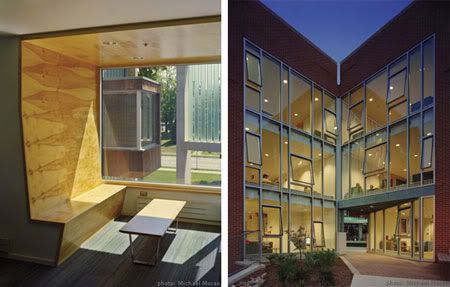
Wood-clad study nooks cantilever, like box seats, into the theatrical space of the courtyard, producing a dynamic entrance to the building and establishing private study areas in a collective setting.
Bornhuetter Hall
Design Team: LTL Architects
Location: The College of Wooster, Wooster, Ohio
Status: Completion 2004

LTL’s work with the College of Wooster began in 2001 with an extensive feasibility study of the residential campus plan that culminated in recommendations for substantial changes in the density and configuration of several student halls. Contrary to the prevailing trend at residential colleges toward apartment-style living, extensive discussions with students, residential life staff, and college administration led to the unanticipated conclusion that a double-loaded corridor type actually encourages the greatest degree of socialization and the most positive student experiences.

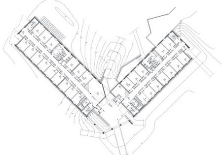
The success of the double-loaded corridor as a catalyst for college social life is predicated on several important conditions: 1) the scale of the hall unit--the total number of rooms served by a single corridor--should be neither too small nor too large, as this resulted either in isolation or institutional anonymity, 2) the corridor should be wide enough to function as an ad-hoc social space and connect to or incorporate other collective spaces, and 3) the corridor should be integrated with the main circulation paths through the building.


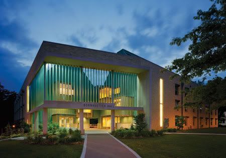
The generative brief for Bornhuetter Hall, a new 47,500 sq. ft. residence hall comprising 185 beds, was derived from this research. Sited on the northern edge of a liberal arts campus, Bornhuetter Hall encourages social interaction by transforming the conventions of the double-loaded corridor and enriches student experience by providing a balance between private spaces for study and public gathering areas for communal life and discussion.

In order to ensure that each hall fosters a sense of community (25-30 students per hall), the building is made of two separate wings, which share a ground floor mechanical system. Within each wing, the hallways flare at their ends and embraces lounges, a kitchenette, and more intimate sitting areas. A collective outdoor courtyard is created by this split. This exterior room functions as the public center of the building. It is an unusual space, simultaneously at the heart of the building and at the ends of each wing. It contains both social and private spaces. It provides a sequence of entry into the building and passage through to a park framed at the rear of the building.

Continue reading...
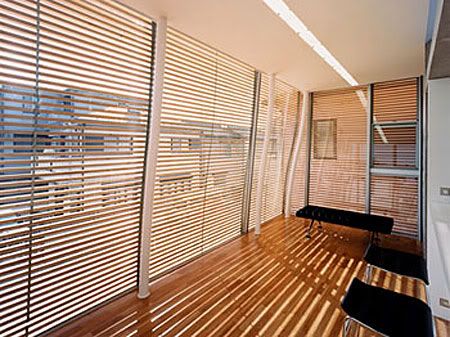
National Heritage Museum by Mecanoo Architecten


A path built of recycled cobblestones leads one past something that looks like a huge boulder, 13 metres high and without any visible entrance.
National Heritage Museum
Design Team: Mecanoo Architecten
Location: Arnhem, Netherlands
Status: Completion 2000

The National Heritage Museum is an open air museum, founded at the beginning of the twentieth century to preserve memories of rural culture and traditional crafts in Holland. In niches in the wooded countryside outside Arnhem, completely furnished farmhouses, shops and workshops from different parts of the country have been brought together. A visit is certainly educational, but today it has to be an attraction as well. To achieve this broader concept a new exhibition building was needed to display the splendid collection, making the museum less dependent on fair weather. With this in mind, Mecanoo has viewed its task as twofold – to provide practical facilities, while also appealing to the public’s imagination.


The landscape was taken as the starting point for the design. In this case this was more or less obvious because it offers possibilities for interventions and also because it is the foundation on which the history of Dutch housing has taken place. In addition, materials with a history have been employed.  Cutting across the countryside is a wall, 143 metres long, made of old cobblestones and bricks with different bonds and joint methods. Through the museum gate in this wall one comes to a large airy hall with an outlook to the open air part of the museum. The hall floor undulates with the changing levels of the landscape. The exhibition galleries are located in the lowest floor level. From it a tunnel leads visitors to the interior of the boulder. This is the ‘HollandRama’, a rotating panoramic theatre where a multimedia show brings historic objects to life.

The entrance hall forms the central area of the museum and includes facilities such as toilets, the café and the museum shop. It functions as a link between indoors and outdoors and it also houses the knowledge centre and auditorium, both of which are in keeping with the current trend in museums. The layout of the changing exhibitions and the semi-permanent display of costumes and jewellery from the museum’s own collection also reflect current trends.


Continue reading...

Tuesday, April 27, 2010

House for Everybody by Kohki Hiranuma Architect


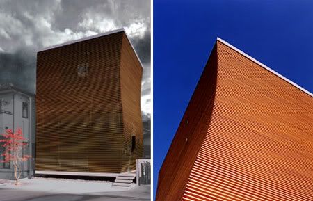
In trying to create an architectural space that establishes in its environment, the house was design & built with focused on the volumn of the small space in the particular size of its' residents of 150mm height.
House for Everybody
Location: Kusatsu City, Shiga, Japan
Status: Completion 2004

This House for Everbody is a three stories house with total floor area of less than 100m2. The site covers a rectangle area of 8m opening by 11m depth, and there was a requirement to prepare a car port on the opening, is on south side of the site, facing to 6m width street. The residents of the house are a family of six contains two household. The family member’s average height is comparatively small that is on 150cm level, so that the point of the project is focused on its volume or height of the small space in the particular human scale, and is required to establish its variation.


With these, the architects was experimenting with ways to root each space in its environment and to redefine the projct identity in response to the unique conditions of house residents.

The requirements from the client and the governing regulations that often bring a difficulty to a small project, and they compose a “condition”. Kohki Hiranuma Architect managed to grasp the achieving point that these “conditions” develop themselves into a “representation” by not receiving them as prejudiced matter but receiving these “conditions” obediently.

The house has won the Grand Design International Architecture Award , England in 2004.


via khaa

Continue reading...

Friday, April 23, 2010

Jiangsu Provincial Art Museum by KSP Jürgen Engel Architekten


The design for the museum was developed with many references to the historic urban environment that surrounds the site. Two u-shaped blocks interlock and refer to the geometry of the surrounding streets.
Jiangsu Provincial Art Museum
Design Team: KSP Jürgen Engel Architekten, Nanjing Kingdom Architecture Design Co.
Location: Nanjing, China
Status: Completion Jan 2010

Located in the cultural center of Nanjing and in the immediate proximity of the historical Presidential Palace of today's provincial capital, the new Jiangsu Provincial Art Museum is one of the most important museums in south-east China. It has space for temporary exhibitions and houses a permanent collection featuring traditional Chinese art. The museum takes up several urban references from its deeply historical location. The main entrance faces the main city square, Daxing Gong Shi Min Square. In addition, the two structures of the Museum that stand at slight angles to one another follow the two flanking thoroughfares: Zhongshan (or Revolution) Road, and Changjiang (or Culture) Road.


The space between the two blocks is a 17-metre-high open plaza inside the building, only covered by a light glass roof. The bright core of the building is surrounded by the massive presence of the two parts containing the museum rooms. One part contains display rooms of different sizes. In the second part, connected by two bridges spanning the glass-covered inner space, the 400 seat auditorium, the training, VIP, conference and office spaces are located. The museum houses a permanent collection of more than 10.000 art works and has additional space for temporary exhibitions.

The travertine natural stone facing with its narrow window indentations obscures the sheer number of storeys and as such reinforces the overall monolithic impression of the museum building. Simultaneously, the alternation between vertical stone panels and window slits with sheet metal jutting out at the sides creates rhythm in the facade.


via KSP Jürgen Engel Architekten

Continue reading...

Thursday, April 22, 2010

Municipal Theatre and Auditorium by FOA

Municipal Theatre and Auditorium by FOA

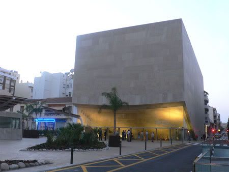
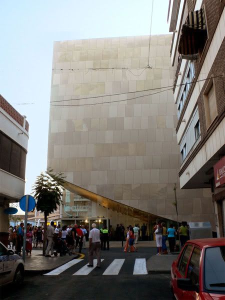
Given the scarce amount of space in the plot in respect to the required program, the design is to lifts the auditorium from the ground level, letting the plaza penetrate the plot, becoming a foyer that sits beneath the cantilevered mass of the building.
Municipal Theatre and Auditorium
Design Team: Foreign Office Architects
Location: Torrevieja, Spain
Status: Completion 2006

Torrevieja is one of the main tourist towns in south-east Spain, and it is now involved in an ambitious program of infrastructural improvements aimed at raising the profile of the town beyond its current mass tourist destination. This project is the result of a commission to implement a new urban infrastructure, a 650-seat theatre and auditorium, in a corner site inside one of the town centre blocks, and the redevelopment of a neighbouring existing plaza.

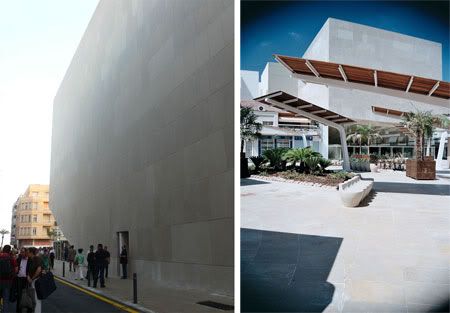
The scarce amount of space in the plot made the architects lift the auditorium from the ground level, letting the plaza penetrate the neighboring plot, becoming a foyer that sits underneath the cantilevered mass of the building. The public space becomes an incision into a solid mass, clad in local limestone, which fills the maximum volume allowed on the site, completing the blocks corner. The geometry of the auditorium has been used as the main feature of the cantilevered, stone mass; a reminder of the landscape of limestone quarries that surrounds the town.

The building has been designed as a single container where the proscenium has been made removable, allowing a seamless continuity between the audience, the stage and the scenic tower. This will provide the maximum flexibility of use of the theatre. The interior finish of the room has been designed as a system of folded planes which reflect the sound to provide ideal acoustic conditions, both for theatre and musica (performances. The crystalline geometry of the interior finish and its white color are a reference to the towns trademark salt lakes.

Municipal Theatre and Auditorium by FOA

via FOA

Continue reading...

Tuesday, April 20, 2010

Cloud Tower by next-ENTERprise


The pavilion inserts itself into the landscape and, through its topographical configuration, reinterprets formal elements of the landscape garden — the play with perspective and visual relations, with contraction and expansion, with enclosure and opening.
Cloud Tower/ Wolkenturm Schlosspark Grafenegg
Design Team: next-ENTERprise
Location: Grafenegg, Österreich, Austria
Status: Completion June 2007

In 2007, the centuries-old architectural landscape of Grafenegg was enhanced by the addition of an open-air stage, which slots into the landscaped gardens like a giant pavilion. The building, designed by architects Marie-Therese Harnoncourt and Ernst J. Fuchs of the next-ENTERprise stands in a natural hollow and harmonises perfectly with its surroundings.


The Wolkenturm is a sculpture which ranges a good 15 metres into the sky, level with the tops of the highest trees, and offers an unexpected view from a range of different perspectives. Here, on the eastern side of the park, the viewer finds a reciprocal relationship between culture and nature. Slanting, unaligned windows fill the arena with light and give an impression of natural airiness. From the seating stands, which have space for 1,730 concertgoers, the view is of the historic castle in its romantic setting.

The open-air pavilion is used as a stage during festival season in summer, and as an attraction for excursionists and flaneurs — similar to the gazebos in historical landscape gardens, which were designed as a destination or a stop-over on extended walks.


The 'Schneise' (loosely translated: an incision in the landscape) creates a vista linking the riding school to the 'Black Gate', and serves as an entrance to and a passage through the auditorium area. The staging of views and spatial sequences, the framing and hiding of points of attraction, often achieved by the meandering layout of paths in the traditional landscape garden, is a theme taken up by varying the elevation of the incision to achieve this effects. Coming from the castle, the visitor is enticed to proceed by the silhouette of the 'cloud tower', visible behind the artificial mound. Immersing himself into the incision, he tunnels through the hill and — after passing this deep narrow — enters the wide arena of the auditorium and the stage, the 'cloud tower' of the stage roof suspended above it.

The basic rule of acoustics for open-air stages, 'what you see is what you hear' serves as a cue to explore affinities between perspective and acoustic space. The topography of the existing depression - the 'Große Senke' - is amplified by modeling the terrain. Artificial hillocks are created by further excavating the depression and subsequently redistributing the soil at its perimeter. Clearly distinguished from the natural terrain by their geometry, stage and auditorium nonetheless merge fluidly with the topography of the site. The stage roof is designed as an autonomous, sculptured object. Suspended above the landscape on a level with the tree canopies, it is placed among the groups of trees as if it were one more of them. The shiny metal surface on the outside reflects the sky and the trees, turning into a cloud-tower.

The Wolkenturm was awarded the Building Prize of Lower Austria in 2007.


via next-ENTERprise

Continue reading...