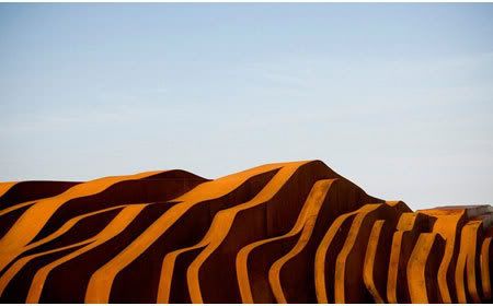
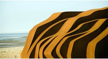
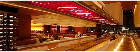
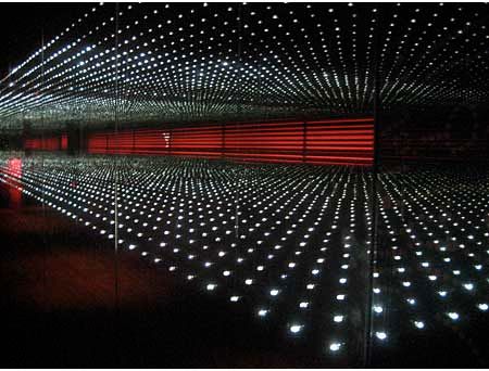
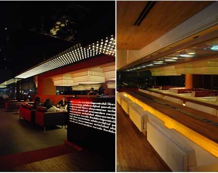
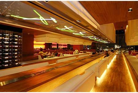
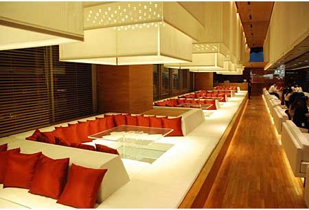
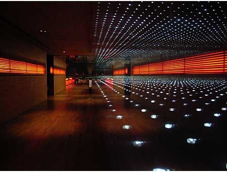
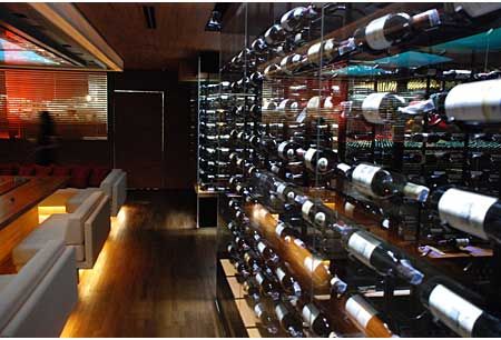
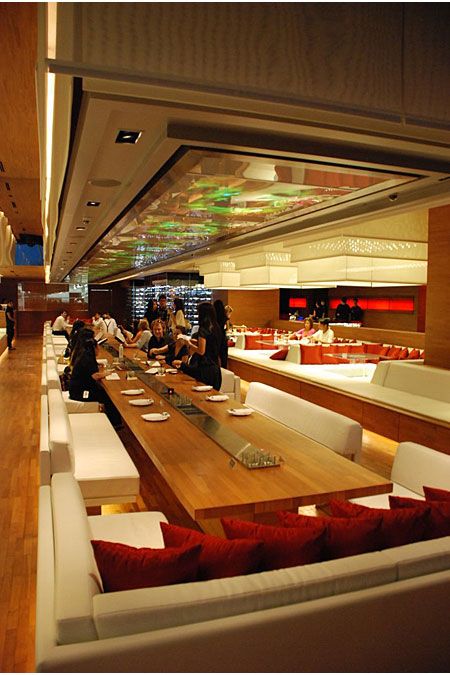
k:fem is Sweden's first pure fashion department store in a building that is specially designed solely for the fashion. It has been described as a luxurious lacquer box or as a beautiful woman dressed in white silk and veil. The interior is a heavenly light experience and in the evening the exterior is transformed into a giant lava lamp with red lacquer ceiling and large glass facade.
Design Team: Wingårdh Arkitektkontor
Location: Vällingby City, Sweden
When to visit: Anytime.
Award: World Architecture Festival 2008 - Category Winner
Fifty years after the opening of Vällingby, Sweden’s world famous New Town from 1954, works began with its resurrection. After the glorious days when children and their mothers filled the community in the outskirts of Stockholm with life, other developments gradually drained the neighbourhood unit. Less people made life difficult for the little cinema, as well as for the shops. Vällingby was in need of new blood, and the pièce de résistance of the renewal would be a new department store.
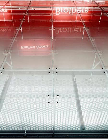
Red as a lacquer box, the construction stands as a precious object by the new entrance of the centre. With layers on layers, a sense of depth is transmitted in the façade. The milky glass gets increasingly see-through as the white dots vanish towards top and exposes the red skin behind. A cool and thin cloth on a warm body.


The building is an image of the content. A home for the fashionistas, who shall be catched like flies by light. No random additions were to disturb the tailored design. Shiny white letters in the red sky is the only exposure of the companies inside. The house is dedicated to branded fashion and just as all these brands are brought together under the huge canopy, they are brought together in one common space inside. The only detached department is the black box in the east end. As the complex continues the urban pattern from the 1950’s, a pedestrian street cuts thru the site and divides one solo retailer from the large department store. The little black as a contrast to the grand evening dress.
The complex is erected on top of the subway tracks, a site that did not exist when the project started. The main entrance is thereby facing the main access road, and the cutting edge 14-meter canopy works as a logotype for the new suburban centre. Vällingby has always been a symbol. A huge rotating letter V once marked the victory for the welfare state. The sign is still there, now as a symbol of what the place used to be. Today do the logotypes shine brightest. Shopping is the new icon.


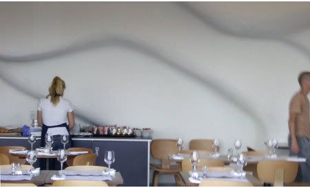
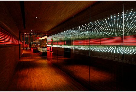
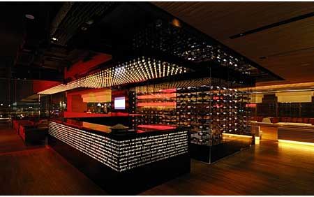
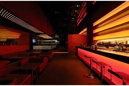
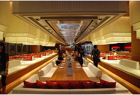
If the exterior is dressed in a red gown and white lace, the interior shows the fancy underwear. The semitransparent theme continues. A pendant ceiling transmits a diffuse light, and the white pattern on the balustrades evaporates like mist in the morning. The large opening in the core of the building opens up toward the light. To ascend the space shall be a travel to the light - as an aeroplane rising thru the clouds.

The scheme for Vällingby was simple and straightforward. Orthogonal blocks with shops on a large horizontal base, decorated with circular pattern in paving stones and fountains. These elements are all present in the plan and detailing of the new building as well. Sadly, few of the buildings got the attention originally intended. With the refurbishment of the entire area and the erection of the fashion department store K:fem, some of the original ideas have been developed further, and the new ideas adapted to the venue. Sensitive, but most of all sensual.


via Wingårdh Arkitektkontor | k:fem
Photo credits: Patrik Gunnar Helin
Continue reading...


The building is an image of the content. A home for the fashionistas, who shall be catched like flies by light. No random additions were to disturb the tailored design. Shiny white letters in the red sky is the only exposure of the companies inside. The house is dedicated to branded fashion and just as all these brands are brought together under the huge canopy, they are brought together in one common space inside. The only detached department is the black box in the east end. As the complex continues the urban pattern from the 1950’s, a pedestrian street cuts thru the site and divides one solo retailer from the large department store. The little black as a contrast to the grand evening dress.
The complex is erected on top of the subway tracks, a site that did not exist when the project started. The main entrance is thereby facing the main access road, and the cutting edge 14-meter canopy works as a logotype for the new suburban centre. Vällingby has always been a symbol. A huge rotating letter V once marked the victory for the welfare state. The sign is still there, now as a symbol of what the place used to be. Today do the logotypes shine brightest. Shopping is the new icon.


If the exterior is dressed in a red gown and white lace, the interior shows the fancy underwear. The semitransparent theme continues. A pendant ceiling transmits a diffuse light, and the white pattern on the balustrades evaporates like mist in the morning. The large opening in the core of the building opens up toward the light. To ascend the space shall be a travel to the light - as an aeroplane rising thru the clouds.

The scheme for Vällingby was simple and straightforward. Orthogonal blocks with shops on a large horizontal base, decorated with circular pattern in paving stones and fountains. These elements are all present in the plan and detailing of the new building as well. Sadly, few of the buildings got the attention originally intended. With the refurbishment of the entire area and the erection of the fashion department store K:fem, some of the original ideas have been developed further, and the new ideas adapted to the venue. Sensitive, but most of all sensual.


via Wingårdh Arkitektkontor | k:fem
Photo credits: Patrik Gunnar Helin


