Thursday, September 24, 2009

Switch by Karim Rashid

Switch Restaurant and Lounge

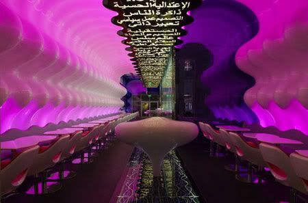
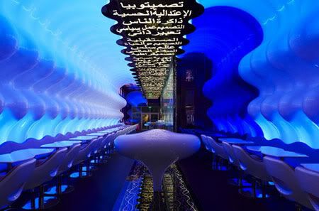
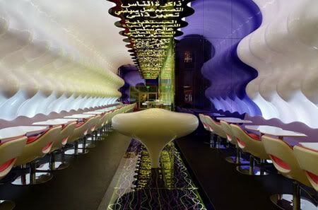
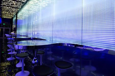
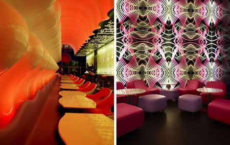
'I wanted Switch to be a strong, symmetrical soft organic womb-like space composed of a continuous, undulating wall that wraps around the entire restaurant', said Rashid.
Switch Restaurant & Lounge
Design Team: Karim Rashid
Location: Dubai Mall, Dubai, UAE
When to visit: Anytime

Switch Restaurant and Lounge is the first restaurant in the UAE designed by Karim Rashid. Switch’s main objective is to change the dining standards of Dubai. The idea behind it is to create a switch, where dining becomes once again an “experience” not just a necessity.

The Switch going to be a break from the norm. In fact, the futuristic space bears all the hallmarks of the world-renowned contemporary visionary, from the ergonomics chair and lilac lighting to the curved walls of the white, womb-like space.
Switch Restaurant and Lounge

It is a unique environment of symmetry and balance that completely envelops the guests. Every experience is composed of views, smells, tastes and sounds here. The senses create individual backgrounds for a truly amaing global dining experience. The continuous wave seating provides an efficient and dynamic operating system. In Switch, Rashid creates a powerful, clean space that offers a beautiful perspective, an oasis free from chaos.

Rashid uses the languges, iconography and geography of the GUlf region: The backlit ceiling artwork consist of stylized inspirational Arabic phrases, while the design's creates play of light and shadow is intended to evoke the sand dunes of the desert.

"My intention was to create a truly unique space for Dubai Mall that will become an iconic reference, not nly in Dubai, but also in the rest of the world" - Karim Rashid
Switch by Karim Rashid

via Switch

Continue reading...

Saturday, September 19, 2009

Nomiya Space by Laurent Grasso

Nomiya Space

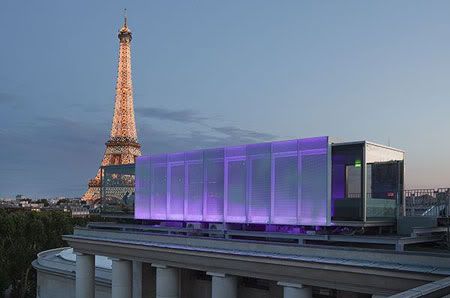
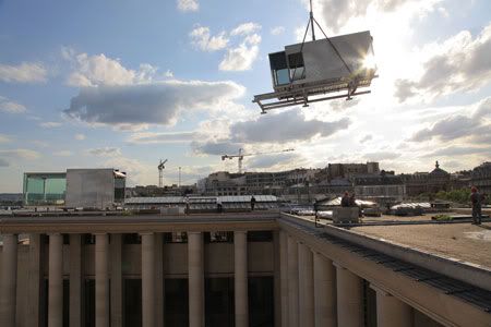
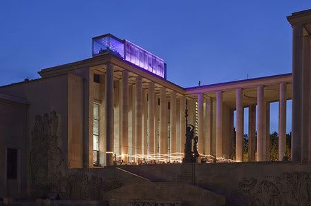
The Nomiya restaurant is replacing the Hotel Everland on the roof of the Palais de Tokyo for one year. Designed by the artist Laurent Grasso, the glass cube is part of the 'Art Home' culinary project by the Palais de Tokyo and Electrolux.
Nomiya Space
Design Team: Laurent Grasso, Pascal Grasso, Electrolux
Location: On the roof of the Palais de Tokyo, Paris
When to visit: From July 1 2009 until June 30 2010

The Nomiya concept developed for the Palais de Tokyo is a project that’s both inspired and named after the tiny Japanese bars. In the creation of Nomiya, Laurent Grasso was assisted by his brother, Pascal Grasso, an architect. Nomiya Space is a rectangular glass box about the size of a shipping container. “We tried to create an overall impression of airiness, transparency, floating,” said the French artist Laurent Grasso.

Nomiya Space
Nomiya Space
Nomiya Space

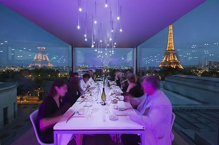
Inside the box, a dozen guests can eat lunch or dine at a communal table while taking in a spectacular view of France's capital city. Behind them is a cooking island at which a couple of chefs prepare each meal — an experimental, no-choice lineup that changes at every sitting. The chef in chief is Gilles Stassart, creator of the MAC/VAL restaurant Transversal, describes the concept as a time to relax, savour and share: “We’re proposing a brand new culinary experience in order to discover the rich multitude of stories that food has to tell us.”

Reservations, for up to 12 seats, are available one month ahead of the desired date. If you only book, say, two seats, then you’ll sit with 10 strangers, but unexpected encounters are part of the plan. This is about cooking as a kind of performance art, and eating together as an act of conviviality. “I don’t care about making a restaurant,” said Grasso. “Creating this experience, on the roof of the Palais de Tokyo, with interesting architecture and the creativity of a chef – that’s not a restaurant. It’s a work of art.”

Those who don’t manage to get a reservation can still visit Nomiya, with free tours every half hour in the afternoons.

Nomiya Space
Nomiya Space
Nomiya Space

Photos Credits: Kleinefenn
via architonic | art-home

Continue reading...

Tuesday, September 15, 2009

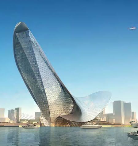
Wings Museum by AS+GG

Wings Museum by AS+GG

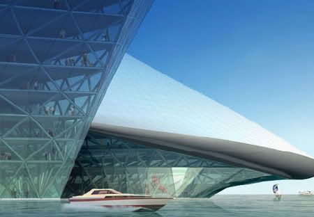
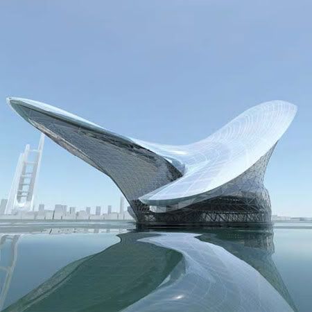
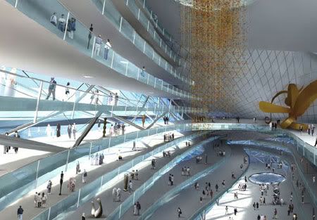
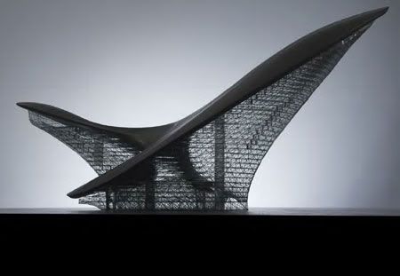
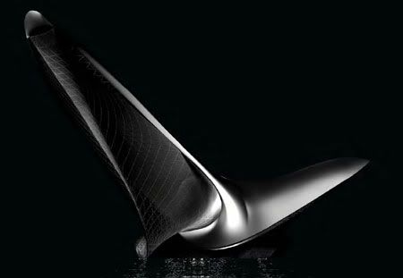
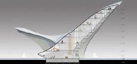
A simple but arresting image from nature—a bird skimming over the surface of a body of water—was the inspiration for this prototype of a museum on a lake or ocean harbor. With its wings unfurled as if in midflight, this powerfully poetic structure is an evocation of the natural world at its most graceful, dynamic, streamlined and ecologically interdependent.
Wings Museum
Design Team: Adrian Smith + Gordon Gill Architecture LLP
Location: Suitable for a lake or ocean harbor
When to visit: Currently a prototype only.

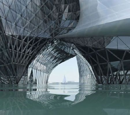
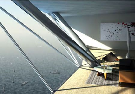
That inspiration, combined with concepts from automobile and product design, has been developed into a sculptural, asymmetrical form echoed in its interior by two great atria that feel equally organic. Appropriately, given its nature imagery, the building is highly sustainable. Covered with photovoltaic cells, the entire roof structure protects the underside of the building from the harshest sunlight. That, in turn, allows for a more transparent curtain wall, which features a graduated frit pattern based on the building’s structural geometry.

Wings Museum
Wings Museum

The elegance of the building’s form is made possible by its complex structure, which involves a system of belt trusses and large columns necessary to support cantilevers of up to 100 meters. A grid of exterior steel members is mirrored inside the building, creating a tube-within-a-tube. The interior diagrid allows the floor plan to be supported with simple spans and achieves a column-free interior space.

The tension face of the structure is reinforced by a belt truss, which occurs at each floor to resist forces that would pull the surface flat, and it provides a support edge for the long-span trusses supporting the interior atrium floors.

The building has about 1.5 million square feet of floor space, with an apex of about 200 meters.

Wings Museum by AS+GG
Wings Museum
Wings Museum by AS+GG
Wings Museum

via AS+GG

Continue reading...

Monday, September 14, 2009

The Lotus by Thinkscape Team3

The Lotus by Thinkscape Team3

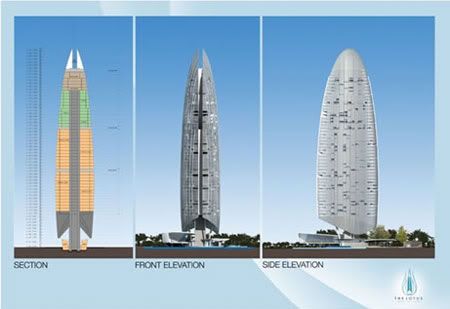
Named "The Lotus', the design was inspired by the lotus bud, a homage to centuries of local culture and history. The flower, which blossoms from mud, is symbolic of pureness and elegance.
The Lotus
Design Team: Thinkscape Team3
Location: Hanoi, Vietnam
When to visit: Under planning stage.

Hanoi, more known for its ancient and colonial history and attractions, is experiencing a highrises' boom in recent and upcoming commercial and residential developments. Among these is a luxury serviced apartment to be located possibly at the city's West Lake district, for which an international concept-design competition was organized.

The Malaysian firm Thinkscape Team3, beat competitors worldwide to win the best-of-show Special Award. Their winning design for what was to be the tallest tower in the city had impressed the judges/organisers, for its' creativity, identity, functionality, cultural and environmental relevance.

Thinkscape Team3's design of the tower - vertically divided into two halves - also represents the palms of two hands pressed together, a very Asian gesture of offering and sincerity. The equal division of the tower reflects the philosophy of balance and harmony, and its surrounding landscape the organic shapes of lotus leaves on a pond.

Instead of the cliched concrete block or glass box, the exterior of this tower consists a jigsaw of metal shutters from individual units. As each dweller open and close their respective shutters, the texture of the building evolves - thus ensuring the tower will never look exactly the same at any given time. This also mimics the lotus in a pond, which blooms and closes at different times of day. The tower will stand as the witness to the elegance of Vietnamese culture and environment. As time goes by. no matter how the lake changes, the tower will remain tall as a testament to the grace and spirit of the Vietnamese and the beauty of the West Lake.

The Lotus by Thinkscape Team3

via Thinkscape

Continue reading...

Wednesday, September 9, 2009

Masdar Headquarters by AS+GG

Masdar Headquarters

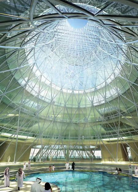
In the future, all cities will look to the Masdar Development as an example of sustainable excellence. As the center of the development, the Masdar Headquarters Building will be the benchmark of performance for the entire city.
Masdar Headquarters
Design Team: Adrian Smith + Gordon Gill
Location: Masdar City, United Arab Emirates
When to visit: Masdar City will be constructed over seven phases and is due to be completed by 2016. Masdar’s headquarters is part of phase one and will be completed by the end of 2010.

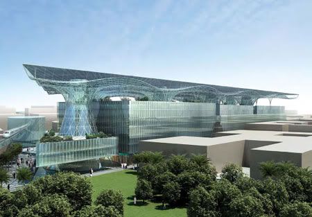
The Masdar Headquarters building will go beyond zero net energy, it will be the world’s first mixed-use, large scale positive energy building. The building will utilize pioneering, never-before-seen technology in the creation of the aesthetically astounding, functionally proficient and experientially superior development that will represent the city.

The building takes it cue from the centuries of indigenous architecture, marrying historically successful building strategies for the climate with the latest technology and innovative building systems, including some developed especially for the Masdar Headquarters.

Masdar Headquarters
AS+GG

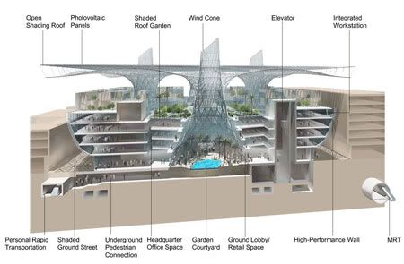
The design, which includes numerous systems that will generate a surplus of the building’s energy, eliminate carbon emissions and reduce liquid and solid waste. The complex will utilize sustainable materials and feature integrated wind turbines, outdoor air quality monitors and one of the world’s largest building-integrated solar energy arrays. Compared with typical mixed-use buildings of the same size, the Headquarters will consume seventy percent less water.

Modern wind towers, one of the building’s references to traditional Islamic architecture, are the basis for a number of features in the complex design. They act as wind towers, exhausting warm air and naturally ventilating the building, as well as bringing cool air up through the subterranean levels of the city below.

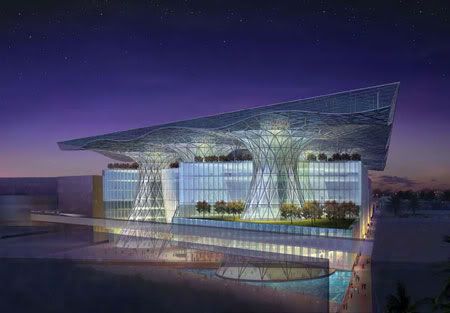
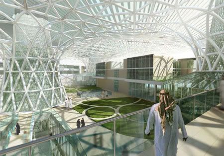
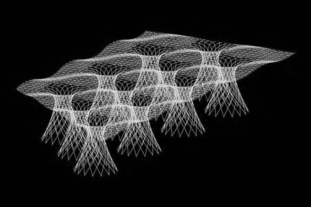
The cones maximize natural daylight throughout the building; the operable windows on the cones allow occupants the option of naturally ventilating interior spaces. Structurally, cones support the building’s roof and allow for the creation of a shaded ground plane on the top of the building. Spatially, they create garden courtyards at the public realm which have pools of light and water.
Each courtyard is programmed differently, providing amenities and public space for occupants. The building is designed to be sustainable and efficient from the beginning of construction. The building cones and roof can be built first, creating a shaded micro climate for the remainder of the construction. The roof, covered with photovoltaic panels, will provide enough power to build the rest of the building.

The building includes office and residential spaces, retail and public gardens, as well as a prayer hall and direct access to the city’s transportation systems.

AS+GG
Masdar Headquarters
Masdar Headquarters
AS+GG

via AS+GG

Continue reading...

Friday, September 4, 2009

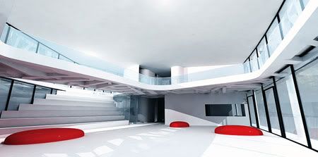
westerdals school of communication by MMW Architects

westerdals school

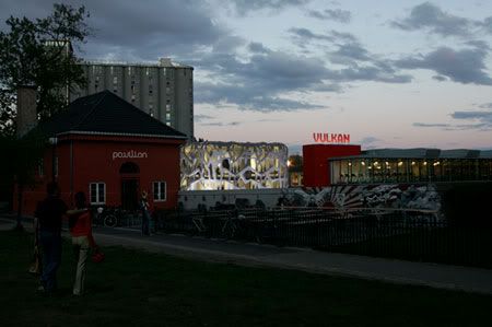
The soft curves represent the dragon in the legend that was said to be living in the old silver mines behind the site.
Westerdals School of Communication
Design Team: MMW Architects
Location: Oslo, Norway
When to visit: Project unrealized

MMW used the history in the area around the site as inspiration for the design. The idea is to have the school as a new focal point in the area surrounded by historical buildings and old industry, representing the creativity of the school.

MMW Architects
westerdals schoolMMW Architects

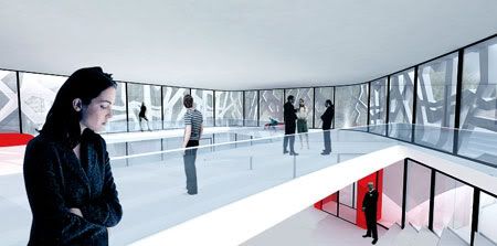
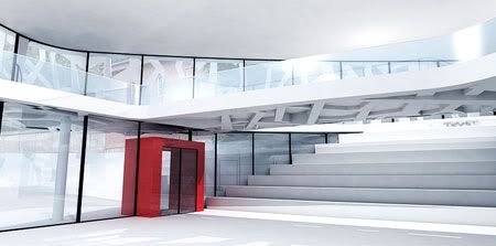
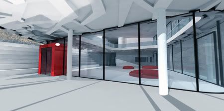
The main structure is the concrete load bearing façade, with elevator shafts and staircases as the only load bearing elements inside the building. The concrete in the façade is prefabricated elements with the size 2.400 × 5.200mm. The choice of materials is based on the idea of establishing a building with passive cooling and heating. The exposed concrete on the façade and on each level has thermal mass.

It is designed to house 550 students and about 60 employees with a total floor area of 6032m2.

westerdals school
westerdals school
MMW Architects
westerdals school

via MMW

Continue reading...