Friday, May 21, 2010

Pearl Academy of Fashion by morphogenesis


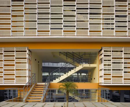
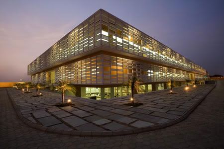
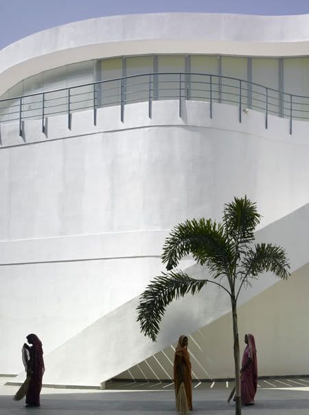
The building is protected from the environment by a double skin which is derived from a traditional building element called the ‘Jaali’ which is prevalent in Rajasthani architecture.
Pearl Academy of Fashion
Design Team: Morphogenesis
Location: Jaipur, India
Status: Completed 2008

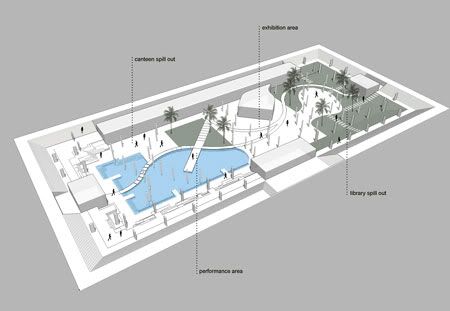
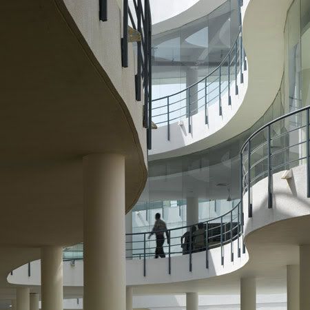
The Pearl Academy of Fashion, Jaipur is designed as a low cost, environmentally sensitive campus, first of its kind in India. The design creates a series of multifunctional spaces which blend the indoors with the outdoors seamlessly. Many elements of this thermally adaptive environment borrow from the tradition of passive cooling techniques prevalent in the hot-dry desert climate of Rajasthan.
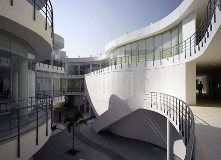


Environmental design is also employed as a strategy to lower energy costs in the long run. Passive climate control methods reduce/eliminate the dependence on expensive mechanical cooling and heating methods in a state with scarce resources. The design takes two almost inviolable Rajasthani architectural motifs and gives them a contemporary twist: the stone screen known as the "jaali" and the open-to-sky courtyard.

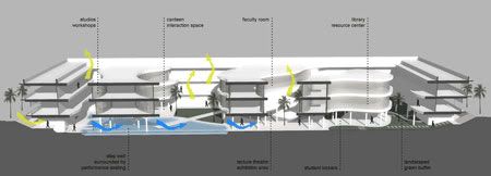
A double skin based on the 'jaali' acts as a thermal buffer between the building and the surroundings. The density of the perforated outer skin has been derived using computational shadow analysis based on orientation of the façades. The screen situated four feet away from the wall reduces the direct heat gain. Drip channels running along the inner face of the screen allow for passive downdraft evaporative cooling, thus reducing the incident wind temperature.
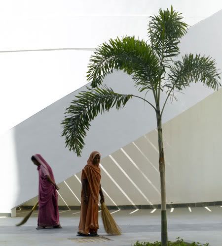

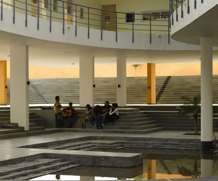
The traditional courtyards take on amorphous shapes within the regulated form of the cloister-like periphery. The shaded courtyards help control the temperature of internal spaces and open step-wells, while allowing sufficient daylighting inside studios and classrooms. The entire building is raised above the ground. The resultant scooped-out underbelly forms a natural thermal sink by way of a water body. The water body which is fed by the recycled water from the sewage treatment plant helps in the creation of a microclimate through evaporative cooling. This underbelly, which is thermally banked on all sides, serves as a large recreation and exhibition zone. Passive environmental design helps achieve temperatures of about 27 degree Celsius inside the building even when the outside temperatures are at 47 degree Celsius. During the night, when the desert temperature drops, this floor slowly dissipates the heat to the surroundings, keeping the area thermally comfortable.

Materials such as local stone, mosaic flooring with steel, glass and concrete help meet the climatic needs of the region while retaining the progressive design intent, keeping in line with the aims of the institute. It promotes rainwater harvesting and wastewater re-cycling through the use of a sewage treatment plant. While it has become a successful model for cost-effective passive architecture in desert regions, the design and facilities of the campus complement the ideology of the Pearl Academy of Fashion - a cutting edge design institute with a sustainable approach.
Continue reading...

Wednesday, May 19, 2010

Safe Haven Bath house by TYIN Tegnestue


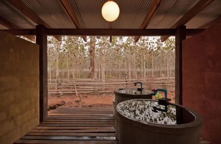
In order to leave the locals useful model for future construction, the project were highly localized, built with the help of locals, using locals materials and based on local traditional methods.
Safe Haven Bath House
Design Team: TYIN Tegnestue
Location: Ban Tha Song Yang, Thailand
Cost: 3300 USD
Status: Completion 2009

TYIN Tegnestue is a non-profit organization working humanitarian through architecture. TYIN is run by five architect students from NTNU and the projects are financed by more than 60 Norwegian companies, as well as private contributions.

The Safe Haven Bath house is a community project done by TYIN for Safe Heaven Orphanage, which is located at Northern Thailand.   Safe Heaven Orphanage houses 49 children that is care by a fantastic woman, Tasanee Keereepraneed, a Karen origin.  While all the children come from different places, one thing they all have in common is their Karen heritage. ( The Karen or Kayin, are a group of ethnic peoples who reside primarily in southern and southeastern Myanmar. The Karen make up approximately 7 percent of the total Burmese population of approximately 50 million people. A large number of Karen also reside in Thailand, mostly on the Thai-Burmese border. Source: Wikipedia)


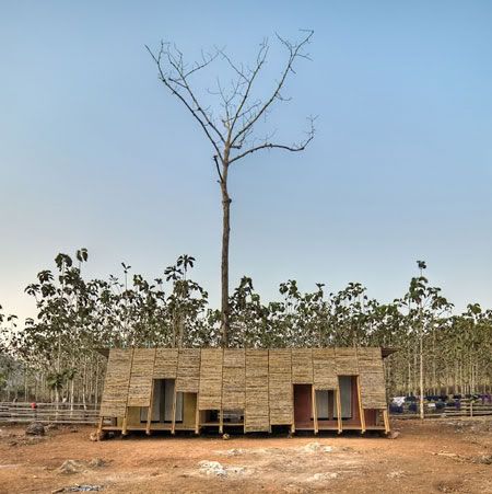
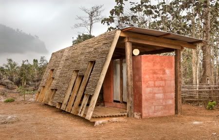
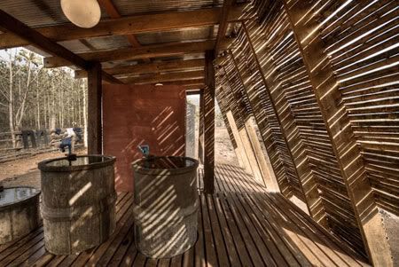
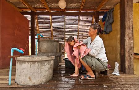
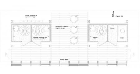
The new bathhouse covers basic needs like toilets, personal hygiene and laundry. A simple structure was already built and became the framework for the project.The most intimate functions are located in the two separate parts of plastered concrete blocks. In the central area you find a space for bathing that opens up towards the vast teak plantation. The bathing area is only partly privatized, adapted to Karen culture. A tilted facade of bamboo covers the front of the building and creates a passage, tying the functions together.

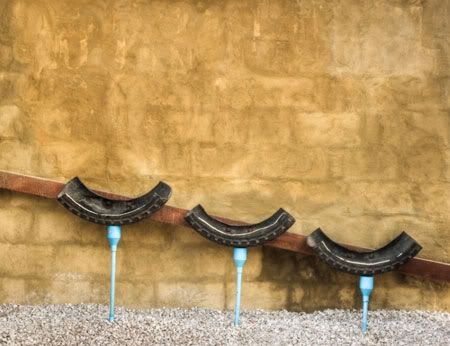
A great challenge in this project is that sewage and drainage had to be dealt with on-site and handle large amounts of water during the rainy season. The waste from the toilets passes through pipes into buried. Concrete tanks that are drained from the bottom and sides. Gravel and wooden floors are easy to keep clean and dry, and all wet rooms are drained by using layers of stone and gravel.


The existing sanitary facilities at Safe Haven Orphanage, as well in the district in general, are narrow, dark and have concrete flooring that accumulates water and dirt. With this bathhouse TYIN has tried alternative solutions that hopefully will be an important asset in the future development in the district. The climate of northern Thailand makes good personal hygiene essential to prevent diseases, especially for small children. With this bathhouse TYIN wanted to create well functioning and dignified facility for personal hygiene.


Continue reading...

Sunday, May 16, 2010

Villa Astrid by Wingardh Arkitektkontor


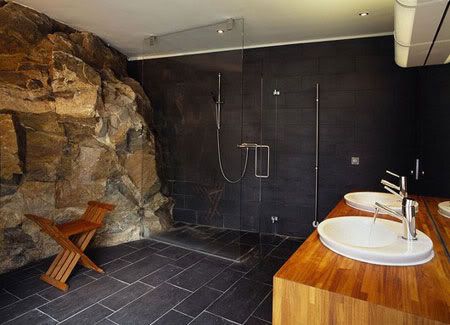
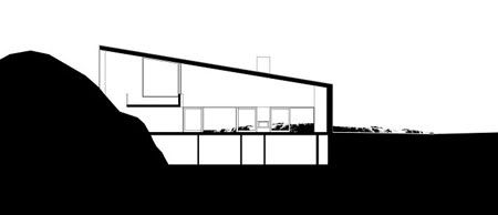
The difficulties of the site, is the oblique angle of the steep cliff to the view, and a huge rock that was incorporated into the design of the resort house.
Villa Astrid
Location: Gothenburg, Sweden
Status: Completed 2005

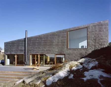
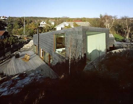
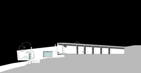
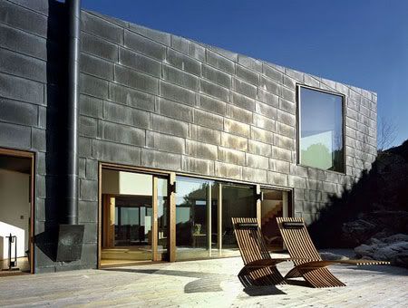
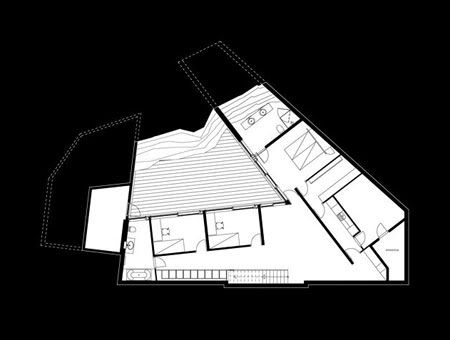
Located at the scenic West Swedish landscape, the Villa Astrid was tucked between two houses and consisted mainly of rugged and fairly steep rock. The detailed plans was dictated by the local building code, which stipulates a maximum 3.5-metre eaves height and a roof slope of 14 to 27 degrees. With the client requirement of a two-storey building, the answer was to sink the upper floor.


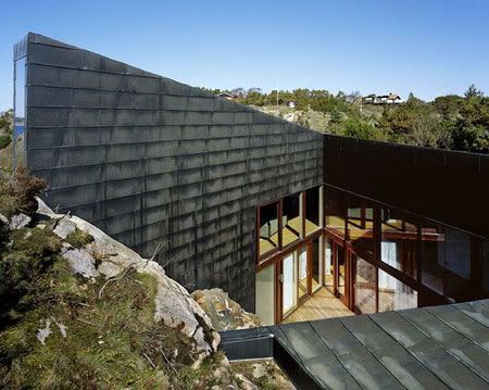
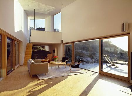
Villa Astrid is low and light, standing there beneath a large pine tree at the end of a small lane. There is a car port and a storage room to the left and you enter the building through the only entrance in the otherwise solid gable end. The sunken atrium courtyard makes an astounding impression as you step inside. What appeared to be a low building suddenly becomes three storeys high.


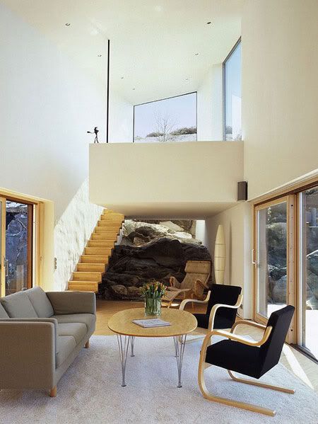
The rock with which it is united is exposed indoors and forms a wall of the deep courtyard admitting daylight to the reception rooms on the ground fl oor. At the same time the social and working rooms on the upper floor focus on the view, imparting a twist to the building – a contrapposto like a human fi gure with the hips and shoulders in slightly different directions.

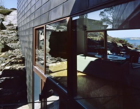
Villa Astrid has an open-plan kitchen, a separate dining room and a large lounge nestled between the atrium and a sea view with the afternoon sun and sunsets. The latter are the reasons for the twist of the house. At the end of the space, there is a work shelf raised one floor above the cascading rock. The gable end facing the rock is mainly a huge insulated glass window that has been sunken into a seam-drilled slit in the rock. The floor below has two children’s bedrooms, a living room and the parents’ bedroom. Swing-sliding doors and insect-proof ventilation openings provide direct contact with the outside in all these rooms.


The roof is made of cast-in-place concrete, insulated with Foamglas and then clad with metal sheeting. The walls have been built in solid, light-weight concrete, plastered on the inside and outside, and then clad with metal sheeting. The black, pre-patinated, copper sheets will slowly become verdigrised. Released copper ions are bound by limestone gravel around the base of the building. It is pure and requires no maintenance.


Continue reading...

Bucky Bar by DUS Architects

Bucky Bar by DUS Architects

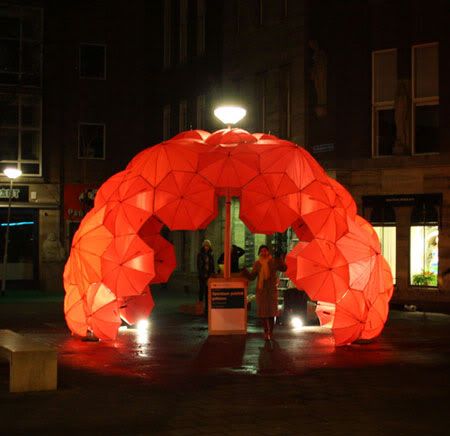
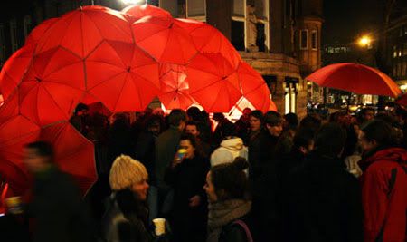
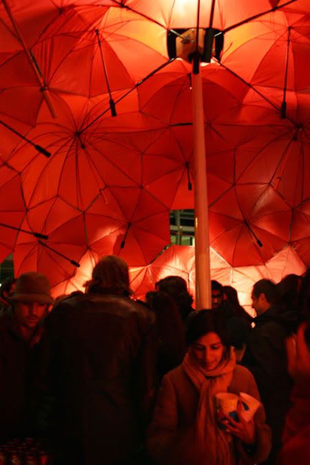
Bucky Bar is a spontaneous street party, a temporary public building designed by DUS architects. The dome-bar, entirely made of umbrella's, appeared seemingly suddenly out of nowhere on the street around a lamppost in the centre of Rotterdam.
Bucky Bar
Design Team:
DUS Architects
Location: Rotterdam, Netherlands
Status: Built 19 Feb 2010, dismantled at 2.00am

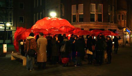
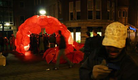
Visitors were asked to show up with an umbrella to contribute to the spontaneous building at an outdoor location on a Friday night in Rotterdam, NL. With the help of a team of architects, the umbrellas were then used to build a fully equipped bar, complete with DJ and drinks. Exactly at 10 the party started in full swing, and old and young, architects and coincidental visitors danced together despite the cold. Umbrellas were attached to each other into one big shelter, so even a bit of rain didn't kill the party.

300 people turned up at the event, and just as it began, the beautiful building ended its life spontaneously when the Police showed up at 2:00 AM to ended the party as there was no permit.

The Bucky Bar is part of a series of 5 unsolicited positive advises for the city, that DUS architects in a collaboration with SUA (Studio for Unsolicited Architecture) pasted onto billboards of existing building signs in the centre of Rotterdam.

Bucky Bar by DUS Architects

The Bucky Bar was first in the series and realized on 19 February 2010. A spontaneous public building made from the most common of materials: an umbrella. As Buckminster Fuller showed us how minimal energy domes could open a way to a more environmentally sustainable future, could an umbrella dome lead the way to a more socially sustainable future? The Bucky Bar is a full-scale model of such a future. It shows the power of space for spontaneous gathering, for improvised shelters to host conversations, debates, games or even parties. Quote of the night: "when is the next party?!".

Bucky Bar is a project by the DUS Architects and the Studio for Unsolicited Architecture, produced to coincide with the opening of the Architecture of Consequence exhibition at the Netherlands Architecture Institute (NAi).

Bucky Bar by DUS Architects

via DUS Architects

Continue reading...
Wednesday, May 12, 2010

De Boogjes by Mecanoo Architecten


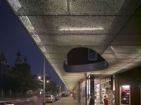
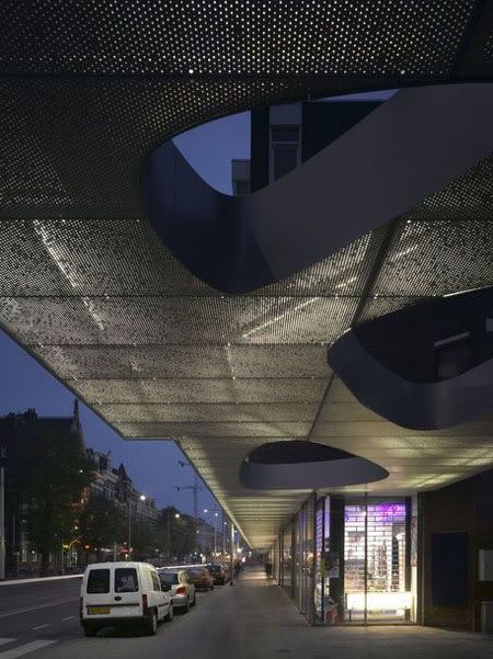
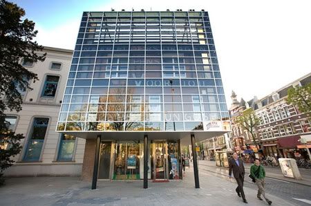
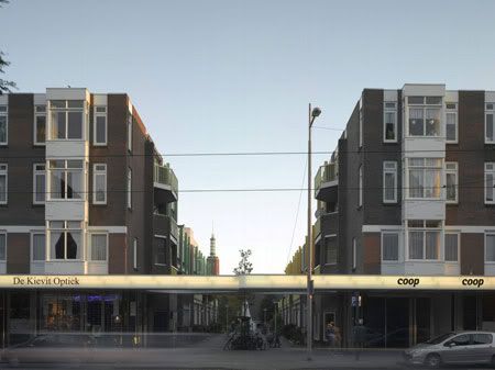
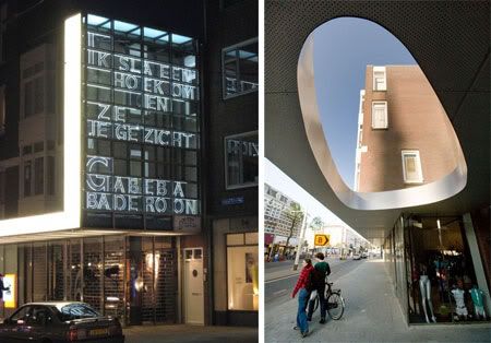
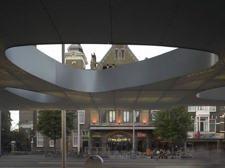
The shops also acquire an awning, which at the two ends of the street is raised up vertically in the form of bookends. This serves to create a grouping of the four blocks and enabling the complex to present itself again as a single entity. The two bookends display a changing selection of poems administered by Poetry International Rotterdam, using separate white letters behind glass.
De Boogjes
Design Team: Mecanoo Architecten
Location: Rotterdam, Netherlands
Status: Original building completion 1979; Redevelopment completion 2007

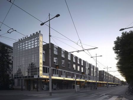
‘De Boogjes’ is a group of buildings designed by the architect Hammel and built in 1979. It is located in the centre of Rotterdam on the Nieuwe Binnenweg and consists of four building blocks comprising shops on the ground floor with three floors of apartments above and the Hotel Emma at the end of the street where it meets the Eendrachtsplein. The four blocks have characteristic arcades at ground level, whereby the shops are set back from the front elevation. These are ‘De Boogjes’ [The Arcades] from which the group of buildings derives its name. Not long after it was built, however, the concept of arcades not only failed to work but even elicited petty crime. The arcades are too low with a large number of columns that are much to wide so as to create uneasiness for the shopping public.


In 2001 the Association of De Boogjes Owners took the initiative to find a solution. Mecanoo decided to demolish the arcades and to bring the storefronts forward by 2.60 metres. The shops in turn gain more window space and the pavement is shifted towards the street. Mecanoo’s design is rendered in highly contrasting materials. The existing complex is built entirely from masonry, concrete ornamentation and wooden window and doorframes. The ceiling of the awning is made of unpainted perforated aluminium panels. The names of the shops are applied to the opal glass on the front of the awning.


Continue reading...
Tuesday, May 11, 2010

House in Romeirão by ARX Portugal Arquitectos


Our architecture doesn't follow a lexicon or a stabilized language. In every new project we try to find the "vocables" for a specific language to the new context. As in the House in Romeirão, the site's natural beauty dictated the entire house design.
House in Romeirão
Location: Romeirão, Ericeira, Portugal
Status: Completed 2003

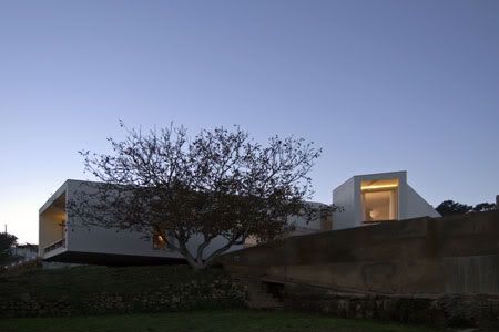
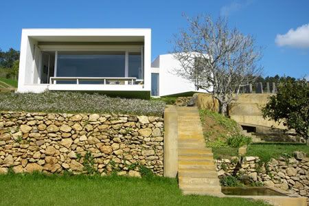
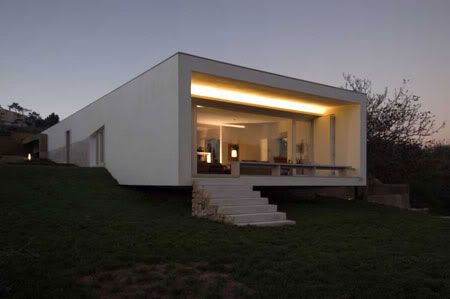
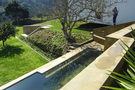
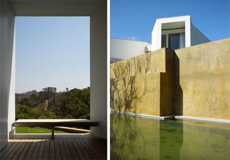
The site has a strong rural character, with small plantations, orchards and pathways limited by roughly made stone property walls and, once in a while, houses, scattered in the landscape.  It is a steep slope facing south over the valley, furrowed by a small river and a mountain in the background. While the upper half of the site is ramped, the lower is built in steps. In the transition between both two clear references became the starting point for the project: a walnut tree and a watering tank.

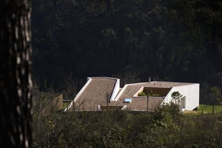
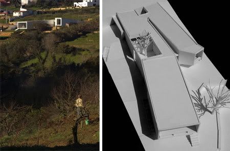
The first site visits immediately suggested a volume lying on the slope, facing the entrance walkway and sheltering the house from the neighbours while opening the interior views to the southern valley.  The house develops in an intimate relation with the ground, penetrating it as the slope increases and eventually becoming part of the mountain where one can walk; then it is displaced while descending, reappearing on the slope.


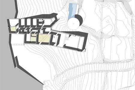
A long volume was then drawn, like a line bent over itself and over the water tank and the tree. Between those elements the primary exterior space was created.  Along the house courtyards were excavated building spaces of intimacy and peace, generally lacking in an overexposed context: the entrance courtyard, the guestroom courtyard and the one of the corridor.  The edges of this tubular form bifurcate interacting in different ways with the exterior: the end of the main room is narrow and high overlooking the eastern valley; the wide and low end of the living room is suspended over the southern valley.

The private area of the house is serviced by an austere corridor whose ends represent opposite realities: the northern one opens to an intimate courtyard dug on the ground whilst the southern one opens to vast landscape, with the walnut tree in the foreground and the mountain in the distance.


via ARX

Continue reading...