Tuesday, December 29, 2009

Encants market by b720 Arquitectos

Encants market

Encants market is an initiative to accomodate all commercial activities and improve the mobility, the public transport system and the management of equipments in the area.
Encants market/ Mercado de Els Encants de Barcelona
Design Team: b720 Arquitectos
Location: Barcelona, Spain
When to visit: Expected completion 2011

b720 Arquitectos has won the design of a new Encants market from the City Council of Barcelona. The new Fira of Bellcaire market, better known as Encants Vells of Barcelona, will be located in the zone of Bosquet and its transfer is one of the pieces that will facilitate the unfolding of the modify of the Metropolitan General Plan in the Glories area.

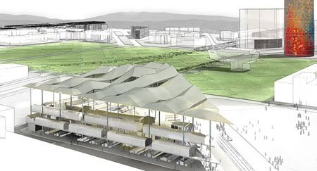
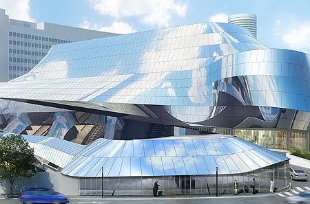
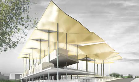
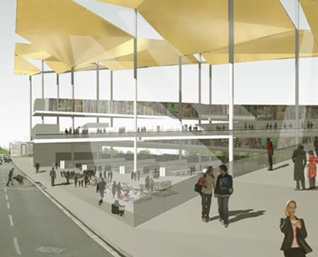
The new Encants market is installed as a device to mediate between the reform of the Glorias square and the axis of Meridiana, an area popularly known as the Glories of Bosquet. The b720 proposal raises a platform (or commercial square) at various levels as a continuous surface suitable for all commercial activities. By bending the platform, the different levels of the street are reconciled, understanding the market as a large square deck, capable of instilling activity in all parts of the program.
Encants market

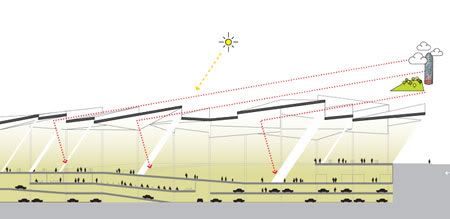
The new facility, defined as “functional, open and future”, tries, from a structural point of view, for protecting the business of inclement weather under their deck, but always retaining a sense of buying outdoors. The commercial solution proposed (shops and auction) will be located primarily at the street level and will not be placed under any building other than its own deck, which will form an open commercial space with a main façade to the Meridiana avenue and the Glories square.

The remaining business that has the market (formed by the other shops that are not at the street level) and the new supply and services that may have (restaurant, play centres, offices, multipurpose rooms…) would be located over this zero level while preserving the sense of buying street. The project includes an underground car park with capacity for about 300 cars, loading area, storage area, locker, offices and other auxiliary services.

The cover, the principal component of urban recognition, protects commercial activities and reflects the city inside the market. Each modular structure will have different inclinations to reflect light, atmosphere and landscape.
b720 Arquitectos
b720 Arquitectos

via b720

Continue reading...

Tuesday, December 22, 2009

Birmingham Gateway by Foreign Office Architects

Birmingham Gateway

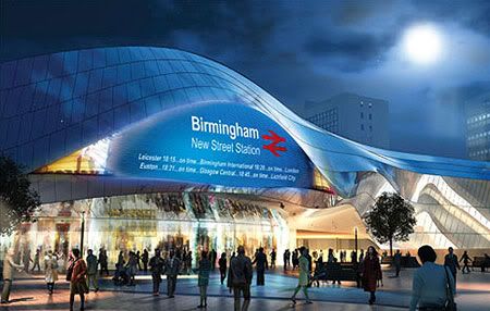
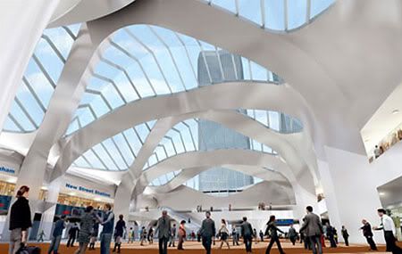
The design was inspired by the movement of people and trains at New Street and the beauty of the skyline.
Birmingham New Street Station /Birmingham Gateway
Design Team: Foreign Office Architects
Location: Birmingham, UK
Cost: £598m
Status: First phase 2012, Second phase 2015

Foreign Office Architects beat more than 40 competitors to design the Birmingham New Street Station replacing the old station that has long been criticized for its outdated concrete appearance, lack of natural light and passenger congestion. The Birmingham New Street Station is an important transport hub and a key aspect of the city's public realm. As the first impression of Birmingham to a large influx of visitor, the newly design transport hub will will support over 52m passengers a year when operate.
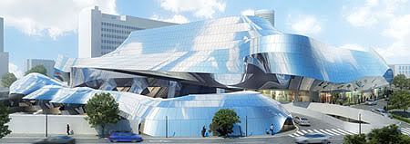
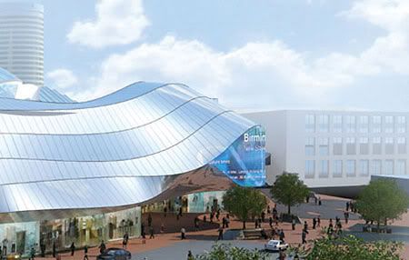
In the new station, the distortion of perception produced by movement will be used in a similar way to the Doppler Effect's distortion of sound - by transferring the undulating, smooth forms of the track field into the geometry of the building, the design will distort the perception of the stations urban setting.The building is enclosed in a reflective screen which climbs the fee and wraps around the building. The concept for this envelope is simple: to clad the station in Birmingham Sky, crowds of people and trains. By turning this external rainscreen into a warping, reflective stainless steel surface the station will produce a controlled reflection of the surrounding urban field, tilting to avoid the reflections of surrounding buildings and shaping itself to reflect instead the famously cloudy Birmingham Sky, the moving crowds of passengers and the trains entering and exiting the station as the clouds pass over the buildings skin. This smooth, curved geometry, the buildings use of bifurcation as a formal system and its distortion of perception will combine to generate its identity.

Birmingham Gateway
Birmingham Gateway
Birmingham Gateway
Birmingham Gateway

via boxercreative

Continue reading...

Thursday, December 17, 2009

Fuji Kindergarten by Tezuka Architects

Fuji Kindergarten

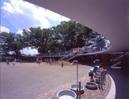
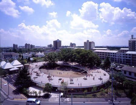
A novel kind of kindergarten, the Fuji Kindergarten is a work that opens a completely new paradigm for school architecture. This building has been created as a huge piece of play equipment with the scale of a child and without any walls or corners.
The Roof House/ Fuji Kindergarten
Design Team: Tezuka Architects, Kashiwa Sato
Location: Tachikawa, Tokyo, Japan
Status: Completion 2007

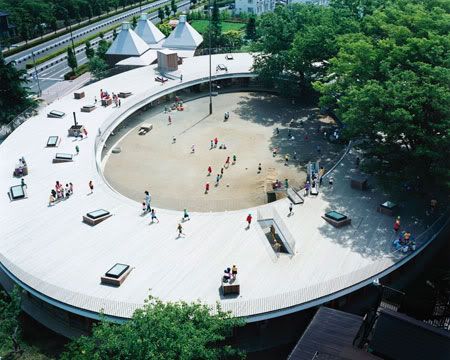
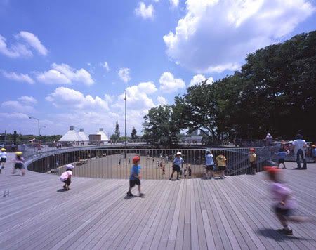
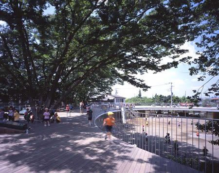
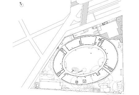
Designed by husband and wife architects Takaharu and Yui Tezuka, Fuji Kindergarten’s most immediately captivating element is indeed its circular orientation. The large one-story halo-shaped building has an 183m outer circumference, and an inner circumference of 108m. This ring works not just on a symbolic or aesthetic level but on a practical level, whereby the central courtyard becomes a meeting point for the various groups that inhabit the kindergarten, generating a designed system of communal togetherness in a very exact manner.

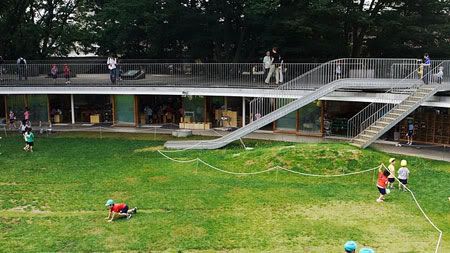
Created in the scale of a child, ceiling heights are restricted to 2.1m. This stresses an extremely close relationship between the ground level and the rooftop, and has been an influential factor encouraging the children to explore without inhibition. Pupils often mingle and meander between the rooftop and central garden, which like many elements of the design consistently facilitate important lessons in self-discovery.

Tezuka Architects
Fuji Kindergarten
Tezuka Architects

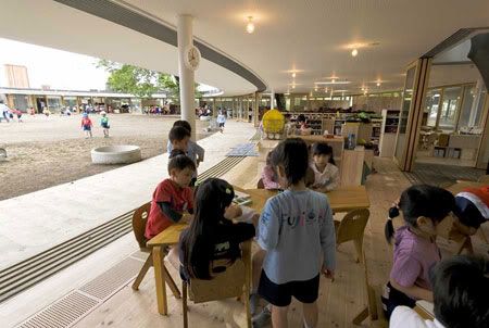
Main functions of the kindergarten are found underneath the oval roof (where children frequently run around in the hundreds). To promote social skills and the removal of hierarchical structures, the kindergarten’s interior environment is devoid of walls. Rooms are divided casually by light-weighted stacked furniture that children can easily reconfigure. Noteworthy is the decision to make use of naked light bulbs. Although not as proficient relative to fluorescent, this choice teaches children about the way light is produced. Strings attached to each light – used to switch on and off – demonstrate the nature of cause and effect.

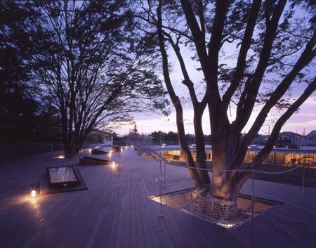
Each classroom is fitted with individual skylights, allowing for the natural sun to seep in, and the curious addition of rope ladders. Pupils playfully use these ladders to access the rooftop. Likewise, three large existing zelkova trees have been cleverly incorporated to serve a trio of purposes: foster respect for nature; provide yet another option for ascending the facility; and eliminate psychological barriers between inside and out. Physically, the existing barriers are composed of glass panels that run along the inner and outer perimeter. The panels swing open for the better part of the year, and again, eases the transition between classroom to outer grounds.

Fuji Kindergarten
Tezuka Architects
Tezuka Architects
Tezuka Architects
Fuji Kindergarten
Fuji Kindergarten

via monocle

Continue reading...

Monday, December 14, 2009

Great (Bamboo) Wall by Kengo Kuma

Great (Bamboo) Wall

...our intention was to apply the nature of the Great Wall to the act of dwelling. This is why the house is titled 'WALL', instead of 'HOUSE'...
Great (Bamboo) Wall
Design Team: Kengo Kuma and Associates
Location: Beijing, China
Status: Completion April, 2002

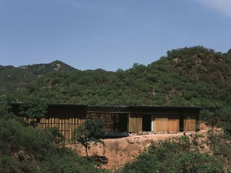
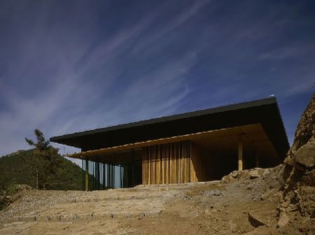
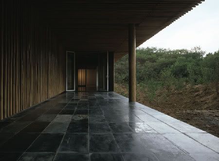
Kengo Kuma's bamboo Wall in the countryside near Beijing is breathtaking. It manages to express the perfect synthesis between architecture and the land, between human intervention and the work of nature, with rare poetry.

It is a statement of feeling, of very great and very delicate sensitivity. It is a building that listens to the land around it, and this is the source of its beauty. The project is part of a wider-ranging programme implemented in 2002 with the participation of 10 Asia's best-known architects - including Yung-Ho Chang, Shigeru Ban and Gary Chang - for construction of ten villas each, creating a commune of one hundred dwellings in a forest adjacent to the Great Wall of China.

Great (Bamboo) Wall
Great (Bamboo) Wall
Great (Bamboo) Wall

Kengo Kuma says that he was inspired by the form of the Great Wall in this project. He explains that he was attracted by its route, by the way it runs almost endlessly along the ridgeline and establishes an indissoluble link with it. The Great Wall, built by human hands, has never been an isolated object. The formal quality of it running almost endlessly along the undulating ridgeline without being isolated from the surrounding environment.

The idea of integration, of fusion of architecture and land - which Kuma says is perfectly embodied by the Great Wall - guides the plan for the Great (Bamboo) Wall House: "(...) our intention was to apply the nature of the Great Wall to the act of dwelling. This is why the house is titled 'WALL', instead of 'HOUSE'".

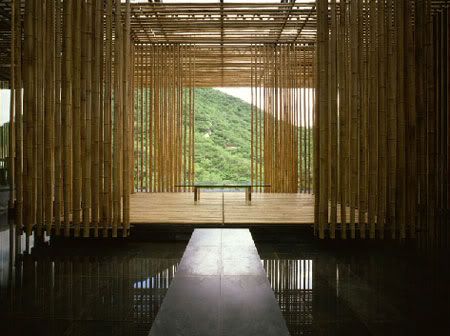
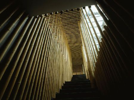
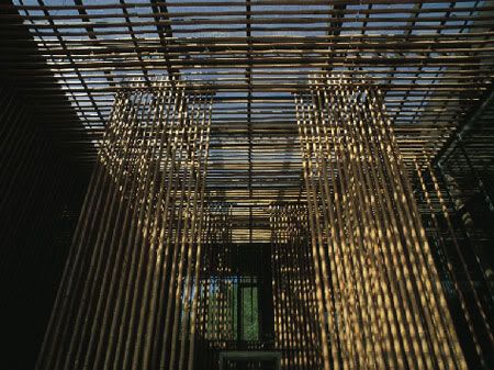
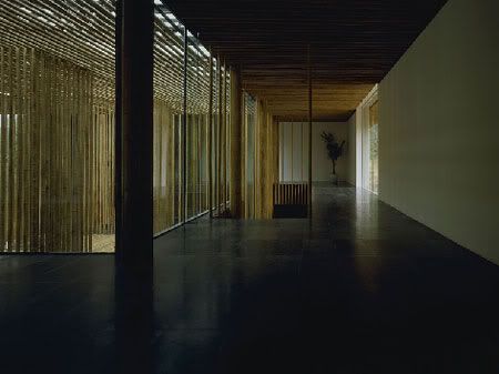
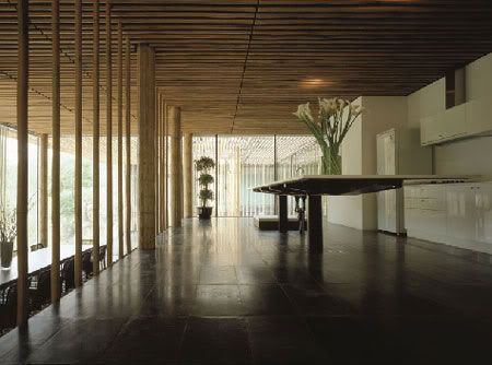
As for the material, bamboo was used as much as possible, since it’s considered as having a significant meaning among Chinese and Japanese cultures. Depending on density of bamboo and its each diameter, it offers a variety of partitioning of space. Indoors, the material encloses the stairwell and living spaces to great effect. Positioned side by side at varying intervals, bamboo shoots seem to hover above the floor, creating breezy, floating partitions. The Eastern simplicity of the décor creates an ethereal, meditative atmosphere informed by subtle changes in the weather and landscape.

Kengo Kuma
Kengo Kuma
Kengo Kuma
Kengo Kuma

via Kengo Kuma

Continue reading...

Wednesday, December 9, 2009

Melbourne Convention Centre by Joint Venture Architects Woods Bagot and NH Architecture

Setting new world benchmarks as the first convention centre to be awarded the highest ‘6 Star Green Star’ environmental rating by the Green Building Council of Australia. The Melbourne Exhibition Centre is the greenest convention center in the world.
Melbourne Convention Centre
Design Team:
Joint Venture Architects Woods Bagot and NH Architecture
Location: Melbourne, Victoria
Status: Completion 2009
Cost: $350m

NH Architecture, in joint venture with Woods Bagot, aimed to create a public building that belongs to Melbourne, rather than the typical convention centre stereotype that looks like a modified sports stadium.

The triangular design of the new Melbourne Convention Centre gives the cityscape a new feature on the banks of the Yarra River. The distinctive 18 metre high glass façade gives passers-by a glimpse to activity within the centre and creates a foyer full of natural light, as well as offering views out across the Yarra River to the city beyond.


The team has also met the challenge of integrating the new Centre with the existing Exhibition Centre, while attempting to create a building with its own distinct identity. The two buildings are linked via an enclosed glass walkway, becoming the largest exhibition and convention facility in the southern hemisphere. The roof is a vast, seamless expanse and its exciting geometry makes for spectacular angles and sweeping planes from any vantage point. The total area of the roof is 20,000m2 , each side being 200m long. The design also exceeds the Government’s brief for a 5,000-seat divisible plenary hall. The Gala seating offers maximum flexibility allowing 2 or 3 events to take place concurrently with spaces set up in differing configurations. “It was a complex problem,” says Hamish Lyon of NH Architecture. “We traveled the world and saw 5,000 seat halls and divisible halls but none that combined the two.” Ultimately, the team has created an innovative and successful design solution which includes a deluxe hotel with restaurants and cafes; a banquet hall for up to 1,500 diners with a spacious pre-dinner cocktail balcony; 32 meeting rooms, and a ground foyer able to cater for 8,400 guests.


via greenerbuildings

Continue reading...

Sunday, December 6, 2009

Mi Casa VolB Showroom by Marcio Kogan

Marcio Kogan

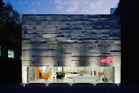
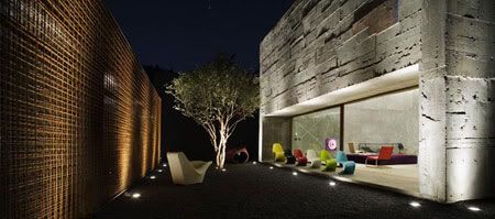
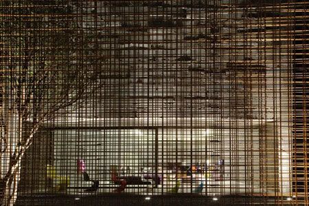
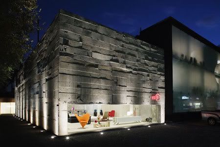
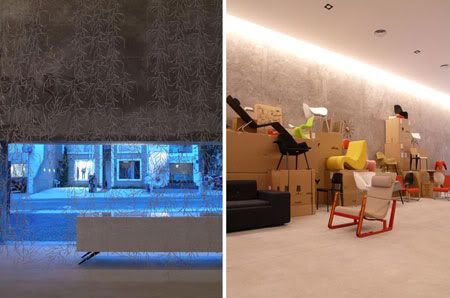
The building is free of detailing, the raw concrete is visible throughout, with even the construction workers' chalk markings left intact inside. One of the facade is an expose steel frame, that normally used to reinforce concrete.
Mi Casa VolB
Design Team: Marcio Kogan Architects
Location: Sao Paulo, Brazil
Status: Completed May 2007

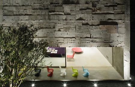
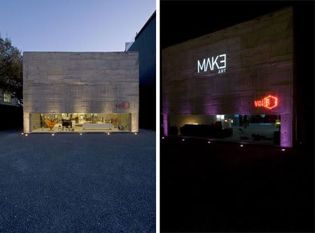
This Mi Casa VolB showroom is an annex to the existing modernist store. A small tunnel connects the entrance with the showroom of the initial store, and is installed perpendicularly in relation to the new space. A patio located at the end of the lot gives access to the store and the design studio. The annex interior ground plan is a large span, conceived to configure an ample and dynamic area to house the VITRA showroom, which Mi Casa sells. The front facade is a broad showcase of instigating proportion, low and long, which every now and then displays the owner’s antique car collection.

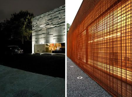
The facades of the store were made in a not-very-common manner using exposed reinforced concrete: the outward appearance of the material, generally done very precisely with new lumber, is used here randomly, chaotically, and some wood was not even removed after curing. The brises-soleil in the offices is made of a net of reinforcing bars used for the concrete.This delicate steel lace placed vertically, function as light filters in the large windows.

Micasa Showroom by Marcio Kogan
Marcio Kogan
Micasa Showroom

The external pebbles are made from the crushed rock used to produce concrete. The building itself was fundamental to the project; actually, the project was complemented and recreated in the building itself. Some of the solutions used, such as the reinforced concrete and the metallic lace, were decided at the work site and part of the creative process was transferred to the builders. The memory of the construction remained, in an exposed archeology of the building: the ‘x’s’ of the tape on the new windows and, on the inner walls, the workers’ notes on the project.These walls have no revetment, no paint: a raw texture of the material provides the finishing.The finalized building, beginning with the use of these materials, delicately displays the constructive phases, as Kogan says, 'almost an X-rays of the materials'.

Marcio Kogan
Micasa Showroom
Marcio Kogan
Micasa Showroom

via Marcio Kogan

Continue reading...